Adaptive Typography Library for Responsive Text Display – Flexflex.js
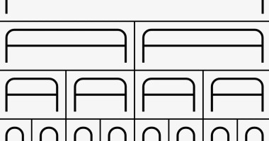
A JavaScript typography library that draws adaptive, monolined letterforms on SVG and Canvas elements to fit any container.


A JavaScript typography library that draws adaptive, monolined letterforms on SVG and Canvas elements to fit any container.

A simple JavaScript solution for responsive text. It dynamically adjusts text to fit containers, widths, heights, or single lines.

A responsive font size utility library that automatically adjusts font sizes across different screen resolutions.

textFit is a standalone JavaScript library that automatically and dynamically scales text to fit inside a fixed width container.
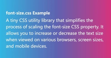
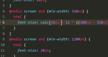
A tiny CSS utility library that simplifies the process of scaling the font-size CSS property. It allows you to increase or decrease the text size when viewed on various browsers, screen sizes, and mobile devices.
A dynamic font size solution for modern responsive and cross-platform design.
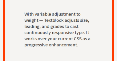
The Textblock JavaScript library dynamically adjusts the font size, font weight, and line-height to fit text within its parent container when resizing.

fitty is a small, zero-dependency JavaScript library that dynamically scales the text to fill its parent container.

Just another text resize library written in pure JavaScript that dynamically scales font sizes of your text to fit the parent container.

Fitter Happier Text is a lightweight Javascript helps you create responsive, big, and fully flexible headings on your web page.