


Just another text resize library written in pure JavaScript that dynamically scales font sizes of your text to fit the parent container.
Ideal for responsive web design that makes your headlines as large as possible no matter how you resize the window.
How to use it:
Wrap your text content into a container called ‘master’ as these:
<div id="master">
  <div>CSSSCRIPT.COM</div>
  <p>Text using font-master.js with paragraph</p>
</div>
Download and place the JavaScript file ‘font-master.js’ at the bottom of the web page. That’s it.
<script src="font-master.js"></script>
See Also:
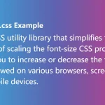 Responsive Text Resize Library – font-size.css
 Small JavaScript Library For Text Auto Resizing – textFit
 Scale Text Element Relative To Its Parent Container – Textblock
 Minimal Text Resizing JavaScript Library – fitty
 Touch-enabled Drag/Rotate/Resize/Snap Library – subjx
 Adaptive Typography Library for Responsive Text Display – Flexflex.js
 Create Interactive HTML Elements with Drag, Resize, Rotate – Draggable.js
 Dynamic Text Resizing for Responsive Typography – Fit Text