


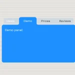
Tabbis.js is a lightweight, pure JavaScript library for generating nice, clean, nested, fully accessible tabs interface from plain HTML structure.
How to use it:
Put the tabbis.js and tabbis.css into the webpage.
<link rel="stylesheet" href="tabbis.css" />
<script src="tabbis.js"></script>
Create a normal, flat tabs component:
<div data-tabs>
  <div>Tab1</div>
  <div data-active>Active Tab</div>
  <div>Tab3</div>
</div>
<div data-panes>
  <div>Pane1</div>
  <div>Pane2</div>
  <div>Pane3</div>
</div>
If you want a complex tabs component which contains as many sub tabs.
<div data-tabs>
  <div>Tab1</div>
  <div>Tab2</div>
  <div>Tab3</div>
</div>
<div data-panes>
  <div>Pane1</div>
  <div>
    <div data-tabs>
      <div>Tab4</div>
      <div>Tab5</div>
    </div>
    <div data-panes>
      <div>Pane4</div>
      <div>
        <div data-tabs>
          <div>Tab6</div>
          <div>Tab7</div>
        </div>
        <div data-panes>
          <div>Pane6</div>
          <div>Pane7</div>
        </div>
      </div>
    </div>
  </div>
  <div>Pane3</div>
</div>
Initialize the Tabbis and done.
tabbis();
Determine whether or not to remember the open/close state. Default: false.
tabbis({
  memory: true
});
Default CSS classes & attributes.
tabbis({
  paneGroup: '[data-panes]',
  prefix: '', // CSS prefix
  tabActive: '[data-active]',
  tabGroup: '[data-tabs]'
});
Enable/disable keyboard navigation. Defaults to true.
tabbis({
  keyboardNavigation: true
});
Set the initial tab index when no [data-active]. Defaults to 0 (tab 1).
tabbis({
  tabActiveFallback: 0
});
You can also customize the trigger event as follows. Defaults to mouse click.
tabbis({
  trigger: 'mousehover'
});
Trigger an event when a tab is activated.
document.addEventListener("tabbis", e => {
  let data = e.detail;
  console.log(data.tab);
  console.log(data.pane);
}, false );
Changelog:
v3.0 (02/18/2020)
- Feature: Support for old browsers (with Babel)
- Feature: Changed callback to custom event
- Feature: Keyboard navigation added
- Feature: Accessability support with aria attributes added
- CSS: Style for focus added on tab and pane
- HTML: Changed divs to buttons for better semantics
- Option: prefix added
- Option: keyboardNavigation added
- Option: tabActiveFallback added
- Enhancement: Now both data-active and aria-selected=”true” works to activate a tab
v2.0 (02/12/2020)
- Behaviour: Set active tab with a selector
- Behaviour: If no tab is active it will set to the first tab to active
- Behaviour: Tab memory is disabled by default
- Option:
memory– Possible to disable withfalse - Option:
activeData– Selector fordata-active - Nested options
- ES6 version, smaller and more readable code
- Even smaller tabbis function call
- Complete rewrite
02/08/2020
- JS updated
- Added minified JS
See Also:
 CSS-Only Inverted Corner Tabs With Anchor Positioning
 Animated Tabs Component In Pure CSS – Tabsy CSS
 Convert Sectioned Contents Into Tabs – tinytabs
 Lightweight Pure JavaScript Tabs With URL Persistence – Tabzy.js
 Dynamic External Content Tabs with Quicktabs.js
 Create Accessible Tabs with Pure CSS and Semantic HTML
 Accessible Tabs Component – tab-container
 Simple Fast Vanilla JavaScript Tabs