


| Author: | pattespatte |
|---|---|
| Views Total: | 84 views |
| Official Page: | Go to website |
| Last Update: | April 27, 2025 |
| License: | MIT |
Preview:

Description:
vanilla-css-design-system is exactly what the name implies: a design system built with plain CSS. No Sass, no Less, no JS framework dependencies. It provides a set of pre-defined components, layout helpers, utility classes, and design tokens (managed via CSS variables) to help you build consistent user interfaces quickly.
While utility-first frameworks like Tailwind are popular, they often require a build step and learning a new class-naming convention. This system uses more traditional, semantic class names for components (e.g., .card, .btn) and relies heavily on CSS variables for customization, which feels quite natural if you’re comfortable with modern CSS.
Features:
- Modular: Import only the components or utilities you need.
- CSS Variable Theming: Customize colors, spacing, fonts easily.
- Responsive: Mobile-first approach built-in.
- Accessible: Designed with ARIA attributes and semantic HTML in mind (though implementation is key).
How to use it:
1. Download the package and link the required stylesheet in your project.
<link rel="stylesheet" href="styles/vanilla-combined.min.css">
2. Start using the provided CSS classes for components, layout, and utilities. Check the Demo Page for available classes and examples.
Development:
# Install dependencies
$ npm install
# Build the combined, purged, and minified CSS
$ npm run build:css
# Convert between formats
$ npm run css2tokens
$ npm run tokens2css
# Watch for Changes
$ npm run watch
# Lint CSS
$ npm run lint:css
$ npm run lint:css:fix
Changelog:
v1.0.2 (04/27/2025)
- Fix shadow color definitions in CSS variables by changing rgba to rgb format for consistency
See Also:
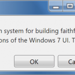 Windows 7 CSS Framework – 7.css
 Minimalist CSS Framework For Creating Modern Web Pages – Mgplus
 Terminal-Inspired CSS Library for Retro Web UI – WebTUI
 Minimal Classless CSS Framework – Simple.css
 Zero-Class Web Development with launch.css Framework
 Responsive Classes CSS Framework – Prime.css
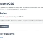 Modern Classless CSS Framework – cosmoCSS
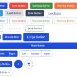 Build Fast Responsive Pages with MinimaCSS Framework