


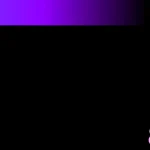
Replicate Windows 10 and Windows 7 boot animation using HTML, CSS, and JavaScript.
How to use it:
1. Create a Windows 10 boot animation using pure CSS/CSS3. In this example, we use Font Awesome iconic font for the Windows logo.

<!-- Logo -->
<div class="logo">
  <i class="fab fa-windows" id="windows"></i>
</div>
<!-- Loader -->
<div class="loader">
  <div class="bg"></div>
  <div class="circle"></div>
  <div class="circle"></div>
  <div class="circle"></div>
  <div class="circle"></div>
  <div class="circle"></div>
</div>
.logo {
  position: absolute;
  top: 0%;
  left: 50%;
  transform: translate(-50%,0%);
  margin: auto;
}
.logo #windows {
  color: #0078d7;
  font-size: 120px;
}
.loader {
  position: absolute;
  bottom: 0%;
  left: 40%;
  transform: translate(-50%,-50%);
  width: 50px;
  height: 50px;
  margin: auto;
  transform: scale(0.8);
}
.loader .circle {
  position: absolute;
  width: 38px;
  height: 38px;
  opacity: 0;
  transform: rotate(225deg);
  animation-iteration-count: infinite;
  animation-name: rotate;
  animation-duration: 4.8s;
}
.loader .circle:after {
  content: '';
  position: absolute;
  width: 3px;
  height: 3px;
  border-radius: 50%;
  background: #fff;
  border: 1px white solid;
  box-shadow: 0 0 1px #0078d7;
}
.loader .circle:nth-child(2) {
  animation-delay: 240ms;
}
.loader .circle:nth-child(3) {
  animation-delay: 480ms;
}
.loader .circle:nth-child(4) {
  animation-delay: 720ms;
}
.loader .circle:nth-child(5) {
  animation-delay: 960ms;
}
.loader .bg {
  position: absolute;
  width: 70px;
  height: 70px;
  margin-left: -16px;
  margin-top: -16px;
  border-radius: 13px;
  background-color: transparent;
}
@keyframes rotate {
  0% {
    transform: rotate(225deg);
    opacity: 1;
    animation-timing-function: ease-out;
  }
  7% {
    transform: rotate(345deg);
    animation-timing-function: linear;
  }
  30% {
    transform: rotate(455deg);
    animation-timing-function: ease-in-out;
  }
  39% {
    transform: rotate(690deg);
    animation-timing-function: linear;
  }
  70% {
    transform: rotate(815deg);
    opacity: 1;
    animation-timing-function: ease-out;
  }
  75% {
    transform: rotate(945deg);
    animation-timing-function: ease-out;
  }
  76% {
    transform: rotate(945deg);
    opacity: 0;
  }
  100% {
    transform: rotate(945deg);
    opacity: 0;
  }
}
2. Create a Windows 7 boot animation using JavaScript and CSS.

<section id="fondo"></section>
<!-- Loader -->
<section>
  <div id="dotGrupo">
    <div class="dotContenedor">
      <div class="dot"></div>
    </div>
    <div class="dotContenedor">
      <div class="dot"></div>
    </div>
    <div class="dotContenedor">
      <div class="dot"></div>
    </div>
    <div class="dotContenedor">
      <div class="dot"></div>
    </div>
    <div class="dotContenedor">
      <div class="dot"></div>
    </div>
    <div id="izqParte"></div>
    <div id="derParte"></div>
  </div>
  <!-- Loading Text -->
  <div id="textoAbajo">
    <p>Loading...</p>
  </div>
</section>
#fondo {
position: absolute;
width: 100%;
height: 100vh;
background-color: #000000;
opacity: 1;
animation: 2s turnOn 1s linear forwards;
}
section {
position: absolute;
width: 100%;
height: 100vh;
}
#dotGrupo {
position: relative;
width: 100px;
height: 100px;
top: calc(50% - 50px);
left: calc(50% - 50px);
opacity: 0;
/*border: 1px solid yellow;*/
}
.dotContenedor {
position: absolute;
width: 100%;
height: 100%;
}
.dot {
position: absolute;
width: 10px;
height: 10px;
border-radius: 50%;
top: calc(100% - 5px);
left: calc(50% - 5px);
background-color: white;
transform-origin: 5px -45px;
}
#leftCover,
#rightCover {
position: absolute;
top: 50%;
left: -10%;
width: 60%;
height: 60%;
background-color: #0068b4;
}
#derParte {
left: 50%;
opacity: 0;
/*animation: 4s derParteAll 1.6s step-start;*/
}
#izqParte {
opacity: 0;
/*animation: 3.8s izqParteAll 0s step-start;*/
}
#textoAbajo {
font-size: 30px;
text-align: center;
width: 100%;
position: absolute;
top: calc(50% + 50px);
color: white;
font-weight: thin;
}
.dotContenedor > .dot {
transform: rotate(-30deg);
}
@keyframes AllCirculos {
0% {
transform: rotate(-30deg);
}
100% {
transform: rotate(360deg);
}
}
@keyframes AllCirculos2 {
0% {
transform: rotate(0deg);
}
100% {
transform: rotate(420deg);
}
}
@keyframes derParteAll {
0% {
opacity: 0;
}
100% {
opacity: 0;
}
}
@keyframes izqParteAll {
0% {
opacity: 0;
}
100% {
opacity: 0;
}
}
@keyframes turnOn {
0% {
opacity: 1;
}
100% {
opacity: 0;
}
}var myDots = document.getElementsByClassName("dotContenedor");
var izqParte = document.getElementById("izqParte");
var derParte = document.getElementById("derParte");
setTimeout(function () {
document.getElementById("dotGrupo").style.opacity = 1;
setInterval(bottomFunc, 1500);
setInterval(animations, 6000);
animations();
var amount = 0;
function bottomFunc() {
amount++;
var result = "";
for (let i = 0; i < (amount % 3) + 1; i++) {
result += ".";
}
document.querySelectorAll("#textoAbajo > p")[0].innerHTML = "Loading..." + result;
}
function animations() {
izqParte.style.opacity = 1;
derParte.style.opacity = 1;
derParte.style.animation = "none";
derParte.offsetHeight;
derParte.style.animation = null;
derParte.style.animation = "4s derParteAni 1.6s step-start";
izqParte.style.animation = "none";
izqParte.offsetHeight;
izqParte.style.animation = null;
izqParte.style.animation = "3.8s izqParteAni 0s step-start";
for (let j = 0; j < myDots.length; j++) {
myDots[j].style.animation = "none";
myDots[j].offsetHeight;
myDots[j].style.animation = null;
myDots[j].style.animation = "2s AllCirculos " + j * 0.375 + "s cubic-bezier(0.2,0.95,0.75,0.2), 2s AllCirculos2 " + (2 + j * 0.375) + "s cubic-bezier(0.2,0.65,0.75,0.2) forwards";
}
}
}, 3000);See Also:
 Detect and Display Website Loading Progress – Siteloader
 Youtube-like Customizable Top Loader In JavaScript – pageload
 Google Loaders Redesign In Pure CSS
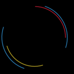 9 CSS Only Loaders
 Auto-Generated Skeleton Loader Web Component for Any Framework – phantom-ui
 Material Design 3 Expressive Loading Indicator to React/Vue/Svelte/Vanilla JS
 Math Curve Loaders: Mathematical SVG Loading Animations in CSS & JS
 Lightweight Loading Overlay Plugin For Bootstrap 5 – AvalynxLoader