


| Author: | papaguycodes |
|---|---|
| Views Total: | 143 views |
| Official Page: | Go to website |
| Last Update: | December 3, 2024 |
| License: | MIT |
Preview:

Description:
This is a 3D liquid progress bar built using only HTML and CSS/CSS3. It represents a new & stylish approach to displaying progress tracking with visual depth and interactivity.
How to use it:
1. Code the HTML. The HTML structure consists of a div container with the class chart, which houses another div with the class bar. Inside the bar div, there are multiple div elements representing different faces of the progress bar. Each face contains a growing-bar div that visually represents the progress. To set the progress level, you add a class like bar-75 to indicate 75% completion. This specific class determines how much the bar fills up.
<div class="chart">
  <div class="bar bar-75 white">
    <div class="face top">
      <div class="growing-bar"></div>
    </div>
    <div class="face side-0">
      <div class="growing-bar"></div>
    </div>
    <div class="face floor">
      <div class="growing-bar"></div>
    </div>
    <div class="face side-a"></div>
    <div class="face side-b"></div>
    <div class="face side-1">
      <div class="growing-bar"></div>
    </div>
  </div>
</div>
2. Apply the necessary CSS styles. The chart class sets up the 3D perspective. The bar class defines the bar’s size, position, and 3D rotation. Specific classes like side-a, side-b, side-0, side-1, top, and floor create the 3D cube effect. The growing-bar class styles the inner bar that visually represents the progress. Pre-defined classes like bar-0 to bar-100 control the width (progress) of the inner bar. Here are the core CSS styles:
.chart {
  font-size: 1em;
  perspective: 1000px;
  perspective-origin: 50% 50%;
  -webkit-backface-visibility: visible;
  backface-visibility: visible;
}
.bar {
  font-size: 1em;
  position: relative;
  height: 10em;
  transition: all 0.3s ease-in-out;
  transform: rotateX(60deg) rotateY(0deg);
  transform-style: preserve-3d;
}
.bar .face {
  font-size: 2em;
  position: relative;
  width: 100%;
  height: 2em;
  background-color: rgba(254, 254, 254, 0.3);
}
.bar .face.side-a, .bar .face.side-b {
  width: 2em;
}
.bar .side-a {
  transform: rotateX(90deg) rotateY(-90deg) translateX(2em) translateY(1em) translateZ(1em);
}
.bar .side-b {
  transform: rotateX(90deg) rotateY(-90deg) translateX(4em) translateY(1em) translateZ(-1em);
  position: absolute;
  right: 0;
}
.bar .side-0 {
  transform: rotateX(90deg) rotateY(0) translateX(0) translateY(1em) translateZ(-1em);
}
.bar .side-1 {
  transform: rotateX(90deg) rotateY(0) translateX(0) translateY(1em) translateZ(3em);
}
.bar .top {
  transform: rotateX(0deg) rotateY(0) translateX(0em) translateY(4em) translateZ(2em);
}
.bar .floor {
  box-shadow: 0 0.1em 0.6em rgba(0, 0, 0, 0.3), 0.6em -0.5em 3em rgba(0, 0, 0, 0.3), 1em -1em 8em #fefefe;
}
.growing-bar {
  transition: all 0.3s ease-in-out;
  background-color: rgba(236, 0, 140, 0.6);
  width: 100%;
  height: 2em;
}
.bar-0 .growing-bar {
  width: 0%;
}
.bar-1 .growing-bar {
  width: 1%;
}
.bar-2 .growing-bar {
  width: 2%;
}
...
.bar-20 .growing-bar, input[id='exercise-2']:checked ~ .chart.grid .exercise .bar:nth-child(1) .growing-bar {
  width: 20%;
}
...
.bar-25 .growing-bar, input[id='pos-0']:checked ~ .chart .growing-bar {
  width: 25%;
}
...
.bar-50 .growing-bar, input[id='pos-1']:checked ~ .chart .growing-bar, input[id='exercise-2']:checked ~ .chart.grid .exercise .bar:nth-child(2) .growing-bar, input[id='exercise-4']:checked ~ .chart.grid .exercise .bar:nth-child(1) .growing-bar, input[id='exercise-4']:checked ~ .chart.grid .exercise .bar:nth-child(2) .growing-bar {
  width: 50%;
}
...
.bar-70 .growing-bar, input[id='exercise-3']:checked ~ .chart.grid .exercise .bar:nth-child(1) .growing-bar, input[id='exercise-3']:checked ~ .chart.grid .exercise .bar:nth-child(2) .growing-bar, input[id='exercise-3']:checked ~ .chart.grid .exercise .bar:nth-child(3) .growing-bar {
  width: 70%;
}
...
.bar-75 .growing-bar, input[id='pos-2']:checked ~ .chart .growing-bar {
  width: 75%;
}
...
.bar-80 .growing-bar, input[id='exercise-2']:checked ~ .chart.grid .exercise .bar:nth-child(3) .growing-bar {
  width: 80%;
}
...
.bar-100 .growing-bar, input[id='pos-3']:checked ~ .chart .growing-bar, input[id='exercise-4']:checked ~ .chart.grid .exercise .bar:nth-child(3) .growing-bar {
  width: 100%;
}
3. Customize the progress bar appearance. You can create new classes like the white class in the example. This lets you alter colors and shadows to fit your website’s design.
.bar.white .side-a,
.bar.white .growing-bar {
  background-color: rgba(254, 254, 254, 0.6);
}
.bar.white .side-0 .growing-bar {
  box-shadow: -0.5em -1.5em 4em #fefefe;
}
.bar.white .floor .growing-bar {
  box-shadow: 0em 0em 2em #fefefe;
}
See Also:
 Easy Scroll Position Tracking – ScrollProgress.js
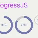 Visualize Progress Data With Animated, Circular Progress Bars – ProgressJS
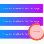 Radial Progress Indicator For Click-and-hold Actions – HoldCircleJS
 Simple Scroll Progress Indicator For Long Pages – PageBar.js
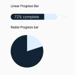 Generate Linear & Radial Progressbars Using CSS – Progress.css
 Lightweight Scroll Progress Bar In JavaScript – scrollProgress.js
 Modern Slim Progress Bar For Form Completion – Fort.js
 Page Scroll Reading Progress Indicator with Progress.js