


Yet another pure CSS progress bar library for creating linear and/or radial progress bars to represent percentages and convey the progression of a process.
The progress bars are customized entirely through CSS for seamless integration into any project.
How to use it:
1. Download and import the Progress.css stylesheet into your project.
<link rel="stylesheet" href="progress.min.css" />
2. Add the CSS class pss-bar to the progress bar container and specify the percentage using the --pss-fill variable.
<div class="pss-bar" style="--pss-fill: 50%"></div>
3. Add a custom label next to the progress bar.
<div class="pss-bar" style="--pss-fill: 20%" data-pss="20%"></div>
4. Create a circular progress bar using the pss-rad class.
<div class="pss-rad" style="--pss-fill: 50%"></div>
5. Create a ring progress bar using the –pss-center variable.
<div class="pss-rad" style="--pss-fill: 15%; --pss-center: #70F"></div>
6. Customize the fill color of the progress bar.
<div class="pss-bar" style="--pss-fill: 45%; --pss-color: #70F"></div>
Changelog:
v1.0.3 (06/08/2023)
- improvements in the round style
See Also:
 Pure CSS Progress Bar Library with Custom Themes – progress-bar.css
 Modern TypeScript Progress Bar Library – BProgress
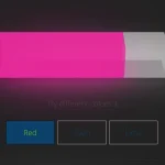 3D Liquid Progress Bar in Pure CSS/CSS3
 Easy Scroll Position Tracking – ScrollProgress.js
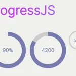 Visualize Progress Data With Animated, Circular Progress Bars – ProgressJS
 Radial Progress Indicator For Click-and-hold Actions – HoldCircleJS
 Simple Scroll Progress Indicator For Long Pages – PageBar.js
 Lightweight Scroll Progress Bar In JavaScript – scrollProgress.js