


An animated, multi-level dropdown navigation menu built with pure CSS and CSS3 transitions, created by rssatnam.
How to use it:
Create the Html for a multi-level dropdown menu using nested unordered lists. The markup structure should be like this:
<nav>
  <ul>
    <li><a href="#">Home</a></li>
    <li><a href="#">Tutorials</a><span class="dropBottom"></span>
      <ul>
        <li><a href="#">Design</a><span class="dropRight"></span>
          <ul>
            <li><a href="#">Photoshop</a></li>
            <li><a href="#">Illustrator</a></li>
            <li><a href="#">Web Design</a><span class="dropRight"></span>
              <ul>
                <li><a href="#">XTHML</a></li>
                <li><a href="#">CSS</a></li>
                <li><a href="#">JavaScript</a></li>
              </ul>
            </li>
          </ul>
        </li>
        <li><a href="#">Articles</a></li>
        <li><a href="#">Interviews</a></li>
      </ul>
    </li>
    <li><a href="#">About</a></li>
    <li><a href="#">Contact</a></li>
  </ul>
</nav>
The CSS to style the dropdown menu.
nav {
  display: table;
  margin: 50px auto;
  box-shadow: 0px 2px 0px #023333;
}
ul {
  margin: 0;
  padding: 0;
  list-style: none;
}
ul ul {
  opacity: 0;
  position: absolute;
  top: 160%;
  visibility: hidden;
  transition: all .4s ease;
  -webkit-transition: all .4s ease;
}
ul ul ul {
  top: 0%;
  left: 160%;
}
ul ul li:hover > ul {
  top: 0%;
  left: 100%;
  opacity: 1;
  visibility: visible;
}
ul li:hover > ul {
  opacity: 1;
  top: 100%;
  visibility: visible;
}
ul li {
  float: left;
  position: relative;
}
ul ul li { float: none; }
ul li {
  background-color: #009C75;
  cursor: pointer;
}
ul a {
  text-decoration: none;
  display: block;
  color: #FF9;
  padding: 10px 15px;
  width: 6em;
  text-align: center;
  text-shadow: 0px -1px 0px rgba(0,0,0,.2);
}
ul li:hover { background-color: #007373; }
ul li a:hover { background-color: #007373; }
The CSS to set the position of sub-menus.
span.dropBottom,
span.dropRight {
  display: block;
  box-shadow: inset 2px 0px 0px #FF9;
  position: absolute;
  left: 0px;
  width: 100%;
  height: 100%;
  top: 0px;
}
span.dropBottom {
  box-shadow: inset 0px 2px 0px #FF9;
  position: absolute;
  width: 100%;
  bottom: 0px;
}
See Also:
 Accessible Dropdown Menu With Smooth JavaScript Animations
 Stylish Accessible Dropdown Menu With JavaScript And CSS3
 Minimal Accessible Dropdown Menu With Vanilla JavaScript
 Advanced Animated Dropdown Menu In Vanilla JavaScript – DropdownEasy
 Accessible Custom Dropdown Menu – dropmic
 Simple Clean Pure CSS3 Dropdown Menu
 3D Flipping Dropdown Navigation with Pure CSS3
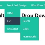 Create A Multi-Level Drop Down Menu with Pure CSS