


| Author: | saurabhdaware |
|---|---|
| Views Total: | 295 views |
| Official Page: | Go to website |
| Last Update: | November 20, 2024 |
| License: | MIT |
Preview:

Description:
Bluesky Profile Widget is a tiny Web Component that provides a Custom Element <bsky-widget /> to embed a Bluesky profile card on your website. It loads user data through the Bluesky API and renders customizable profiles on any website.
This widget allows you to display basic information about your Bluesky profile, like handle, profile picture, banner image (if available), follower and following counts, and bio, on your website. This provides a direct link for visitors to connect with you on Bluesky.
How to use it:
1. Install and Import the Bluesky Profile Widget
$ npm install bsky-widget@latest
import "bsky-widget";
2. Alternatively, you can load it as a module directly using the <script> tag:
<script src="/path/to/index.js" type="module"></script>
3. Insert the <bsky-widget /> custom element in your HTML document where you want the profile to appear. Don’t forget to pecify your Bluesky handle to link the profile:
<bsky-widget handle="allenzong.bsky.social"></bsky-widget>
4. If your profile includes a banner, you can choose whether to display it. To hide the banner, set show-banner to “false”:
<bsky-widget
  handle="allenzong.bsky.social"
  show-banner="false">
</bsky-widget>
5. To hide the profile description, set data-show-description to “false”:
<bsky-widget
  handle="allenzong.bsky.social"
  show-description="false">
</bsky-widget>
6. Change the theme of the widget: ‘dark’, ‘dim’, ‘auto’, ‘auto-dim’, ‘light'(default)
<bsky-widget
  handle="allenzong.bsky.social"
  theme="dark">
</bsky-widget>
7. You can override the default CSS variables to match your website’s design.
:host {
  --bsky-background: #fff;
  --bsky-primary: #1185fe;
  --bsky-primary-hover: #4ca2fe;
  --bsky-text-on-primary: #fff;
  --bsky-text-on-background: #0b0f14;
  --bsky-text-on-background-subtle: #42576c;
  --bsky-text-large: 1.4rem;
  --bsky-text-large-line-height: 1.8rem;
  --bsky-text-medium: 1rem;
  --bsky-text-small: 0.9rem;
  /* Styles that can be overriden outside */
  font-family: Arial, Helvetica, sans-serif, -apple-system, sans-serif;
  width: 350px;
  max-width: 100%;
  min-height: 170px;
  display: inline-block;
  box-shadow: 1px 1px 8px 1px #0002;
  border-radius: 8px;
  overflow: auto;
  opacity: 0;
}
Changelog:
v0.1.0 (11/20/2024)
- Added Dark Theme.
- You can now override styles using the ‘theme’ attribute
- You don’t need data- prefix in props anymore. You can directly use props like handle, show-description, show-banner, theme, etc.
- Code cleanup.
v0.0.20 (11/19/2024)
- bugfixes
- update handler
See Also:
 Embed Bluesky Comments On Your Site Using This Web Component
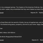 Display Bluesky Posts with Metadata – bluesky-post.js
 Minimal Bsky Share Button In Vanilla JavaScript & Svelte
 Responsive Background Image Delivery Using Vanilla JavaScript
 Simplest Copy To Clipboard Library – simpleCopy
 Create Sleek Toast-Like Alert Notifications With Alerto.js
 Insert A Basic Calendar UI Into Your Webpage – calendar.js
 LED Matrix Display With Scrolling Text