


A vanilla JavaScript (ES6) extension to Bootstrap 5 (and Bootstrap 4) that converts a multi-select box into a user-friendly tags input component.
How to use it:
1. Import the Tags.js.
import Tags from "./tags.js";
2. Initialize the library on the select element.
Tags.init("select[multiple]");3. That’s it. It will automatically convert all select boxes with the multi attribute into a tags input where you can select options from a suggestion list while typing.
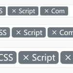
<select class="form-select" id="validationTags" multiple>
  <option selected disabled hidden value="">Choose a tag...</option>
  <option value="1" selected="selected">JavaScript</option>
  <option value="2">HTML5</option>
  <option value="3">CSS3</option>
  <option value="4">jQuery</option>
  <option value="5">React</option>
  <option value="6">Angular</option>
  <option value="7">Vue</option>
  <option value="8">Python</option>
</select>
<div class="invalid-feedback">Please select a valid tag.</div>
4. Add the data-allow-new="true" to the select box in cases where you want to add new options.
<select class="form-select" id="validationTags" multiple data-allow-new="true">
  <option selected disabled hidden value="">Choose a tag...</option>
  <option value="1" selected="selected">JavaScript</option>
  <option value="2">HTML5</option>
  <option value="3">CSS3</option>
  <option value="4">jQuery</option>
  <option value="5">React</option>
  <option value="6">Angular</option>
  <option value="7">Vue</option>
  <option value="8">Python</option>
</select>
5. Determine whether to allow new options only if they match a given regex.
<select class="form-select" id="validationTagsNew" name="tags_new[]" multiple data-allow-new="true" data-regex=".*@mycompany\.com$">
  <option disabled hidden value="">Add mail address</option>
  <option value="1" selected="selected">[email protected]</option>
  <option value="2">[email protected]</option>
  <option value="3">[email protected]</option>
</select>
<div class="invalid-feedback">Please select only @mycompany.com addresses.</div>
6. Determine whether to show all suggestions using the data-show-all-suggestions attribute.
<select class="form-select" id="validationTags" multiple data-show-all-suggestions="true">
  ...
</select>
7. Enable the close icon to clear all sections.
<select class="form-select" id="validationTags" multiple data-allow-clear="true" data-clear-label="Clear">
  ...
</select>
8. Load data from an external JSON file.
<select class="form-select" id="validationTagsJson" name="tags_json[]" multiple data-allow-new="true" data-server="demo.json" data-live-server="1" data-server-params='{"key":"val"}'>
  <option disabled hidden value="">Choose a tag...</option>
</select>
9. Set the maximum number of tags allowed to insert.
<select class="form-select" id="validationTagsJson" name="tags_json[]" multiple data-max="5" data-server="demo.json" data-live-server="1">
  <option disabled hidden value="">Choose a tag...</option>
</select>
10. Customize the separator. You can add multiple separators with |.
<select class="form-select" id="validationTagsJson" name="tags_json[]" multiple data-separator=" |," data-server="demo.json" data-live-server="1">
  <option disabled hidden value="">Choose a tag...</option>
</select>
11. Determine how many characters need to be typed to show the dropdown. Default: 1.
<select class="form-select" id="validationTagsJson" name="tags_json[]" data-suggestions-threshold="2">
  <option disabled hidden value="">Choose a tag...</option>
</select>
12. Customize the badge style and/or class.
<option value="2" data-badge-style="success" selected="selected">Banana</option>
<option value="3" data-badge-style="warning" data-badge-class="text-dark another-class">Orange</option>
<option value="4" data-badge-style="secondary">Blueberry with a very long label that pushes the menu</option>
13. Determine whether to keep suggestions open after selection. Clear on focus out. Default: false.
<option value="2" data-badge-style="success" selected="selected">Banana</option>
<option value="3" data-badge-style="warning" data-badge-class="text-dark another-class">Orange</option>
<option value="4" data-badge-style="secondary">Blueberry with a very long label that pushes the menu</option>
<select class="form-select" id="validationTagsJson" name="tags_json[]" multiple data-allow-new="true" data-server="demo.json" data-live-server="1" data-server-params='{"key":"val"}' data-keep-open="1">
  <option disabled hidden value="">Choose a tag...</option>
</select>
14. Set the debounce time. Default: 300.
<select class="form-select" id="validationTagsJson" name="tags_json[]" multiple data-max="5" data-debounce-time="500" data-server="demo.json" data-live-server="1">
  <option disabled hidden value="">Choose a tag...</option>
</select>
15. Set the debounce time. Default: 300.
<select class="form-select" id="validationTagsJson" name="tags_json[]" multiple data-max="5" data-debounce-time="500" data-server="demo.json" data-live-server="1">
  <option disabled hidden value="">Choose a tag...</option>
</select>
16. You’re also allowed to pass the options via JavaScript. Full options:
- items: An array of suggestions
- allowNew: Allows creation of new tags
- showAllSuggestions: Show all suggestions even if they don’t match. Disables validation.
- badgeStyle: Color of the badge (color can be configured per option as well)
- allowClear: Show a clear icon
- clearEnd: Place clear icon at the end
- selected: A comma separated list of selected values
- regex: Regex for new tags
- separator: A list (pipe separated) of characters that should act as separator (default is using enter key)
- max Limit to a maximum of tags (0 = no limit)
- placeholder: Provides a placeholder if none are provided as the first empty option
- clearLabel: Text as clear tooltip
- searchLabel: Default placeholder
- keepOpen: Keep suggestions open after selection, clear on focus out
- allowSame: Allow same tags used multiple times
- baseClass: Customize the class applied to badges
- addOnBlur: Add new tags on blur (only if allowNew is enabled)
- showDisabled: Show disabled tags
- hideNativeValidation: Hide native validation tooltips
- suggestionsThreshold: Number of chars required to show suggestions
- maximumItems: Maximum number of items to display
- autoselectFirst: Always select the first item
- updateOnSelect: Update input value on selection (doesn’t play nice with autoselectFirst)
- highlightTyped: Highlight matched part of the suggestion
- fullWidth: Match the width on the input field
- fixed: Use fixed positioning (solve overflow issues)
- labelField: Key for the label
- valueField: Key for the value
- queryParam: Name of the param passed to endpoint (query by default)
- server: Endpoint for data provider
- serverMethod: HTTP request method for data provider, default is GET
- serverParams: Parameters to pass along to the server
- fetchOptions: Any other fetch options (https://developer.mozilla.org/en-US/docs/Web/API/fetch#syntax)
- liveServer: Should the endpoint be called each time on input
- noCache: Prevent caching by appending a timestamp
- allowHtml: Allows HTML content in input
- displayValueInBadge: Display the value attribute instead of text in badges. If no title is set, use the text as title
- debounceTime: Debounce time for live server
- notFoundMessage: Display a no suggestions found message. Leave empty to disable
- onRenderItem: Callback function that returns the suggestion
- onSelectItem: Callback function to call on selection
- onClearItem: Callback function to call on clear
- onClearItem: Callback function to call on clear
- onServerResponse: Callback function to process server response. Must return a Promise
- onCanAdd: Callback function to validate item. Return false to show validation message.
- onBlur: Callback function on blur
- onFocus: Callback function on focus
items:  Array.<(Suggestion|SuggestionGroup)>,
allowNew: false,
showAllSuggestions: false,
badgeStyle: "primary",
allowClear: false,
clearEnd: false,
selected: [],
regex: "",
separator: [],
max: 0,
clearLabel: "Clear",
searchLabel: "Type a value",
keepOpen: false,
allowSame: false,
baseClass: "",
placeholder: "",
addOnBlur: false,
showDisabled: false,
hideNativeValidation: false,
suggestionsThreshold: 1,
maximumItems: 0,
autoselectFirst: true,
updateOnSelect: false,
highlightTyped: false,
fullWidth: false,
fixed: false,
labelField: "label",
valueField: "value",
queryParam: "query",
server: "",
serverMethod: "GET",
serverParams: {},
fetchOptions: {},
liveServer: false,
noCache: true,
allowHtml: false,
displayValueInBadge: true,
debounceTime: 300,
notFoundMessage: "",
onRenderItem: (item, label, inst) => {
  return label;
},
onSelectItem: (item, inst) => {},
onClearItem: (value, inst) => {},
onCreateItem: (option, inst) => {},
onBlur: (event, inst) => {},
onFocus: (event, inst) => {},
onCanAdd: (text, data, inst) => {},
onServerResponse: (response) => {
  return response.json();
},
17. API methods.
inst.getSelectedValues();
inst.resetState();
inst.setItem(index);
inst.addItem('New Item');
inst.removeItem(index);
inst.removeAll();
inst.toggleSuggestions(false);
inst.resetSuggestions();
inst.resetSearchInput();
inst.dispose();
Changelog:
v1.7.17 (05/31/2026)
- Update
v1.7.16 (11/30/2025)
- Fixed first option being used as placeholder if it has a value
- Added new displayValueInBadge option
v1.7.15 (05/24/2025)
- Sanitize separator to allow paste
v1.7.14 (05/17/2025)
- Better support for custom label/value field
v1.7.13 (04/30/2025)
- Fix how setItem works
v1.7.12 (04/28/2025)
- Add custom color support
v1.7.11 (04/25/2025)
- Fix input width for hidden parents
v1.7.10 (04/18/2025)
- Fix input width
v1.7.9 (04/16/2025)
- Enable/disable was reversed
- Fix performance issue
v1.7.8 (04/04/2025)
- Fix performance issue due to getComputedStyle
v1.7.7 (02/13/2025)
- Fix change event fired on load and add onDataLoaded
v1.7.6 (11/27/2024)
- Deal better with values and duplicated labels
v1.7.5 (08/19/2024)
- Fix clicking on scroll within a modal
v1.7.4 (08/02/2024)
- Improve tooltips
- Fix bugs
v1.7.3 (08/01/2024)
- Fix accessibility issue
v1.7.2 (05/29/2024)
- Fix blur + clicking on scroll in a modal
v1.7.0 (02/12/2024)
- Allow custom sanitizer
- Allow filtering input using inputFilter
v1.7.0 (02/10/2024)
- Do not allow html by default (set allowHtml if you want this)
v1.6.16 (01/30/2024)
- Fix options in optgroup not being initialized properly
v1.6.15 (11/29/2023)
- Support nested data key
v1.6.14 (11/28/2023)
- Improve single selects
- Fix again scroll not working with mouse due to focus event
v1.6.13 (11/23/2023)
- Fix addOnBlur regression
- Fix alignment regression
- setItem should adjustWidth automatically
v1.6.12 (11/23/2023)
- Refactor how blur events work
- Minor css fix for older browsers
- Two new public methods
v1.6.11 (10/11/2023)
- Improve setItem and add getItem
v1.6.10 (10/09/2023)
- Add setItem method
v1.6.9 (09/20/2023)
- Support pasting tags with space separator
v1.6.8 (09/05/2023)
- Track validation classes
- Unset min-height when hiding the select
v1.6.7 (07/20/2023)
- Fix menu positioning
- Add highlightClass
- Fix optgroup regression with hasItem (+ refactor)
v1.6.6 (07/19/2023)
- Minor tweak to prevent hiding suggestion when not needed (allow css animation to work nicely)
v1.6.5 (07/18/2023)
- Add starts with feature
- Add confirm on add/clear feature
- Remove flex align from badges since it breaks truncation. Simplify positioning and remove float as well
- Fix disabled on reset
- Fix aria attributes (remove -)
- Fix setData not updating items properly
v1.6.4 (07/03/2023)
- Dynamic data server params
- event-polyfill compat
v1.6.3 (07/01/2023)
- Minor fix for BS4 when jQuery use no conflict
v1.6.2 (06/19/2023)
- Full width is now the default since the goal is to make the form work more often like a select element. This is needed to align with the use of the drop down icon taken from the select element. Full width menu now position like bootstrap (2px offset below input).
- The dropdown icon is hidden if you have a suggestionThreshold > 0 or no option
- Added a is-max-reached class, which allows for example to hide the drop icon when max is reached, providing visual feedback that the component has reached its max elements
- Fix form-select-lg/-sm styles not working anymore
- Properly dispose of tooltips
- Various code cleanup
v1.6.1 (06/17/2023)
- Fix blurry text if translateY was used
- Fix canAdd regression with server parameter
v1.6.0 (06/16/2023)
- Add support for items in config
- Revamp how single select are displayed. Use max=1 if you want to show as badges
- Make this work more like a select element except if using live server (+ add drop icon)
- Improve how same values options are dealt with
- Dark mode fixes + BS 5.3 fixes
- Remove delay after blur
- Improve clear button positioning
v1.5.24 (06/14/2023)
- Fix accessibility attributes in Firefox
v1.5.23 (06/09/2023)
- Fuzzy search
- Customizable search fields
- Improve related param field
- Customizable server data key
v1.5.22 (05/12/2023)
- placeholder respect autofirst option
v1.5.21 (05/02/2023)
- Update css + add pure css var version
- Improve server callback (pass instance, allow nested objects, check invalid callbacks)
- Add public config getter (useful in callbacks mostly)
v1.5.20 (04/27/2023)
- Remove console.log (and add a test for it)
v1.5.19 (04/27/2023)
- Don’t focus back on search input if single or max reached
v1.5.18 (04/21/2023)
- Add onBlur&onFocus callbacks
v1.5.17 (04/17/2023)
- Fix new tag not being applied when using separators
v1.5.16 (04/17/2023)
- Remove console.log
v1.5.15 (04/11/2023)
- Fix potentially undefined window.bootstrap
v1.5.14 (04/11/2023)
- Tooltips support!
- Dynamic empty message
- On create callback
v1.5.13 (03/17/2023)
- Add loadData()
- Fix max-width issue
- Refactor add on blur
v1.5.12 (03/16/2023)
- Optgroup support
- Lots of minor fixes
v1.5.10 (03/13/2023)
- Check regex only for new input
- Add custom validator with onCanAdd
- Refactoring
v1.5.9 (03/07/2023)
- Add fetch options
v1.5.8 (03/01/2023)
- Fix resize event
- Improve scroll handling
- Disabled pseudo class
v1.5.7 (02/27/2023)
- Added highlightTyped
- Added disabled option support
- Fix validation in various scenarios (mobile, native, …)
- Other minor tweaks
v1.5.6 (02/14/2023)
- Fix show menu with arrow down
v1.5.5 (02/09/2023)
- Improve fixed positioning and refactor menu positioning
- RTL support
- Fix minWidth on input
v1.5.4 (01/17/2023)
- Fix onClearItem not being triggered
v1.5.3 (01/17/2023)
- Add fixed positioning option
- Add allowSame option
- Minor tweaks
v1.5.2 (01/09/2022)
- Bootstrap 5.3 dark mode support
- Configurable query parameter
v1.5.1 (12/12/2022)
- Bugfix
v1.5.0 (11/21/2022)
- Accessibility improvements
- Refactored config system
- Added new options
v1.4.42 (11/09/2022)
- Add on blur feature + event fired on blur for custom behaviour
v1.4.41 (10/26/2022)
- Fix android support
- Add focus support
v1.4.40 (10/25/2022)
- Improve input event support
- Clicking on label now works as expected
- Android “enter” support improved
v1.4.39 (10/13/2022)
- Fix initial values from remote server
- Suggestions threshold 0 now works as expected with live server
v1.4.38 (07/05/2022)
- New badge default classes and new clear icon position flag
v1.4.37 (07/04/2022)
- Update
v1.4.36 (06/30/2022)
- Add base class option
v1.4.35 (06/22/2022)
- fix showing all suggestions
v1.4.34 (04/22/2022)
- Fix unexpected suggestions showing when max is above limit
v1.4.32 (04/19/2022)
- Fix placeholder size for non ascii chars
- Support form-select-lg and form-select-sm classes
v1.4.30/31 (04/19/2022)
- Fix input size for non ascii languages
v1.4.29 (03/18/2022)
- placeholder also works as a constructor param
- add full width feature
v1.4.28 (03/18/2022)
- Fix bounding (right and bottom)
v1.4.27 (03/18/2022)
- Fix hardcoded value
v1.4.26 (03/17/2022)
- Add keep open
- Debounce ajax calls
- Support custom columns names
v1.4.25 (03/01/2022)
- fix minor issue with overflow container
v1.4.24 (02/11/2022)
- Deal better with window borders and overflow containers
- Remove unnecessary standalone build since we don’t use the dropdown js lib
v1.4.23 (02/10/2022)
- Switch from private var/methods to _ based convention and mangle props. This allows support for safari 14.1 and improve min file size even more.
v1.4.22 (02/08/2022)
- Support multiple classes on badges
v1.4.21 (01/20/2022)
- Allow to use esc to hide suggestions
- Added some unit tests and rework some of the internals
v1.4.20 (01/20/2022)
- Fix regression for enter key
v1.4.19 (01/19/2022)
- Fix regression from input event
v1.4.18 (01/19/2022)
- Fix and refactor how max setting works
v1.4.14 (01/17/2022)
- Update
v1.4.12 (01/15/2022)
- Disable spellcheck
- Hide dropdown on validation error
v1.4.11 (01/14/2022)
- Restore the selected attribute
v1.4.10 (01/13/2022)
- Refactor resetState
v1.4.9 (01/13/2022)
- Rework single select again
v1.4.8 (01/12/2022)
- Fix event bubbling
- Rework single select
v1.4.7 (01/12/2022)
- Allow to reset state
- Fix dispose
v1.4.6 (01/10/2022)
- Add ability to reset suggestions if options are updated
v1.4.5 (01/10/2022)
- Fix suggestionsThreshold global setting if 0
v1.4.4 (01/10/2022)
- Add ability to reset suggestions if options are updated
v1.4.3 (01/10/2022)
- Disable disabled options
- Keep suggestions open if threshold is 0
- Initialize with empty list
v1.4.2 (12/29/2021)
- Fix layout issue in Firefox
- Improve bs4 close icon
v1.4.1 (12/29/2021)
- Single select support
- Internal tweaks
- Fire change events properly
- Add getInstance for bootstrap consistency
v1.4.0 (12/28/2021)
- Drastically reduced the minified file size thanks to private scope
v1.3.6 (12/28/2021)
- Support multiple separators
v1.3.5 (12/23/2021)
- Support max tags
v1.3.4 (12/23/2021)
- Allow custom separator
v1.3.3 (12/23/2021)
- fix regression
v1.3.2 (12/23/2021)
- add regex validation feature
- demo & doc update
v1.3.0/1 (12/13/2021)
- Server side support
- Honor reset
v1.2.2 (12/13/2021)
- get rid of setTimeout
v1.2.0 (11/18/2021)
- Bootstrap 4 support
v1.1.6 (11/15/2021)
- Fix remove last item (which prevents backspace from working properly)
- Improve accessibility
v1.1.5 (10/26/2021)
- Don’t allow adding same value twice
- Don’t keep focus when clicking on clear icon
v1.1.4 (08/22/2021)
- don’t use scrollIntoView
v1.1.3 (08/19/2021)
- improve clear ui
- add suggestions threshold
v1.1.2 (08/10/2021)
- Added allow clear
v1.1.1 (08/10/2021)
- Mouse should not interfere with keyboard nav
v1.1.0 (08/10/2021)
- Add show all suggestions option
- Ux improvements (show list with arrow down + better visibility for selection)
- Handle long lists (with scrollbar)
v1.0.3 (08/10/2021)
- Update
v1.0.2 (06/28/2021)
- Update
See Also:
 Customizable Tag/Chip Style Inputs For Bootstrap 5 – use-bootstrap-tag
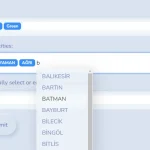 Searchable Tags Input Component For Bootstrap 5
 Add Web Audio Feedback to Bootstrap 5 Components – Bootstrap UI Sounds
 iOS-style Bottom Sheet Component for Bootstrap 5 – BootstrapSheet
 Inspect CSS Styles With Bootstrap Popover CSS Inspector
 Navbar-Synced Context Menu for Bootstrap 5 – BRC JS
 Make Bootstrap 5 Tables More Readable On Mobile Devices – AvalynxTable.js
 Shadstrap: Bootstrap 5 Theme with shadcn/ui Aesthetics
Hi, thanks so much for this simple yet awesome feature. I have one small issue when using it. I want to use it solely for entering “new” tags, so without a “lookup” functionality, within a form in html. I want to pass the data entered to python back-end. However, python only receives the very first value/tag as opposed to the whole list of tags entered. Any idea what may be causing this?
Thanks in advance!
Stefan
Hello my friend, thanks for sharing. Please note that the downloaded tags.js file (as of 21st Dec) is not the same as the one running on your demo site and it encounters an error during initialisation.
Fixed. Thanks for your feedback!