


use-bootstrap-select is a JavaScript plugin that enhances standard select elements with customizable features using the native Bootstrap 5 dropdown component.
Features:
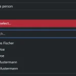
- Display selections as tag-style pills.
- Searchable, filterable, and clearable options.
- Add new options to the regular select box.
- Customize sizing and proportions.
- Validate forms and reflect states.
- Work with single or multi-selects.
How to use it:
1. Download and load the use-bootstrap-select’s files into your Bootstrap 5 project.
<!-- Bootstrap 5 -->
<link rel="stylesheet" href="/path/to/cdn/bootstrap.min.css" />
<script src="/path/to/cdn/bootstrap.min.js"></script>
<!-- use-bootstrap-select -->
<link rel="stylesheet" href="use-bootstrap-select.min.css" />
<script src="use-bootstrap-select.min.js"></script>
2. Initialize the plugin on your select element.
<select class="form-select" id="example">
  ... options here
</select>
const example = new UseBootstrapSelect(document.getElementById('example'))3. Config the plugin with the following data attributes:
- data-clearable: Display a close icon to clear selections
- data-searchable: Enable a search field to filter through options
- data-creatable: Allows users to add more options to the select
- data-max-height: Specify the max height of the dropdown
- data-search-placeholder: Placeholder for the search field
- data-no-results-text: Text to display when no results
- data-creatable-text: ‘Add <b>{value}</b>…’
- data-position: ‘up’ or ‘down’
<select
  class="form-select"
  id="example"
  data-clearable="true"
  data-searchable="true"
  data-creatable="true"
  data-max-height="15rem">
  ... options here
</select>
4. API methods.
// show the dropdown
example.show();
// hide the dropdown
example.hide();
// toggle the dropdown
example.toggle();
// set value(s)
example.setValue('chrome');
example.setValue(['chrome', 'opera']);
// remove value(s)
example.removeValue('chrome');
example.removeValue(['chrome', 'opera']);
// add vaule(s)
example.addValue('chrome');
example.addValue(['chrome', 'opera']);
// add option(s)
// addOption(value, text, selected, position)
example.addOption('safari', 'Safari', true, 'last')
// get selections
example.getValue();
// clear value(s)
example.clearValue();
// update the instance
example.update();
// select element
example.selectElement();
// clear all
example.clearAll();
Changelog:
v2.2.1 (11/20/2024)
- Fix search entry is not removed with multiple selection.
v2.2.0 (06/17/2024)
- Added a method: clearAll
v2.1.1 (05/02/2024)
- Fix show method not focusing on input.
v2.1.0 (04/30/2024)
- Added new methods: show, hide, and toggle.
v2.0.0 (04/04/2024)
- Now initialization must be done using classes instead of functions. (e.g., new UseBootstrap(target) instead of UseBootstrap(target)).
- Configuration attribute has been changed from “data-ub-select-[config]” to “data-[config]”. (e.g., data-clearable=”true” instead of data-ub-select-clear).
- The use-bootstrap-select now works without Bootstrap JavaScript.
- The dropdown menu position is now static, you can configure it to be shown on the down or up.
- Added several new methods.
v1.1.0 (03/09/2024)
- Added options: data-ub-select-search-placeholder; data-ub-select-no-results-text; data-ub-select-creatable-text
v1.0.1 (11/16/2023)
- Bugfix
v1.0.0 (08/08/2023)
- Refactor project to use function-based implementation UseBootstrapSelect() instead of class-based instantiation new UseBootstrapSelect()
- Reduced file size
See Also:
 Bootstrap 5 Select Dropdown Enhancer – AvalynxSelect
 Modern Select Box Alternative – Better-Nice-Select
 Multi-level Dropdown Component For Bootstrap 5
 Enhanced Dropdown Select Box For Bootstrap 5 – dselect
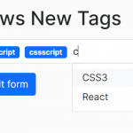 Easy Tags Input Component For Bootstrap 5/4 – Tags.js
 Add Web Audio Feedback to Bootstrap 5 Components – Bootstrap UI Sounds
 iOS-style Bottom Sheet Component for Bootstrap 5 – BootstrapSheet
 Inspect CSS Styles With Bootstrap Popover CSS Inspector