


Modbox is a vanilla JavaScript wrapper around the Bootstrap 5 modal component, which helps you create custom popup windows using Bootstrap styles.
Features:
- Info/Success/Danger/Error/Warning alerts.
- Confirmation dialogs.
- Prompt popups.
- Supports Promise API.
- Asynchronous content loading.
How to use it:
1. Install and import the Modbox into your Bootstrap 5 project.
# NPM
$ npm i bootstrap-modbox
// From CDN
<script src="https://unpkg.com/bootstrap-modbox"></script>
// From Local
<script src="./dist/bootstrap-modbox.min.js"></script>
// As a module
import modbox from './dist/bootstrap-modbox.esm.min.js';
2. Create alert dialogs.
// basic
modbox.alert('Alert Message');
// or
modbox.alert({
  body: 'Alert Message'
});
// Promise
modbox.alert({
  body: 'Alert Message'
})
.then(() => console.log('Alert resolved'));
// variants
modbox.info({
  // options
});
modbox.success({
  // options
});
modbox.danger({
  // options
});
modbox.error({
  // options
});
modbox.warning({
  // options
});
3. Create a confirmation dialog.
modbox.confirm({
  body: 'Confirm Message',
  okButton: {
    label: 'Yes',
    size: 'lg'
  },
  closeButton: {
    label: 'No',
    size: 'sm'
  }
})
.then(() => console.log('okButton clicked'))
.catch(() => console.log('okButton not clicked'));
4. Create a prompt dialog.
modbox.prompt({
  body: 'Prompt Dialog',
  input: {
    required: true,
    pattern: /\d+/, // input validation
  }
})
.then(response => console.log(response));
5. Create a custom popup box using the modbox method.
const myModal = new modbox({
  id: 'myModal',
  style: 'primary',
  title: 'My Custom Modal',
  body: 'Details about that thing you were meant to be doing all day.',
  justifyButtons: 'between',
  destroyOnClose: true,
  buttons: [
    { label: 'Button 1', style: 'primary' },
    '<button type="button" class="btn btn-dark" data-bs-dismiss="modal">Button 2</button>'
  ],
  events: {
    shown: () => console.log('modal shown')
  }
});
myModal.addButton({ label: 'Button 3', style: 'danger' }, true);
myModal.addEvent('hidden', () => console.log('modal hidden'));
myModal.show();
6. Full options.
// custom icon class
icon: null,
// color based on Bootstrap utility classes
style: 'white',
// title text color
titleStyle: null,
// dialog title
title: 'Information',
// dialog content
body: '',
// alternate to the body configuration option
message: '',
// sm, lg, ...
size: null,
// center the popup box
center: false,
// enable fade animation
fade: true,
// show the popup box on page load
show: false,
// show the close button in the header
showHeaderClose: true,
// Sets the style of the header close button ("X").
// If null, this will be automatically set to dark or white, depending on the value of the style option.
// Possible values: dark, white
headerCloseStyle:  'null',
// set the relatedTarget property on the event object passed to show and shown event callback functions.
// can be overridden by passing in an element when calling the .show() method.
relatedTarget: undefined,
// is scrollable
scrollable: true,
// destroy the popup box on close
destroyOnClose: false,
// add default buttons to the popup box
defaultButton: true,
// swap button order
swapButtonOrder: false,
// start, end, center, between, around, evenly
justifyButtons: null,
// events
events: {
  show: null,
  shown: null,
  hide: null,
  hidden: null,
  hidePrevented: null,
},
// only applies to constructor modals
buttons: [],
// only applies to class modals, and overwrites defaults set by modbox.defaultButtonOptions
okButton: {
  label: 'OK',
  style: 'primary'
},
closeButton: {
  label: 'Cancel',
  style: 'secondary'
},
// only applies to .prompt() class modal
input: {
  type: 'text',
  class: '',
  value: '',
  title: null,
  placeholder: null,
  autocomplete: 'off',
  minlength: null,
  maxlength: null,
  pattern: null,
  required: false,
  sanitizer: false, // If true, the input field value will be sanitized using the same function that is defined for the modal sanitizer option, before being passed to the Promise resolve function. Alternatively, a separate function may be supplied, which differs from the modal option.
},
7. Methods & properties.
// add a new button
// addButton(options, swapOrder)
instance.addButton({
  label: 'New Button'
});
// dispatch an event
// addEvent(event, function)
instance.addEvent('shown', () => console.log('shown'));
// show the popup box
instance.show(relatedTarget);
// hide the popup box
instance.hide();
// toggle the popup box
instance.toggle();
// dispose the popup box
instance.dispose();
// destroy the instance
instance.destroy();
// re-position the popup box
instance.handleUpdate();
// set defaults
instance.setDefaults(string modalType, object modalOptions);
Changelog:
v1.7.0 (10/24/2024)
- New headerCloseStyle modal configuration option to specify the header close button (“X”) style
- The .modal-title element has been changed from h5 to div.h5. This was to correct a very minor issue with some ADA accessibility compliancy scanners which could flag this element as being an invalid heading rank
v1.6.2 (06/15/2022)
- Calling event.preventDefault() from within the okButton callback function now prevents the Promise from resolving.
v1.6.1 (05/24/2022)
- Updated the getUID() private method again. It turns out that JavaScript dates aren’t precise enough, and it resulted in identical epoch values generated when called multiple times in quick succession. It now uses a combination of both the old and new methods.
- Fixed an event timing issue in Safari preventing the modal Promise resolve() function from firing.
v1.6.0 (05/14/2022)
- New setDefaults() method to allow independent default options for each modal type.
- The getUID() private method now uses Date.now() epoch to guarantee a unique ID. Previously, getting a duplicate value was highly improbable, but not impossible.
v1.5.0 (03/25/2022)
- New optional bootstrapModal property to manually define a reference to the Bootstrap Modal class. Modbox will automatically attempt to locate a reference in the global namespace, and this is only recommended if loading Bootstrap as a module.
- Append Bootstrap modal defaults to modbox defaultOptions in the constructor as opposed to on initialization to avoid hoisting issues when Bootstrap is loaded as an ES module.
v1.4.0 (03/05/2022)
- New showHeaderClose modal configuration option which can hide the header close button (“X”) (docs).
- Setting title to null or an empty string previously excluded the header markup from the DOM entirely. Now it is still rendered but hidden, so it is available for future use if needed. The same behavior applies to the new showHeaderClose option.
v1.3.1 (02/28/2022)
- New showHeaderClose modal configuration option which can hide the header close button (“X”) (docs).
- Setting title to null or an empty string previously excluded the header markup from the DOM entirely. Now it is still rendered but hidden, so it is available for future use if needed. The same behavior applies to the new showHeaderClose option.
v1.3.0 (02/28/2022)
- New .warning() alert modal variant.
- New sanitizer modal configuration option which can be used to sanitize the modal markup string before parsing and inserting into the DOM.
- New sanitizer input configuration option for .prompt() modals which can be used to sanitize user input before being passed to the Promise resolve function.
- Safari has now supported private class methods for a few versions, so removed the Grunt task that converted them into private field functions (the compatibility file still exists for older browser versions).
See Also:
 Create & Manage Bootstrap 5 Modals Using use-bootstrap-dialog JS Library
 Custom Dialog Boxes With Bootstrap 5 Modal Component – BS-DIALOGS
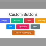 Build Interactive Customizable Popups And Alerts with AsPopup.js
 Advanced Alert Notification System For Bootstrap 5 – AvalynxAlert.js
 Simple Confirmation Dialogs on Click – Bootstrap 5 Confirm Popover
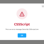 Create Custom Stylish Dialogs with SnapDialog JavaScript Library
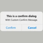 Create iOS-Style Popups & Notifications With Popup JS Library
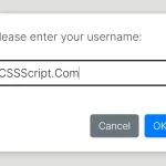 Async, Promise-based Alert/Confirm/Prompt Dialogs – Prompts.js