Responsive Hexagon Layout In Pure CSS – Hexi-Flexi Grid

Hexi-Flexi Grid is an SCSS component used to render a responsive, flexible, customizable hexagon layout using CSS grid layout.


Hexi-Flexi Grid is an SCSS component used to render a responsive, flexible, customizable hexagon layout using CSS grid layout.
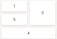
iota.css is a lightweight CSS layout library which makes it easier to generate flexible, responsive grid layout using CSS grid properties.

equaldiv is a vanilla JavaScript plugin that equalizes the height of your grid items within the same row.

A pure CSS solution for mobile-friendly bootstrap tabs component that makes all extra tabs available through dropdown “More tabs” if there is no room for them.
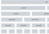
Less Grid Boilerplate is a lightweight and standalone CSS/LESS library to generate a basic, responsive, flexible grid layout for modern web design.

A JavaScript Grid plugin which helps you dynamically render a responsive, customizable, mobile-friendly, Pinterest-like grid layout.

pkmx is a tiny, flexible, dependency-free JavaScript library used for creating a compact cascading grid layout without any space between cells.

right-height is a lightweight (4kb) and standalone JavaScript library to easily equalize the heights of any group of elements.
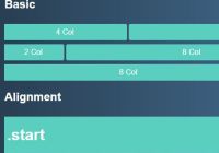
Griddd is a lightweight, responsive, CSS flexbox based grid layout that is fully customizable via SASS.
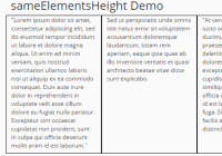
A simple, lightweight script that makes all the grid items within a grid row have the same height depending on the tallest one.