Reposition DOM Relative To Parent – contain-element

contain-element is a small JavaScript library that dynamically positions your DOM element relative to its parent container.


contain-element is a small JavaScript library that dynamically positions your DOM element relative to its parent container.
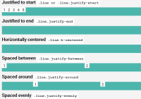
Align.css is a pure CSS library which can be used to align elements inside a container element using CSS Flexible Box Layout.
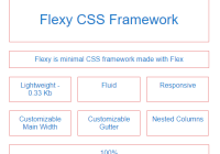
Yet another CSS framework to create a responsive, justified/fluid grid of elements using CSS flexbox. Just weights in 0.3kb (minified) and super flexible.

Just another text resize library written in pure JavaScript that dynamically scales font sizes of your text to fit the parent container.
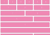
SMART CSS GRID is an ultra-light (~0.5kb minified) CSS grid framework to create responsive, flexible, fluid, 12-column grid layout for your modern web app.

Just another JavaScript plugin that makes all the columns have the same height depending on the tallest one. Works perfectly with window resize event.

metroStyles.css is a small CSS library to create a Windows 10 Metro-style tiled menu with plain HTML and CSS.

This is a fully responsive, user-friendly, navigatable gallery & layout inspired by Medium.com. Built on top of HTML, CSS/CSS3 and vanilla JavaScript.

Atomic Bulldog Grid is a CSS(SCSS) library to generate modern, responsive, flexible grid layout using the CSS Grid Layout technology.

A responsive fading image grid that uses Intersection Observer to lazy load images as they scrolled into view.