Responsive Cascading Grid Layout With Pure JavaScript – BrickCols.js
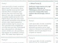
BrickCols.js is a really small JavaScript library that lets you create fully responsive cascading grid layout without any dependencies.


BrickCols.js is a really small JavaScript library that lets you create fully responsive cascading grid layout without any dependencies.

A collection of CSS libraries used to generate MS word style sheets of paper in your html document.

tiny-masonry.js is a minimalist JavaScript library that makes it easy to create Masonry-like responsive, neat, fluid grid layout for your web project.

Matchbox is a responsive equal height JavaScript library used to make a set of matched html containers have a same height.

Responsive, fullscreen, skewed panels with an expanding effect on mouse hover. Heavily based on CSS3 flexbox model.

Gridfolio is a simple and easy-to-use JavaScript library for generating a Flickr-style justified grid layout for portfolio webpages.

A vanilla JavaScript library used to make your iframe responsive by automatically adjusting the height and width depending on its inner content and the screen size.
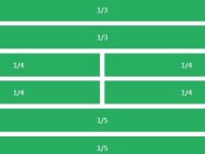
Lemonade.css is a super tiny CSS/LESS/SCSS library that helps you create a fully responsive & flexible grid layout with ease.

colm.js is a lightweight & standalone JavaScript library that dynamically arrange a collection of elements into a responsive grid layout similar to Pinterest or Masonry.

AlignJS is a pure JavaScript library for aligning the heights of a set of elements to help make a neat, clean web layout.