Dynamic Responsive Pinterest Style Columns Layout with Pure CSS

A pure CSS implementation of Pinterest style responsive grid layout that automatically adjusts the number of grid columns based on screen size.


A pure CSS implementation of Pinterest style responsive grid layout that automatically adjusts the number of grid columns based on screen size.

LeScroll.js Helps you create a responsive one page scrolling website with CSS transitions, written in vanilla JavaScript.
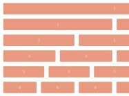
Siimple is a minimal 12 column .scss grid created with a focus on simplicity and usability.

Republic is a super tiny, cross-browser CSS framework which helps you create fully responsive 12-column based grid layout in a minute.
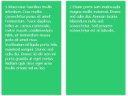
A minimalist way to create columns with equal height that works with multiple rows and responsive design. Written in vanilla JavaScript.

Fullpage.js is a lightweight JavaScript library used to create an one page navigation which allows you to navigate through the content sections with fancy CSS3 transform based animations.

ungrid.css is a super tiny CSS library that helps you create responsive, smart, fluid grid system with ease.
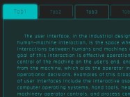
A cool Scifi-style tabs widget which allows to swap between content sections by clicking on the radio button based tabs.

A 3D hexagon(honeycomb) grid layout with cool hover effects, built on top of CSS3 transitions and transforms.
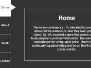
A vertical tabs UI which allows you to swap between content panels with subtle CSS3 based animations.