


colm.js is a lightweight & standalone JavaScript library that dynamically arrange a collection of elements into a responsive grid layout similar to Pinterest or Masonry.
How to use it:
Load the latest version of colm.js in your document.
<script src="build/colm.x.js"></script>
Create a column grid as follow. You can pass the options to the grid layout via HTML5 data-* attributes.
- data-colm-width=”160″: the width of the items
- data-colm-min-width=”140″: minimux width of the items
- data-colm-align-columns=”stretch”: left, right, center, justify, space or stretch
- data-colm-align-items=”stretch”: top, bottom, center, justify, space or stretch
- data-colm-place=”column”: force child items into a particular column. Use negative numbers for counting from the right.
<div
  id="colm1"
  class="colm"
  data-colm-width="160"
  data-colm-min-width="140"
  data-colm-align-columns="stretch"
  data-colm-align-items="stretch"
>
  <article>
    <section>
      <h2>1</h2>
      Content 1
    </section>
  </article>
  <article>
    <section>
      <h2>2</h2>
      Content 2
    </section>
  </article>
  <article>
    <section>
      <h2>3</h2>
      Content 3
    </section>
  </article>
  ...
</div>
</div>
Advanced usage.
// Used to programmatically trigger layouting on the page.
// This is automatically called on page load and resize.
colm()
// Add new children to a container.
// Content can be a single element, an array or node list of elements or an HTML string.
colm.appendTo(selector,content)
See Also:
 Tiny Pinterest Inspired Responsive Grid Layout In Vanilla JS – Gridify
 Super Tiny Pinterest-style Grid Library – waterfall.js
 Responsive Masonry Layouts with CSS Grid and Mason-it.js
 Responsive CSS Masonry Grid Layout – Grid Overflow
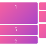 Minimal Masonry Web Layout In Pure JavaScript – MiniMasonry.js
 Easy Responsive Masonry Grid Library – Stackgrid
 Minimalist Masonry Gallery Layout With CSS Grid – mm-masonry.css
 Tiny Responsive Masonry Grid Library – stack-up.js