Horizontally & Vertically Stack Grid Items – HStack & VStack
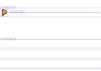
A pure CSS library that makes it easier to horizontally stack items in a line or to vertically stack items on top of each other using CSS flexbox.


A pure CSS library that makes it easier to horizontally stack items in a line or to vertically stack items on top of each other using CSS flexbox.

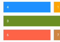
Blunt.css is a powerful CSS layout framework that makes it easier to arrange and position elements in your existing responsive web design.
dirg.css is an extremely lightweight (~1kb) CSS library which helps you quickly render a responsive grid layout using CSS Grid Layout properties.
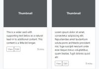
Yet another equal height plugin written in pure JavaScript that automatically equalizes the height of blocks/columns in your responsive web layout.

Gridify is a small vanilla JavaScript plugin used for generating a Pinterest-inspired responsive fluid grid layout (a.k.a Masonry Layout) from a group of items with different width & height.
json2bootgrid is a dependency-free Bootstrap plugin that dynamically generates a Bootstrap grid layout from JSON or JavaScript objects.

Favorite Grid is a tiny yet customizable, responsive, mobile-friendly grid layout system built with CSS flexbox and inspired by Bootstrap.

Just another pure JavaScript library that creates a responsive, fluid, Pinterest inspired grid to showcase your products, services, designs, etc. Also known as Masonry Layout.

Driveway.css is a pure CSS library to generate a responsive, interactive, customizable, Masonry-style layout using pure HTML/CSS.

A pure CSS solution to render a fully responsive hexagon grid layout with fancy mouse hover effects in your html page.