Tiny 12-column Grid System – waffle-grid

Just another CSS library used to create responsive, flexbox-based 12-column grid layout for modern web design. Fully customizable via SASS.


Just another CSS library used to create responsive, flexbox-based 12-column grid layout for modern web design. Fully customizable via SASS.

reframe.js is a lightweight and pure JavaScript library which makes any embedded content (e.g. iframes, videos, Youtube videos) fully responsive to fit any screen size.

Bricklayer is a JavaScript library for generating a responsive, dynamic, Masonry- and Pinterest-like cascading grid layout for your web project.

A CSS extension for Bootstrap that adds equal height borders to Bootstrap columns.

minigrid is a standalone JavaScript library used to generate a responsive, flexible, customizable grid layout for your next web design.

This is the vanilla JavaScript version of the sticky-sidebar plugin which provides the smart, high-performance sticky sidebars for your cross-browser websites.
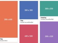
A pure JavaScript solution used to create responsive, fluid waterfall grid layout as you seen on Pinterest.com.
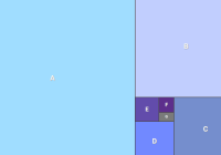
A CSS only Golden Ratio Page Layout that makes use of CSS grid layout to size a series of elements relative to their previous sibling using the golden ratio.

The 60gs.css library lets you create 60 columns grid system based on the CSS Grid Layout.

Yet another small CSS framework that helps developers and beginners to quickly create fully responsive, nested grid layouts using CSS flexbox model.