Responsive Navigation Bar With Flexbox And JavaScript – simply-nav
A simple, lightweight, sticky, fully responsive, mobile-compatible navigation system built using JavaScript and CSS flexbox.


A simple, lightweight, sticky, fully responsive, mobile-compatible navigation system built using JavaScript and CSS flexbox.

An animated dropdown mega menu that animates menu items when switching between nav links. Inspired by Stripe.com’s header navigation.

A hamburger site/app navigation that pops out a horizontal navigation bar when clicked/tapped.
A modern header navigation bar that sticks to the top of the webpage by using the CSS position: sticky property.

A tiny, dynamic, multi-level context menu library that can be attached to any DOM element via vanilla JavaScript.

A beautiful, animated, multi-level dropdown mega menu component created using nested HTML lists and pure CSS.

A CSS only radial menu/list library that pops up a list of menu items and arranges them around the trigger element just like a circle or spiral.

A set of 17+ accessible, fully responsive, and mobile-friendly header navbar templates for modern web app design.

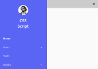
A modern, responsive, mobile-first site navigation that collapses nav items into a sidebar off-canvas menu on mobile.
A responsive navbar system that collapses items in a horizontal multi-level menu into a mobile-friendly sidebar navigation with dropdowns on the mobile.