Responsive Mega Menu In JavaScript

A modern, responsive mega menu template for online stores. Written in Pure JavaScript and CSS/CSS3.


A modern, responsive mega menu template for online stores. Written in Pure JavaScript and CSS/CSS3.

A fancy 3D perspective hamburger navigation built with CSS/CSS3 and a little bit of JavaScript.

A responsive, mobile-friendly, cross-device, multi-level hamburger navigation written in JavaScript and CSS/CSS3.
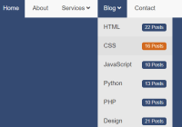
A CSS only, fully responsive dropdown navigation that reveals sub-menu items on hover (desktop) or tap (tablet & mobile).

A beautiful, responsive, collapsible sidebar menu (also called offcanvas menu) created for dashboard & admin panel projects.

A mobile-friendly navigation system that transforms the site menu into a bottom navigation bar on small screens.
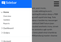
A responsive and mobile-first off-canvas sidebar navigation built using Bootstrap 5’s offcanvas component.

Implement a modern collapsible Sidebar Navigation with smooth collapse/expand transitions. Fast, responsive, and pure CSS/JS.
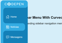
An expanding sidebar navigation menu with a curved outside effect.

A smart and user-friendly sticky navbar component that automatically shows and hides itself depending on the scroll direction.