


An expanding sidebar navigation menu with a curved outside effect.
How to use it:
1. Create a sidebar menu on the page.
<aside class="side-bar-wrap">
  <nav class="side-bar">
    <div class="logo-area">
      <img class="min" src="images/min-logo.png" alt="logo">
      <img class="max" src="images/max-logo.png" alt="logo">
    </div>
    <ul>
      <li class="active">
        <a href="#">
          <span class="title">Home</span>
        </a>
      </li>
      <li>
        <a href="#">
          <span class="title">News</span>
        </a>
      </li>
      <li>
        <a href="#">
          <span class="title">Jobs</span>
        </a>
      </li>
      <li>
        <a href="#">
          <span class="title">Contact</span>
        </a>
      </li>
      <li>
        <a href="#">
          <span class="title">About</span>
        </a>
      </li>
    </ul>
  </nav>
</aside>
2. The necessary CSS styles for the side menu & curved outside effect.
:root {
  --color-primary: #1380b8;
  --color-secondary: #33ace3;
}
aside.side-bar-wrap {
  --radius-size: 25px;
  height: 98vh;
  position: fixed;
  top: 1vh;
  left: 1vh;
  overflow-y: scroll;
  overflow-x: hidden;
  border-radius: var(--radius-size);
  padding-right: 2px;
}
aside.side-bar-wrap::-webkit-scrollbar {
  width: 10px;
}
aside.side-bar-wrap::-webkit-scrollbar-track {
  background-color: transparent;
}
aside.side-bar-wrap::-webkit-scrollbar-thumb {
  border-radius: var(--radius-size);
  background-color: var(--color-primary);
}
nav.side-bar {
  min-height: 100%;
  background-color: var(--color-primary);
  display: inline-block;
  border-left: var(--radius-size) solid var(--color-secondary);
  border-right: var(--radius-size) solid var(--color-primary);
  border-radius: var(--radius-size);
}
nav.side-bar .logo-area {
  --curve-size: calc(2 * var(--radius-size));
  position: relative;
  display: flex;
  justify-content: center;
  align-items: center;
  padding: 10px;
  min-height: var(--curve-size);
  background-color: var(--color-secondary);
  border-radius: 0 var(--radius-size) var(--radius-size) 0;
  box-shadow: var(--radius-size) 0 var(--color-secondary);
}
nav.side-bar .logo-area::after {
  content: '';
  width: var(--curve-size);
  height: var(--curve-size);
  background-color: var(--color-primary);
  border-radius: 50%;
  position: absolute;
  bottom: calc(-1 * var(--curve-size));
  left: 0;
  box-shadow:  calc(-1 * var(--curve-size) * 0.5)  calc(-1 * var(--curve-size) * 0.5) var(--color-secondary);
}
nav.side-bar .logo-area img {
  position: absolute;
  max-height: 75%;
  transition-duration: 1s;
}
aside.side-bar-wrap:hover nav.side-bar .logo-area img.min {
  max-height: 0;
  opacity: 0;
}
nav.side-bar .logo-area img.max {
  max-width: 0;
  opacity: 0;
  transition-duration: 1s;
}
aside.side-bar-wrap:hover nav.side-bar .logo-area img.max {
  max-width: 90%;
  opacity: 1;
}
nav.side-bar ul {
  padding: 0;
  margin: calc(2 * var(--radius-size)) 0;
  display: flex;
  flex-direction: column;
}
nav.side-bar ul li {
  height: 50px;
  padding: 10px var(--radius-size);
  list-style: none;
  border-radius: var(--radius-size);
  margin-bottom: var(--radius-size);
  z-index: 1;
}
nav.side-bar ul li:not(.active) {
  z-index: 2;
}
nav.side-bar ul li:not(.active):hover {
  backdrop-filter: brightness(0.85);
}
nav.side-bar ul li.active {
  position: relative;
  background-color: var(--color-secondary);
  border-radius: 0 var(--radius-size) var(--radius-size) 0;
}
nav.side-bar ul li.active::before,
nav.side-bar ul li.active::after {
  --curve-size: calc(2 * var(--radius-size));
  content: '';
  width: var(--curve-size);
  height: var(--curve-size);
  background-color: var(--color-primary);
  border-radius: 50%;
  position: absolute;
}
nav.side-bar ul li.active::before {
  top: calc(-1 * var(--curve-size));
  left: 0;
  box-shadow: calc(-1 * var(--curve-size) * 0.5) calc(var(--curve-size) * 0.5) var(--color-secondary);
}
nav.side-bar ul li.active::after {
  bottom: calc(-1 * var(--curve-size));
  left: 0;
  box-shadow: calc(-1 * var(--curve-size) * 0.5) calc(-1 * var(--curve-size) * 0.5) var(--color-secondary);
}
nav.side-bar ul li a{
  color: white;
  font-size: 16pt;
  width: 100%;
  height: 100%;
  display: flex;
  gap: 0;
  align-items: center;
  text-decoration: none;
  transition: 1s;
}
aside:hover nav.side-bar ul li a{
  gap: 10px;
}
nav.side-bar ul li a span {
  display: flex;
  transition: 0.75s cubic-bezier(0.39, 0.58, 0.57, 1);
}
nav.side-bar ul li a span.icon {
  font-size: 24pt;
}
nav.side-bar ul li a span.title {
  max-width: 0;
  opacity: 0;
}
aside:hover nav.side-bar ul li a span.title {
  width: auto;
  max-width: 10rem;
  opacity: 1;
}
3. Highlight the currently selected menu item using the following JS.
const initNavBar = () => {
  const menusEl = document.querySelectorAll('.side-bar ul li')
  menusEl.forEach(menu => menu.addEventListener('click', ()=> {
    const menuActiveEl = document.querySelector('.side-bar ul li.active')
    menuActiveEl.classList.remove('active')
    menu.classList.add('active')
  }))
}
initNavBar()
See Also:
 Vanilla JS Offcanvas Side Menu – Mobile Swipe Menu
 Create Mobile-First Side Menus with SlideReveal.js Library
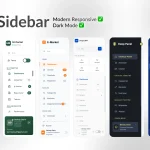 6 Modern Responsive Sidebar Navigation Components for TailwindCSS
 Simple Sidebar Hamburger Menu In CSS
 Responsive Multi-level Dropdown Menu With JavaScript And CSS – ozmenu.js
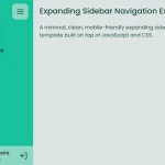 Expanding Sidebar Navigation With JavaScript And CSS
 Responsive Sidebar Navigation With Hamburger Toggle Button
 Off-canvas Accordion Menu With Bootstrap 5