


A pure Html and CSS approach to presenting percentage values in partially filled circles just like the ring chart. Powered by CSS3 transform and clip properties.
See Also:
- Best circular/Radial progress Bar JavaScript Plugins
- Best Loading Spinner/Indicator JavaScript & CSS Libraries
- Best JavaScript & CSS Progress Bar Components
How to use it:
Place the core style sheet css-circular-prog-bar.css in the header of the document and we’re ready to go.
<link href="css-circular-prog-bar.css" rel="stylesheet">
Create a circular progress bar (10%) following the markup structure like this:
<div class="progress-circle p10">
  <span>10%</span>
  <div class="left-half-clipper">
    <div class="first50-bar"></div>
    <div class="value-bar"></div>
  </div>
</div>
See Also:
 Pure CSS Progress Bar Library with Custom Themes – progress-bar.css
 Modern TypeScript Progress Bar Library – BProgress
 3D Liquid Progress Bar in Pure CSS/CSS3
 Easy Scroll Position Tracking – ScrollProgress.js
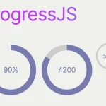 Visualize Progress Data With Animated, Circular Progress Bars – ProgressJS
 Radial Progress Indicator For Click-and-hold Actions – HoldCircleJS
 Simple Scroll Progress Indicator For Long Pages – PageBar.js
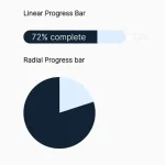 Generate Linear & Radial Progressbars Using CSS – Progress.css
How i make progressive bar with more of 50%? It’s invert the colors
you need to add ‘over50’ class when >50%..
like this:
adding ‘over50’ class will do the job
Thanks for sharing great articular, how can i reduce size of
Reduce the font-size in progress-circle.
its’s very helpful.tks
Hello, it’s very good thank you, but i have a problem i want to use it without background-color only the line that fill if is full. if i delete your background color than after 50% ist the right side filled with a color. But i only want the line.
Can u help me ?
How i used the progress bar for 30 min
Perfect!
How do you make the gauge bigger