


A JavaScript library to create a customizable, beautiful, mobile-friendly time picker component inspired by Google Material design system.
It provides a clean, modern UI for time input that works across vanilla JS and popular frameworks like React, Angular and Vue.js.
Features:
- 12 Built-in Themes: Material, Crane, Dark, Glassmorphic, Cyberpunk, AI, and additional theme variations.
- TypeScript Support: Full type definitions with IntelliSense integration for improved development experience.
- Inline Mode Functionality: Always-visible timepicker without modal overlay for embedded use cases.
- API Methods: Rich method library and event system for programmatic control.
- Accessibility Compliance: ARIA-compliant implementation with keyboard navigation support.
- Server-Side Rendering Compatible: Works with Next.js, Nuxt, and other SSR frameworks without hydration issues.
- Lightweight Bundle: Minimal footprint with tree-shaking support for optimized production builds.
How to use it:
1. Install the timepicker-ui package with NPM.
# Yarn
$ yarn add timepicker-ui
# NPM
$ npm i timepicker-ui --save
2. Import it into your project.
import { TimepickerUI } from "timepicker-ui";
import "timepicker-ui/main.css"; // Don't forget the main CSS
// Browser & CDN <link href="https://cdn.jsdelivr.net/npm/[email protected]/dist/css/index.min.css" rel="stylesheet"> <script type="module"> import { TimepickerUI } from "https://cdn.jsdelivr.net/npm/[email protected]/+esm"; </script>
3. The library requires box-sizing: border-box; to be set globally. Most CSS resets or frameworks already do this, but if you’re not using one, add this to your main stylesheet to prevent layout issues.
*,
*::before,
*::after {
  box-sizing: border-box;
}
4. Insert a time input into the document.
<div class="example">
  <input class="timepicker-ui-input" value="12:00 AM" />
</div>
5. Initialize the time picker.
const element = document.querySelector('.timepicker-ui-input');
const myTimePicker = new TimepickerUI(element);
6. Activate the time picker on the time input. That’s it.
myTimePicker.create();
7. Enable the Mobile layout.
const myTimePicker = new TimepickerUI(element,{
  ui: {
    mobile: true
  }
});
8. Display a switch button inside the time picker that allows the user to switch between Desktop and Mobile layouts.
const myTimePicker = new TimepickerUI(element,{
  ui: {
    enableSwitchIcon: true
  }
});
9. Set the theme you prefer.
- basic: The default theme, based on Google’s standard Material Design.
- crane-straight: A theme inspired by Google’s Crane design system, featuring straight edges.
- crane Also based on the Crane design system, but with rounded corners for a softer look.
- m3: A theme that implements the newer Material Design 3 (also known as Material You) style.
- m2: Classic Material Design theme.
- dark: A classic dark mode theme, ideal for low-light interfaces or matching dark application shells.
- glassmorphic: A modern theme that applies a frosted-glass effect to the timepicker background.
- pastel: A theme with soft, muted pastel colors for a lighter, more subtle UI.
- ai: A futuristic theme with a design inspired by artificial intelligence aesthetics.
- cyberpunk: A high-contrast, neon-style theme reminiscent of the cyberpunk genre.
- blueprint: Light precision-instrument look.
- blueprint-dark: Dark sibling of Blueprint.
const myTimePicker = new TimepickerUI(input, {
  ui: {
    theme: 'crane-radius'
  }
});
10. All available configuration options.
const myTimePicker = new TimepickerUI(input, {

  ui: {
    /**
     * @description Theme for the timepicker
     * @default "basic"
     */
    theme?:
      | 'basic'
      | 'crane'
      | 'crane-straight'
      | 'm2'
      | 'm3-green'
      | 'dark'
      | 'glassmorphic'
      | 'pastel'
      | 'ai'
      | 'cyberpunk';
    /**
     * @description Enable/disable animations
     * @default true
     */
    animation?: boolean;
    /**
     * @description Show backdrop when timepicker is open
     * @default true
     */
    backdrop?: boolean;
    /**
     * @description Force mobile mode
     * @default false
     */
    mobile?: boolean;
    /**
     * @description Enable switch icon (mobile ↔ desktop)
     * @default false
     */
    enableSwitchIcon?: boolean;
    /**
     * @description Allow editing hour/minutes directly
     * @default false
     */
    editable?: boolean;
    /**
     * @description Enable scrollbar when timepicker is open
     * @default false
     */
    enableScrollbar?: boolean;
    /**
     * @description Additional CSS class for the wrapper
     * @example cssClass: "my-custom-timepicker"
     */
    cssClass?: string;
    /**
     * @description Selector where to append modal (default: body)
     * @default ""
     */
    appendModalSelector?: string;
    /**
     * @description Custom keyboard icon template (desktop → mobile)
     * @default Material Icons template
     */
    iconTemplate?: string;
    /**
     * @description Custom schedule icon template (mobile → desktop)
     * @default Material Icons template
     */
    iconTemplateMobile?: string;
    /**
     * @description Inline mode configuration
     * @example
     * inline: {
     *   enabled: true,
     *   containerId: "timepicker-container",
     *   showButtons: false,
     *   autoUpdate: true
     * }
     */
    inline?: {
      enabled: boolean;
      containerId: string;
      showButtons?: boolean;
      autoUpdate?: boolean;
    };
  },
  clock: {
    /**
     * @description Set type of clock: `12h` or `24h`
     * @default "12h"
     */
    type?: '12h' | '24h';
    /**
     * @description Set increment for hours (1, 2, 3, etc.)
     * @default 1
     */
    incrementHours?: number;
    /**
     * @description Set increment for minutes (1, 5, 10, 15, etc.)
     * @default 1
     */
    incrementMinutes?: number;
    /**
     * @description Automatically switch to minutes after selecting hour
     * @default false
     */
    autoSwitchToMinutes?: boolean;
    /**
     * @description Disable specific hours/minutes or time intervals
     * @example
     * disabledTime: {
     *   minutes: [1, 2, 4, 5, 55, 23, "22", "38"],
     *   hours: [1, "3", "5", 8],
     *   interval: "10:00 AM - 12:00 PM" | ["10:00 AM - 12:00 PM", "5:00 PM - 8:00 PM"]
     * }
     */
    disabledTime?: {
      minutes?: Array;
      hours?: Array;
      interval?: string | string[];
    };
    /**
     * @description Set current time to the input and timepicker
     * @example
     * currentTime: {
     *   time: new Date(),
     *   updateInput: true,
     *   locales: "en-US",
     *   preventClockType: false
     * }
     * @example currentTime: true
     */
    currentTime?:
      | {
          time?: Date;
          updateInput?: boolean;
          locales?: string | string[];
          preventClockType?: boolean;
        }
      | boolean;
  },
  labels: {
      /**
     * @description "AM" label text
     * @default "AM"
     */
    am?: string;
    /**
     * @description "PM" label text
     * @default "PM"
     */
    pm?: string;
    /**
     * @description "OK" button text
     * @default "OK"
     */
    ok?: string;
    /**
     * @description "Cancel" button text
     * @default "Cancel"
     */
    cancel?: string;
    /**
     * @description Time label on desktop
     * @default "Select time"
     */
    time?: string;
    /**
     * @description Time label on mobile
     * @default "Enter Time"
     */
    mobileTime?: string;
    /**
     * @description Hour label on mobile
     * @default "Hour"
     */
    mobileHour?: string;
    /**
     * @description Minute label on mobile
     * @default "Minute"
     */
    mobileMinute?: string;
  },
  behavior: {
    /**
     * @description Focus input after closing modal
     * @default false
     */
    focusInputAfterClose?: boolean;
    /**
     * @description Enable focus trap in modal
     * @default true
     */
    focusTrap?: boolean;
    /**
     * @description Delay for clickable elements (ms)
     * @default 300
     */
    delayHandler?: number;
    /**
     * @description Custom ID for the timepicker instance
     * @example id: "my-timepicker-1"
     */
    id?: string;
  }
});
12 Callback functions:
const myTimePicker = new TimepickerUI(input, {
  callbacks: {
    /**
     * @description Triggered when timepicker opens
     */
    onOpen?: TimepickerEventCallback<OpenEventData>;
    /**
     * @description Triggered when user cancels
     */
    onCancel?: TimepickerEventCallback<CancelEventData>;
    /**
     * @description Triggered when user confirms time
     */
    onConfirm?: TimepickerEventCallback<ConfirmEventData>;
    /**
     * @description Triggered during interaction (real-time)
     */
    onUpdate?: TimepickerEventCallback<UpdateEventData>;
    /**
     * @description Triggered when hour mode is selected
     */
    onSelectHour?: TimepickerEventCallback<SelectHourEventData>;
    /**
     * @description Triggered when minute mode is selected
     */
    onSelectMinute?: TimepickerEventCallback<SelectMinuteEventData>;
    /**
     * @description Triggered when AM is selected
     */
    onSelectAM?: TimepickerEventCallback<SelectAMEventData>;
    /**
     * @description Triggered when PM is selected
     */
    onSelectPM?: TimepickerEventCallback<SelectPMEventData>;
    /**
     * @description Triggered on invalid time format
     */
    onError?: TimepickerEventCallback<ErrorEventData>;
  }
});
13. More API methods
// create the timepicker
myTimePicker.create();
// open the timepicker
myTimePicker.open();
// close the timepicker
myTimePicker.close();
// destroy
myTimePicker.destroy();
// get the current value
myTimePicker.getValue();
// set time
myTimePicker.setValue("18:30");
// Get the DOM element
myTimePicker.getElement();
// update options
myTimePicker.update({ options: newOptions });
// Get instance by ID
TimepickerUI.getById("my-id");
// Get all instances
TimepickerUI.getAllInstances();
// Destroy all instances
TimepickerUI.destroyAll();
13. Event handlers.
const picker = new TimepickerUI(input);
picker.create();
picker.on("confirm", (data) => {
  console.log("Time confirmed:", data);
});
picker.on("cancel", (data) => {
  console.log("Cancelled:", data);
});
picker.on("open", () => {
  console.log("Picker opened");
});
picker.on("update", (data) => {
  console.log("Time updated:", data);
});
picker.on("select:hour", (data) => {
  console.log("Hour selected:", data.hour);
});
picker.on("select:minute", (data) => {
  console.log("Minute selected:", data.minutes);
});
picker.on("select:am", (data) => {
  console.log("AM selected");
});
picker.on("select:pm", (data) => {
  console.log("PM selected");
});
picker.on("error", (data) => {
  console.log("Error:", data.error);
});
picker.once("confirm", (data) => {
  console.log("This runs only once");
});
picker.off("confirm", handler);
Changelog:
v4.4.0 (06/11/2026)
- Two new built-in themes
- 16 new accessibility labels.* options
- Home / End / PageUp / PageDown key support
- Bugfixes
v4.3.0 (03/29/2026)
- Added: Plugin templateProvider hook allowing plugins to register their own modal templates without core static imports
v4.3.0 (03/29/2026)
- Added: Plugin templateProvider hook allowing plugins to register their own modal templates without core static imports
- Added: Plugin clearHandler hook allowing plugins to register custom clear logic executed when the clear button is pressed
- Added: Exported TemplateProvider and ClearHandler types from the public API
- Added: getTemplateProvider() and getClearHandler() methods on PluginRegistry
- Plugin system refactored for true tree-shaking: unused plugins (wheel, range, timezone) are completely excluded from the final bundle when not imported
- Wheel template is no longer statically bundled with core – it is registered by the WheelPlugin at import time
- Range and timezone clear logic moved from core ClearButtonManager to plugin-provided clear handlers
- Core no longer statically imports any plugin implementation modules
- sideEffects field corrected to exclude plugin files, enabling bundlers to eliminate unused plugin code
v4.2.2 (03/24/2026)
- fix WheelOptions
v4.2.0 (03/18/2026)
- fix types
v4.1.7 (03/08/2026)
- fix range plugin
v4.1.6 (02/15/2026)
- Range plugin: minutes were incorrectly disabled for all hours in TO picker instead of only for the FROM hour. Now minutes are blocked only when TO hour equals FROM hour (both 12h and 24h modes)
- setValue() method not working correctly when called programmatically after initialization
v4.1.5 (02/11/2026)
- Bugfixes
v4.1.4 (02/10/2026)
- Bugfixes
v4.1.2 (02/08/2026)
- Update
v4.1.1 (02/01/2026)
- Update types
v4.1.0 (02/01/2026)
- Upgrade/new options
- fix clock hand lags
v4.0.3 (01/23/2026)
- fix enableSwitchIcon
v4.0.0/1 (11/22/2025)
- All CSS classes have been renamed from timepicker-ui-* to tp-ui-* for shorter, cleaner class names.
- All options are now organized into logical groups (clock, ui, labels, behavior, callbacks) for better maintainability and clarity.
- Custom DOM events (timepicker:confirm, timepicker:open, etc.) have been completely removed. Use EventEmitter API or callback options instead.
- Programmatic theme customization via setTheme() has been removed. Use CSS classes with CSS variable overrides instead.
- Added EventEmitter API with Callback Bridge
- SSR-Safe/Composition-Based Architecture
- Auto-Focus Improvements
- TypeScript Enhancements
v3.2.0/1 (11/15/2025)
- Refactor/fix memory leaks and validation
v3.1.2/1 (11/07/2025)
- Added: Virtual DOM caching for clock face tips – Reuses DOM elements instead of recreating them on each render for 25% performance improvement
- Added: RequestAnimationFrame batching for DOM updates – Smoother animations and reduced layout thrashing
- Input sanitization – Security enhancement to prevent XSS attacks in time input fields
- Added: EventEmitter API – Modern event handling system with on(), once(), and off() methods
- Added: New event names for EventEmitter: confirm, cancel, open, update, select:hour, select:minute, select:am, select:pm, error
- Added: Exported EventEmitter class – Available for advanced users who want to use it separately
- Added: Dual event system – Both EventEmitter and DOM events fire simultaneously for backward compatibility
- Changed: Event system refactored to use internal EventEmitter for better memory management
- Changed: DOM events (timepicker:*) are now considered legacy and will be removed in v4.0.0
- Changed: Clock face rendering now uses element pooling with Map-based cache
- Changed: DOM updates are batched using RAF for better performance during clock hand animations
- Changed: User input is sanitized before processing in setValue and event handlers
- Reduced DOM operations by caching clock tip elements
- Eliminated unnecessary innerHTML clearing on every render
- Improved animation smoothness with RAF-based update scheduling
- Fixed lots of bugs
v3.0.0/1 (07/25/2025)
- Inline Mode: Always-visible timepicker without modal overlay
- Instance Management: getById(), destroyAll(), and custom instance IDs
- Callback System: Direct callback functions instead of manual event listeners
- New Themes: Added dark, glassmorphic, pastel, ai, cyberpunk
- Enhanced API: getValue(), setValue(), improved destroy()
- SSR Compatibility: Better support for server-side rendering
- TypeScript Improvements: Complete type definitions and better IntelliSense
- Event Names: All events now use timepicker: prefix
- Destroy Behavior: .destroy() no longer removes input from DOM
- Theme Options: Some theme names have changed
- API Changes: Some method signatures have been updated
- Styles are no longer auto-loaded You must now explicitly import CSS files.
v2.6.1 (11/18/2021)
- Added new value to the property theme called m3. Theme m3 based on the new Material Design v3.
v2.6.0 (11/17/2021)
- changed invoke of close() method. These method has to invoke with double parentheses close()(). The first parentheses doesn’t have any parameters, the second has the same what had in the previous method.
- added delayHandler prop to avoid delay on buttons
- fixed problem with 0NaN error when using touch input.
v2.5.0 (05/07/2021)
- fixed problem with focusTrap with React about eval error
v2.4.4 (04/02/2021)
- fixed problem with focusTrap with React about eval error
v2.4.3 (04/02/2021)
- fixed problem with minutes option in currentTime
- added focusTrap to turn off/on focus traping on picker. The default value is set to true
- added possibility to open picker by click enter if input is focused
v2.4.2 (03/30/2021)
- fixed problem with currentTime about displaying the wrong hour in the picker
- fixed problem with editable option when switch during desktop/mobile options
- added OptionTypes to allows to import types from package
v2.4.1 (03/26/2021)
- added new currentTime option
- fixed landscape on the mobile view
v2.4.0 (03/23/2021)
- added new update method
- added new destroy method
- added new option disabledTime that allows to set to timepicker disabled time
- updated a methods open, close with new parameters and callbacks
v2.3.0 (03/06/2021)
- bugfixes
- changed option name from
selectLabelTimetolabelTime - added UMD version
- added new options
mobileTimeLabelto change time label on mobile version
v2.1.1 (01/24/2021)
- fix problem with transition and add new version 2.1.1
v2.0.2 (01/21/2021)
- fix problem with close event
v2.0.1 (01/18/2021)
- Everything was rewritten to TypeScript.
- Fixed problems with move events on mobile.
- Fixed problem with keyboard icon click on mobile.
11/05/2020
- v1.2.0
See Also:
 Material Design-style Time Picker Web Component – clock-timepicker
 Material Inspired Date & Time Picker – simplePicker
 Material Design Date Time Picker In Vanilla JavaScript
 Persian Jalali & Gregorian Date Picker in Vanilla JS – Azar Datepicker
 Material Design 3 Expressive Loading Indicator to React/Vue/Svelte/Vanilla JS
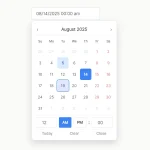 Accessible Customizable Date/Time/Date Picker for Modern Web App – FDatepicker
 Vanilla DateTime Picker: Zero-Dependency JS Date-Time Input
 Material Design Icon Picker in Vanilla JavaScript
it doesn’t work in a simple vanilla website, i tried to use timepicker-ui.js without success. It seems that the plugin is not really vanilla javascript because it can only work with obese framework like nodes etc.
Not vanilla JS. Requires node to implement.
I added the UMD version since 2.3.0 version and this package also is available in the cdnjs https://cdnjs.com/libraries/timepicker-ui which you can use this library without installation.