


A pure CSS, mobile-friendly off-canvas navigation system built using plain HTML/CSS/CSS3 and :focus-within CSS pseudo-class.
How to use it:
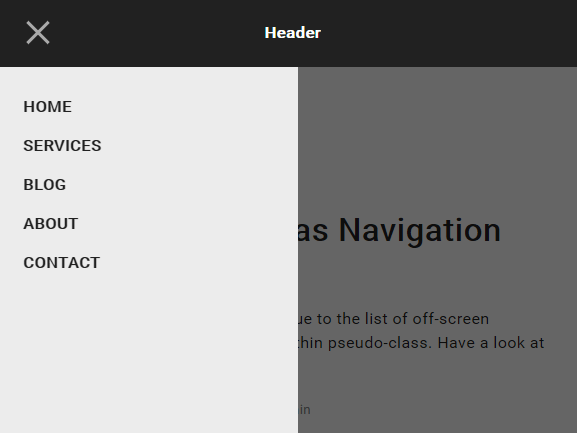
Create the html for the off-canvas navigation.
<div id="nav-container">
  <div class="bg"></div>
  <div class="button" tabindex="0">
    <span class="icon-bar"></span>
    <span class="icon-bar"></span>
    <span class="icon-bar"></span>
  </div>
  <div id="nav-content" tabindex="0">
    <ul>
      <li><a href="#0">Home</a></li>
      <li><a href="#0">Services</a></li>
      <li><a href="#0">Blog</a></li>
      <li><a href="#0">About</a></li>
      <li><a href="#0">Contact</a></li>
    </ul>
  </div>
</div>
The CSS for the hamburger toggle button.
.button {
  position: relative;
  display: flex;
  flex-direction: column;
  justify-content: center;
  z-index: 1;
  -webkit-appearance: none;
  border: 0;
  background: transparent;
  border-radius: 0;
  height: 70px;
  width: 30px;
  cursor: pointer;
  pointer-events: auto;
  margin-left: 25px;
  touch-action: manipulation;
  -webkit-tap-highlight-color: rgba(0,0,0,0);
}
.icon-bar {
  display: block;
  width: 100%;
  height: 3px;
  background: #aaa;
  transition: .3s;
}
.icon-bar + .icon-bar { margin-top: 5px; }
#nav-container:focus-within .button {
  pointer-events: none;
}
#nav-container:focus-within .icon-bar:nth-of-type(1) {
  transform: translate3d(0, 8px, 0) rotate(45deg);
}
#nav-container:focus-within .icon-bar:nth-of-type(2) {
  opacity: 0;
}
#nav-container:focus-within .icon-bar:nth-of-type(3) {
  transform: translate3d(0, -8px, 0) rotate(-45deg);
}
The main CSS/CSS3 for the off-canvas navigation.
#nav-container {
  position: fixed;
  height: 100vh;
  width: 100%;
  pointer-events: none;
}
#nav-container .bg {
  position: absolute;
  top: 70px;
  left: 0;
  width: 100%;
  height: calc(100% - 70px);
  visibility: hidden;
  opacity: 0;
  transition: opacity .3s, visibility 0s;
  background: #000;
}
#nav-container:focus-within .bg {
 visibility: visible;
 opacity: .6;
}
#nav-container * { visibility: visible; }
#nav-content {
  margin-top: 70px;
  padding: 20px;
  width: 90%;
  max-width: 300px;
  position: absolute;
  top: 0;
  left: 0;
  height: calc(100% - 70px);
  background: #ececec;
  pointer-events: auto;
  -webkit-tap-highlight-color: rgba(0,0,0,0);
  transform: translateX(-100%);
  transition: transform .3s;
  will-change: transform;
  contain: paint;
}
#nav-content ul {
  height: 100%;
  display: flex;
  flex-direction: column;
}
#nav-content li a {
  padding: 10px 5px;
  display: block;
  text-transform: uppercase;
  transition: color .1s;
}
#nav-content li a:hover { color: #BF7497; }
See Also:
 Vanilla JS Offcanvas Side Menu – Mobile Swipe Menu
 Multi-Direction Offcanvas Drawers with Smooth Sliding Animations
 Create Mobile-First Side Menus with SlideReveal.js Library
 Hover-triggered Off-Canvas Side Menu – Less Annoying Hotzone
 Responsive Dropdown/Off-canvas Navigation In Vanilla JavaScript – Menue
 Swipeable Off-canvas Navigation For Mobile – Mobile Swipe Menu
 Lightweight Off-canvas (Push) Menu JavaScript Library – offcanvas.js
 Multifunctional Sliding Drawer Plugin In JavaScript – toolslide.js