


This is a pure CSS implementation of the hover effects that slide in/out depending on the direction your mouse enters in/out. Heavily based on CSS3 will-change, transform and transition properties.
How to use it:
Add custom overlay content to the elements as follow:
<div class="row">
  <div class="col">
    <div class="photo-container" style="background-image:url(1.jpg)"></div>
    <h2>Image 1</h2>
    <div class="slide">
      <p>Hover Effect 1</p>
    </div>
  </div>
  <div class="col">
    <div class="photo-container" style="background-image:url(1.jpg)"></div>
    <h2>Image 2</h2>
    <div class="slide">
      <p>Hover Effect 2</p>
    </div>
  </div>
  <div class="col">
    <div class="photo-container" style="background-image:url(1.jpg)"></div>
    <h2>Image 3</h2>
    <div class="slide">
      <p>Hover Effect 3</p>
    </div>
  </div>
</div>
The basic styles for the overlay when hovering over.
.slide {
  background: rgba(#190115, 0.8);
  padding: 0 1.5rem;
}
The core CSS styles for the direction-aware hover effect.
.slide {
  position: absolute;
  top: 0;
  right: 0;
  bottom: 0;
  left: 0;
  /*
    Visibility delay gives the previously hovered element time to slide out before disappearing.
    Remove the `visibility` transition to slide in current element without sliding out previous element
  */
  -webkit-transition: all 0.275s ease-in-out, visibility 0s 0.275s;
  transition: all 0.275s ease-in-out, visibility 0s 0.275s;
  visibility: hidden;
  will-change: transform;
  -webkit-transform: translateY(100%);
          transform: translateY(100%);
}
.row:hover ~ .row .slide {
  -webkit-transform: translateY(-100%);
          transform: translateY(-100%);
}
.row:hover .slide {
  -webkit-transform: translateX(100%);
          transform: translateX(100%);
}
.row:hover .col:hover ~ .col .slide {
  -webkit-transform: translateX(-100%);
          transform: translateX(-100%);
}
.row:hover .col:hover .slide {
  -webkit-transform: none;
          transform: none;
  visibility: visible;
  -webkit-transition-delay: 0s;
          transition-delay: 0s;
}
See Also:
 7 Creative Hover Effects Using CSS Box-Shadow
 150+ CSS Hover Effects for Modern Web Apps – ChangeHover.css
 Create Interactive Pixelated Image Transitions with JavaScript
 Interactive 3D Parallax Effect on Hover with Pure CSS/CSS3
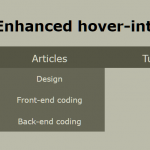 Determine User Intent Using Vanilla JavaScript – sv-hover-intent
 Minimal Ripple Click & Hover Effect – ripple.js
 3D Hover-triggered Wave Effect With Pure CSS/CSS3
 Custom Cursor That Interacts With Buttons – Wobbly Buttons