


A sleek and functional range slider control built with HTML, CSS, JavaScript, and native range inputs.
This range slider control allows users to select a range of values indicated by two sliders, commonly referred to as “thumbs.” When you move the thumbs, the corresponding tooltips update to show the selected minimum and maximum values. This provides immediate visual feedback and makes it easier for users to understand their selections.
How to use it:
1. Place two regular range inputs together with tooltips and a range scale on the page.
<div class="range_container">
  <div class="sliders_control">
    <div id="fromSliderTooltip" class="slider-tooltip">0</div>
    <input id="fromSlider" type="range" value="120" min="50" max="350" steps="10" />
    <div id="toSliderTooltip" class="slider-tooltip">0</div>
    <input id="toSlider" type="range" value="260" min="50" max="350" steps="10" />
  </div>
  <div id="scale" class="scale"></div>
</div>
2. Apply the necessary styles to the range slider control.
- Slider container and track dimensions
- Tooltip position, color, and styling
- Range input thumb design and hover effects
- Scale marker positioning and text formatting
.range_container {
  --_marker-border-clr: #0EA5E9;
  --_marker-size: 15px;
  --_track-heigt: 3px;
  --_tooltip-bg-clr: rgba(0, 0, 0, 0.4);
  --_tooltip-txt-clr: var(--_marker-border-clr);
  width: 100%;
  max-width: 600px;
  display: flex;
  flex-direction: column;
}
.sliders_control {
  position: relative;
}
.slider-tooltip {
  position: absolute;
  top: -3.5rem;
  left: 0;
  width: fit-content;
  background-color: var(--_tooltip-bg-clr);
  color: var(--_tooltip-txt-clr);
  font-size: 0.8rem;
  border-radius: 4px;
  padding: 0.5rem 1rem;
  text-align: center;
  translate: -50% 0;
}
.slider-tooltip::before {
  content: "";
  position: absolute;
  bottom: -0.25rem;
  left: 50%;
  translate: -50% 0;
  width: .5rem;
  height: .5rem;
  rotate: 45deg;
  z-index: -1;
  background-color: inherit;
}
input[type=range]::-webkit-slider-thumb {
  -webkit-appearance: none;
  pointer-events: all;
  width: var(--_marker-size);
  height: var(--_marker-size);
  background-color: var(--_marker-border-clr);
  border-radius: 50%;
  box-shadow: 0 0 0 1px var(--_marker-border-clr);
  cursor: pointer;
}
input[type=range]::-moz-range-thumb {
  -webkit-appearance: none;
  pointer-events: all;
  width: var(--_marker-size);
  height: var(--_marker-size);
  background-color: var(--_marker-border-clr);
  border-radius: 50%;
  box-shadow: 0 0 0 1px var(--_marker-border-clr);
  cursor: pointer;
}
input[type=range]::-webkit-slider-thumb:hover {
  background: #f7f7f7;
}
input[type=range]::-webkit-slider-thumb:active {
  box-shadow: inset 0 0 3px #387bbe, 0 0 9px #387bbe;
  -webkit-box-shadow: inset 0 0 3px #387bbe, 0 0 9px #387bbe;
}
input[type="range"] {
  -webkit-appearance: none;
  appearance: none;
  height: var(--_track-heigt);
  width: 100%;
  position: absolute;
  background-color: var(--_marker-border-clr);
  pointer-events: none;
}
#fromSlider {
  height: 0;
  z-index: 1;
}
.scale {
  display: flex;
  justify-content: space-between;
  margin-top: 2rem;
  position: relative;
  width: calc(100% - var(--_marker-size));
  margin-inline: auto;
  font-size: 0.8rem;
}
.scale div {
  position: absolute;
  translate: -50% 0;
}
.scale div::before {
  content: '';
  position: absolute;
  top: 0;
  left: 50%;
  translate: -50% -125%;
  width: 1px;
  height: 10px;
  background-color:#666;
}
3. The JavaScript code initializes the range slider by setting up event listeners for the range inputs.
- As the user interacts with the slider thumbs, the event handlers perform calculations to update the tooltips’ positions and values accordingly.
- The range track’s appearance is dynamically adjusted using CSS linear gradients.
- The createScale function generates the range scale by iterating over the specified range and creating marker elements with corresponding values.
document.addEventListener('DOMContentLoaded', () => {
  const COLOR_TRACK = "#666";
  const COLOR_RANGE = "#0EA5E9"; /* this can be the same or different to the markers */
  const MIN = 50;
  const MAX = 350;
  const STEPS = 50;
  function controlFromSlider(fromSlider, toSlider, fromTooltip, toTooltip) {
      const [from, to] = getParsed(fromSlider, toSlider);
      fillSlider(fromSlider, toSlider, COLOR_TRACK, COLOR_RANGE, toSlider);
      if (from > to) {
          fromSlider.value = to;
      }
      setTooltip(fromSlider, fromTooltip);
  }
  function controlToSlider(fromSlider, toSlider, fromTooltip, toTooltip) {
      const [from, to] = getParsed(fromSlider, toSlider);
      fillSlider(fromSlider, toSlider, COLOR_TRACK, COLOR_RANGE, toSlider);
      setToggleAccessible(toSlider);
      if (from <= to) {
          toSlider.value = to;
      } else {
          toSlider.value = from;
      }
      setTooltip(toSlider, toTooltip);
  }
  function getParsed(currentFrom, currentTo) {
      const from = parseInt(currentFrom.value, 10);
      const to = parseInt(currentTo.value, 10);
      return [from, to];
  }
  function fillSlider(from, to, sliderColor, rangeColor, controlSlider) {
      const rangeDistance = to.max - to.min;
      const fromPosition = from.value - to.min;
      const toPosition = to.value - to.min;
      controlSlider.style.background = `linear-gradient(
        to right,
        ${sliderColor} 0%,
        ${sliderColor} ${(fromPosition) / (rangeDistance) * 100}%,
        ${rangeColor} ${((fromPosition) / (rangeDistance)) * 100}%,
        ${rangeColor} ${(toPosition) / (rangeDistance) * 100}%,
        ${sliderColor} ${(toPosition) / (rangeDistance) * 100}%,
        ${sliderColor} 100%)`;
  }
  function setToggleAccessible(currentTarget) {
      const toSlider = document.querySelector('#toSlider');
      if (Number(currentTarget.value) <= 0) {
          toSlider.style.zIndex = 2;
      } else {
          toSlider.style.zIndex = 0;
      }
  }
  function setTooltip(slider, tooltip) {
      const value = slider.value;
      tooltip.textContent = `$${value}`;;
      const thumbPosition = (value - slider.min) / (slider.max - slider.min);
      const percent = thumbPosition * 100;
      const markerWidth = 20; // Width of the marker in pixels
      const offset = (((percent - 50) / 50) * markerWidth) / 2;
      tooltip.style.left = `calc(${percent}% - ${offset}px)`;
  }
  function createScale(min, max, step) {
      const scale = document.getElementById('scale');
      const range = max - min;
      const steps = range / step;
      for (let i = 0; i <= steps; i++) {
          const value = min + (i * step);
          const percent = (value - min) / range * 100;
          const marker = document.createElement('div');
          marker.style.left = `${percent}%`;
          marker.textContent = `$${value}`;
          scale.appendChild(marker);
      }
  }
  const fromSlider = document.querySelector('#fromSlider');
  const toSlider = document.querySelector('#toSlider');
  const fromTooltip = document.querySelector('#fromSliderTooltip');
  const toTooltip = document.querySelector('#toSliderTooltip');
  // events
  fromSlider.oninput = () => controlFromSlider(fromSlider, toSlider, fromTooltip, toTooltip);
  toSlider.oninput = () => controlToSlider(fromSlider, toSlider, fromTooltip, toTooltip);
  // Initial load
  fillSlider(fromSlider, toSlider, COLOR_TRACK, COLOR_RANGE, toSlider);
  setToggleAccessible(toSlider);
  setTooltip(fromSlider, fromTooltip);
  setTooltip(toSlider, toTooltip);
  createScale(MIN, MAX, STEPS);
});
See Also:
 Responsive & Touch-enabled Range Slider In Vanilla JavaScript – rangeSlider
 Accesible Range Slider Custom Element
 Build Custom Circular Range Sliders with CircularRange Web Component
 Accessible Dual-Handle Range Slider Library – range-slider.js
 Accessible Dual-Thumb Range Slider for Web & Mobile – DoubleRange
 Modern Range Sliders Based On Native Range Inputs – dual-range-input
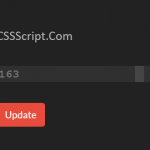 Highly Customizable Range Slider In JavaScript – Slider89.js
 Interactive Range Slider with Tooltip Using Pure CSS