


This is a stylish custom range slider UI built using regular HTML range input, CSS/CSS3, and a bit of JavaScript.
This range slider allows users to select a minimum and maximum value range from a predefined scale using two sliders with tooltips displaying the selected values. Accompanying bars visualize the selected range on the scale.
It is useful in filtering data based on specific criteria, setting price ranges for products or services, adjusting settings or parameters within defined limits, and more.
How to use it:
1. Defines the basic structure of the slider component. It includes two range inputs for the minimum and maximum values, along with divs to contain the tooltips and scale.
<div class="range_container">
  <div class="sliders_control">
    <div id="fromSliderTooltip" class="slider-tooltip">115</div>
    <input id="fromSlider" type="range" value="120" min="0" max="500" steps="10" />
    <div id="toSliderTooltip" class="slider-tooltip">260</div>
    <input id="toSlider" type="range" value="360" min="0" max="500" steps="10" />
  </div>
  <div id="scale" class="scale" data-steps="10"></div>
</div>
2. Copy and paste the CSS rules into your document. The following CSS defines the appearance and layout of the range slider components, including the tooltips, thumb styles, scale markers, and range track colors.
.range_container {
  --_marker-border-clr: #ca8a04;
  --_marker-size: 15px;
  --_track-heigt: 3px;
  width: 100%;
  max-width: 600px;
  display: flex;
  flex-direction: column;
}
.sliders_control {
  position: relative;
}
.slider-tooltip {
  position: absolute;
  bottom: -3.5rem;
  left: 0;
  width: fit-content;
  background-color: rgba(0, 0, 0, 0.8);
  color: var(--_marker-border-clr);
  font-size: 0.8rem;
  border-radius: 4px;
  padding: 0.5rem 0.75rem;
  text-align: center;
  translate: -50% 0;
}
.slider-tooltip::before {
  content: "";
  position: absolute;
  top: -0.25rem;
  left: 50%;
  translate: -50% 0;
  width: 0.5rem;
  height: 0.5rem;
  rotate: 45deg;
  z-index: -1;
  background-color: inherit;
}
input[type="range"]::-webkit-slider-thumb {
  -webkit-appearance: none;
  pointer-events: all;
  width: var(--_marker-size);
  height: var(--_marker-size);
  background-color: var(--_marker-border-clr);
  border-radius: 50%;
  box-shadow: 0 0 0 1px var(--_marker-border-clr);
  cursor: pointer;
}
input[type="range"]::-moz-range-thumb {
  -webkit-appearance: none;
  pointer-events: all;
  width: var(--_marker-size);
  height: var(--_marker-size);
  background-color: var(--_marker-border-clr);
  border-radius: 50%;
  box-shadow: 0 0 0 1px var(--_marker-border-clr);
  cursor: pointer;
}
input[type="range"]::-webkit-slider-thumb:hover {
  background: #f7f7f7;
}
input[type="range"]::-webkit-slider-thumb:active {
  box-shadow: inset 0 0 3px #387bbe, 0 0 9px #387bbe;
  -webkit-box-shadow: inset 0 0 3px #387bbe, 0 0 9px #387bbe;
}
input[type="range"] {
  -webkit-appearance: none;
  appearance: none;
  height: var(--_track-heigt);
  width: 100%;
  position: absolute;
  background-color: var(--_marker-border-clr);
  pointer-events: none;
}
#fromSlider {
  height: 0;
  z-index: 1;
}
.scale {
  position: relative;
  bottom: 0;
  display: flex;
  justify-content: space-between;
  width: calc(100% - var(--_marker-size));
  height: 70px;
  margin-inline: auto;
  z-index: -1;
}
.scale .marker {
  position: absolute;
  translate: -50% 0;
  bottom: 100%;
}
.scale .marker::before {
  content: "";
  position: absolute;
  left: 50%;
  translate: -50%;
  width: 5px;
  background: var(--marker-bg, #ddd); /* Use custom property for background */
  border-radius: 5px 5px 0 0;
  height: 100%; /* Full height of the marker */
}
.bar {
  --speed: 700ms;
}
.bar::before {
  animation: slide-bar var(--speed) ease-in-out forwards;
  animation-delay: calc(var(--order) * var(--speed));
}
@keyframes slide-bar {
  to {
    width: var(--percent);
  }
}
.bar::after {
  animation: slide-tooltop var(--speed) ease-in-out forwards;
  animation-delay: calc(var(--order) * var(--speed));
}
@keyframes slide-tooltop {
  50% {
    opacity: 100%;
  }
  100% {
    opacity: 100%;
    left: var(--percent);
  }
}
.step::before {
  animation: step-done 150ms ease-in-out forwards;
  animation-delay: var(--delay);
}
@keyframes step-done {
  to {
    inset: var(--inset);
    color: white;
  }
}
3. The JavaScript code handles the behavior and functionality of the range slider. It initializes the slider, controls the slider movements, updates the tooltips with the selected values, fills the range track with colors based on the selected range, and creates and updates the scale markers accordingly.
document.addEventListener('DOMContentLoaded', () => {
  const fromSlider = document.querySelector('#fromSlider');
  const toSlider = document.querySelector('#toSlider');
  const fromTooltip = document.querySelector('#fromSliderTooltip');
  const toTooltip = document.querySelector('#toSliderTooltip');
  const scale = document.getElementById('scale');
  const COLOR_TRACK = "#E5E7EB30";
  const COLOR_RANGE = "#CA8A04";
  const COLOR_BARS = "#FED7AA70";
  const MIN = parseInt(fromSlider.getAttribute('min')); // scale will start from min value (first range slider)
  const MAX = parseInt(fromSlider.getAttribute('max')); // scale will end at max value (first range slider)
  const STEPS = parseInt(scale.dataset.steps); // update the data-steps attribute value to change the scale points
  function controlFromSlider(fromSlider, toSlider, fromTooltip, toTooltip) {
      const [from, to] = getParsed(fromSlider, toSlider);
      fillSlider(fromSlider, toSlider, COLOR_TRACK, COLOR_RANGE, toSlider);
      if (from > to) {
          fromSlider.value = to;
      }
      setTooltip(fromSlider, fromTooltip);
      updateScaleColors(from, to);
  }
  function controlToSlider(fromSlider, toSlider, fromTooltip, toTooltip) {
      const [from, to] = getParsed(fromSlider, toSlider);
      fillSlider(fromSlider, toSlider, COLOR_TRACK, COLOR_RANGE, toSlider);
      setToggleAccessible(toSlider);
      if (from <= to) {
          toSlider.value = to;
      } else {
          toSlider.value = from;
      }
      setTooltip(toSlider, toTooltip);
      updateScaleColors(from, to);
  }
  function getParsed(currentFrom, currentTo) {
      const from = parseInt(currentFrom.value, 10);
      const to = parseInt(currentTo.value, 10);
      return [from, to];
  }
  function fillSlider(from, to, sliderColor, rangeColor, controlSlider) {
      const rangeDistance = to.max - to.min;
      const fromPosition = from.value - to.min;
      const toPosition = to.value - to.min;
      controlSlider.style.background = `linear-gradient(
        to right,
        ${sliderColor} 0%,
        ${sliderColor} ${(fromPosition) / (rangeDistance) * 100}%,
        ${rangeColor} ${((fromPosition) / (rangeDistance)) * 100}%,
        ${rangeColor} ${(toPosition) / (rangeDistance) * 100}%,
        ${sliderColor} ${(toPosition) / (rangeDistance) * 100}%,
        ${sliderColor} 100%)`;
  }
  function setToggleAccessible(currentTarget) {
      const toSlider = document.querySelector('#toSlider');
      if (Number(currentTarget.value) <= 0) {
          toSlider.style.zIndex = 2;
      } else {
          toSlider.style.zIndex = 0;
      }
  }
  function setTooltip(slider, tooltip) {
      const value = slider.value;
      tooltip.textContent = `$${value}`;
      const thumbPosition = (value - slider.min) / (slider.max - slider.min);
      const percent = thumbPosition * 100;
      const markerWidth = 20; // Width of the marker in pixels
      const offset = (((percent - 50) / 50) * markerWidth) / 2;
      tooltip.style.left = `calc(${percent}% - ${offset}px)`;
  }
  function createScale(min, max, step) {
  const range = max - min;
  const steps = range / step;
  for (let i = 0; i <= steps; i++) {
      const value = min + (i * step);
      const percent = (value - min) / range * 100;
      const heightPercent = (i / steps) * 100; // Height increases from 0% to 100%
      const marker = document.createElement('div');
      marker.classList.add('marker');
      marker.style.left = `${percent}%`;
      marker.style.height = `${heightPercent}%`; // Set height based on position
      marker.dataset.value = value; // Store value for easy access
      scale.appendChild(marker);
  }}
  function updateScaleColors(from, to) {
      const markers = document.querySelectorAll('.marker');
      markers.forEach(marker => {
          const value = parseInt(marker.dataset.value, 10);
          if (value >= from && value <= to) {
              marker.style.setProperty('--marker-bg', COLOR_BARS);
          } else {
              marker.style.setProperty('--marker-bg', COLOR_TRACK);
          }
      });
  }
  // Events
  fromSlider.oninput = () => controlFromSlider(fromSlider, toSlider, fromTooltip, toTooltip);
  toSlider.oninput = () => controlToSlider(fromSlider, toSlider, fromTooltip, toTooltip);
  // Initial load
  fillSlider(fromSlider, toSlider, COLOR_TRACK, COLOR_RANGE, toSlider);
  setToggleAccessible(toSlider);
  setTooltip(fromSlider, fromTooltip);
  setTooltip(toSlider, toTooltip);
  createScale(MIN, MAX, STEPS);
  updateScaleColors(parseInt(fromSlider.value, 10), parseInt(toSlider.value, 10));
});
See Also:
 Responsive & Touch-enabled Range Slider In Vanilla JavaScript – rangeSlider
 Accesible Range Slider Custom Element
 Build Custom Circular Range Sliders with CircularRange Web Component
 Accessible Dual-Handle Range Slider Library – range-slider.js
 Accessible Dual-Thumb Range Slider for Web & Mobile – DoubleRange
 Modern Range Sliders Based On Native Range Inputs – dual-range-input
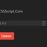 Highly Customizable Range Slider In JavaScript – Slider89.js
 Interactive Range Slider with Tooltip Using Pure CSS