


An ultralight (~ 2kb minified) JavaScript library for creating beautiful and customizable dialog boxes programmatically.
This Javascript library is inspired by the need to have custom dialog boxes on the fly, without having to go through the hassle of setting up your own modular routing system. With this tool, you can create and immediately apply beautiful dialog boxes in a matter of minutes. You’ll want to explore its code and play with it—you might be surprised how well it performs!
How to use it:
1. Load the default theme in the document.
<link rel="stylesheet" href="dist/themes/messagebox-default.min.css" />
2. Load the MessageBox.js at the end of the document.
<script src="dist/messagebox.min.js"></script>
3. Create a new dialog box instance.
let message = new MessageBox();
4. Add a title to the dialog box.
message.setTitle("Dialog Title");5. Insert your own content to the dialog body.
message.setMessage('Dialog Message');6. Add action buttons to the dialog box.
message
.addButton("Green Button", "green")
.addButton("Red Button", "red")
.addButton("Blue Button", "blue")
.addButton("Purple Button", "purple")
.addButton("Cyan Button", "cyan")
7. Trigger a function when an action button is clicked.
message.show().then(x => clicked.textContent = x)
8. ask the user to select a file.
message
// askForFile(multiple, MIMEType)
.askForFile(true, "image/*");
message.show().then(file => ...)
9. Ask the user to enter text.
message.askForInput(placeholder, maxChars);
10. Create your own themes in CSS.
.message-box-container {
  /* --- DO NOT EDIT START --- */
  box-sizing: border-box;
  display: flex;
  justify-content: center;
  align-items: center;
  position: fixed;
  top: 0;
  left: 0;
  z-index: 99999;
  max-width: 100vw;
  max-height: 100vh;
  height: 100vh;
  width: 100vw;
  padding: 20px;
  /* --- Custom properties --- */
  background-color: rgba(0, 0, 0, 0.5);
}
.message-box-container * {
  color: #fff;
  font-family: 'Segoe UI', Tahoma, Geneva, Verdana, sans-serif
}
.message-box {
  box-sizing: border-box;
  max-width: 500px;
  height: max-content;
  max-height: 100%;
  display: flex;
  align-items: center;
  flex-direction: column;
  overflow-y: auto;
  /* --- Custom properties --- */
  background-color: #181B23;
  padding: 25px;
  flex: 1;
  border-radius: 5px;
  opacity: 0.95;
  box-shadow: 0 0 20px rgba(0, 0, 0, 0.9);
}
.message-box-title,
.message-box-message {
  /* --- DO NOT EDIT --- */
  margin-bottom: 10px;
  margin: 0;
  padding: 0;
  max-width: 100%;
  overflow-wrap: break-word;
  white-space: normal;
  word-break: break-word;
}
.message-box-title {
  font-size: 40px;
  font-weight: bold;
}
.message-box-message {
  font-size: 25px;
}
.message-box-buttons {
  margin-top: 20px;
  display: flex;
  justify-content: center;
  align-items: center;
  flex-wrap: wrap;
  max-width: 100%;
  gap: 10px;
}
.message-box-button {
  border: none;
  outline: none;
  font-size: 25px;
  cursor: pointer;
  padding: 5px 10px;
  border-radius: 4px;
  box-shadow: 0 0 10px rgba(0, 0, 0, 0.5);
}
.message-box-button:hover {
  box-shadow: 0 0 20px rgba(0, 0, 0, 0.9);
}
Changelog:
v0.5.0 (05/27/2022)
- new feature : text input
v0.4.0 (05/27/2022)
- Allow multiple files selection
- Allow MIME types choice
See Also:
 WAI-ARIA Compliant Dialog Box In JavaScript – a11y-dialog
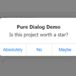 iOS Style Dialog Web Component – pure-dialog
 Modern Dialog Modals with Invoker Command API
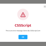 Create Custom Stylish Dialogs with SnapDialog JavaScript Library
 Easily Build Confirmation Popups with the confirmDialog.js Library
 Create Bootstrap 5 Modals Programmatically With JavaScript – bs_dialogs.js
 Moden Modal Window Using Dialog Element and CSS @starting-style
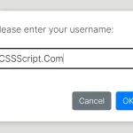 Async, Promise-based Alert/Confirm/Prompt Dialogs – Prompts.js