


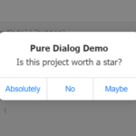
a11y-dialog is a pure JavaScript plugin to create fully accessible dialog boxes with custom styling and event handling.
Based on the native <dialog> element.
Installation:
# NPM
$ npm install a11y-dialog --save
How to use it:
1. Import the a11y-dialog.
// ES module
import A11yDialog from 'a11y-dialog'
// Browser
<script defer src="https://cdn.jsdelivr.net/npm/a11y-dialog@8/dist/a11y-dialog.min.js"></script>
2. Create the dialog box following the html structure as follows:
<div
id="your-dialog-id"
aria-labelledby="your-dialog-title-id"
aria-hidden="true"
>
<!-- Dialog overlay -->
<div data-a11y-dialog-hide></div>
<!-- Dialog -->
<div role="document">
<!-- Close button -->
<button type="button" data-a11y-dialog-hide aria-label="Close dialog">
×
</button>
<!-- Dialog title -->
<h1 id="your-dialog-title-id">Your dialog title</h1>
<!-- Dialog content here -->
</div>
</div>3. Create an element to toggle the dialog box. Note that the ‘data-a11y-dialog-show’ has to match the dialog ID.
<button data-a11y-dialog-show="myDialog">open the dialog</button>
4. The necessary styling for the dialog to work.
.dialog[aria-hidden="true"] {
  display: none;
}
5. The extra dialog styling to make it shiny.
.dialog-container,
.dialog-overlay {
  position: fixed;
  top: 0;
  right: 0;
  bottom: 0;
  left: 0;
}
.dialog-container {
  z-index: 2;
  display: flex;
}
.dialog-overlay {
  background-color: rgb(43 46 56 / 0.9);
}
.dialog-content {
  margin: auto;
  z-index: 2;
  position: relative;
  background-color: white;
}
6. Initialize the a11y-dialog via JavaScript.
const element = document.getElementById('your-dialog-id')
const dialog = new A11yDialog(element)
7. API methods.
// Show the dialog
myDialog.show();
// Hide the dialog
myDialog.hide();
// Unbind click listeners from dialog openers and closers and remove all bound
// custom event listeners registered with `.on()`
myDialog.destroy();
// Bind click listeners to dialog openers and closers
myDialog.create();
8. Event handlers.
myDialog.on('show', function (dialogEl, event) {
  // Do something when dialog gets shown
  // Note: opener is `event.currentTarget`
});
myDialog.on('hide', function (dialogEl, event) {
  // Do something when dialog gets hidden
  // Note: closer is `event.currentTarget`
});
myDialog.on('destroy', function (dialogEl) {
  // Do something when dialog gets destroyed
});
myDialog.on('create', function (dialogEl) {
  // Do something when dialog gets created
  // Note: because the initial `create()` call is made from the constructor, it
  // is not possible to react to this particular one (as registering will be
  // done after instantiation)
});
Changelog:
v8.1.5 (02/08/2026)
- Update
v8.1.4 (06/30/2025)
- Fix an edge case with focus restoration
v8.1.3 (04/02/2025)
- Bugfixes
v8.1.2 (03/27/2025)
- Fix a focus issue related to Shadow DOM
v8.1.1 (09/09/2024)
- Fix web components as openers/closers not working properly
- Update dev dependencies
v8.1.0 (08/18/2024)
- Add exportsfield to package.json
- Build proper CJS version of the library
- Enable canceling events to prevent usual behavior
- Fix click handlers not working properly in web components
- Account for Shadow DOM when dealing with nested dialogs
v8.0.4 (10/03/2023)
- Try/catch a new DOM query which could fail in unsupported browsers
v8.0.3 (10/02/2023)
- Consider open popovers when pressing ESC
v8.0.2 (09/30/2023)
- Respect ignore-focus attribute when shown via focus event
v8.0.1 (08/09/2023)
- Update
v8.0.0 (07/24/2023)
- The library now longer supports Internet Explorer
- Pseudo-private properties prefixed with an underscore (e.g. _id) are no longer prefixed, and marked as private in TypeScript instead
- All events now go through cancellable DOM CustomEvent objects instead of a custom event system, and the event listener signature has change
- The focus trap now accounts for Shadow DOM
- The focus trap now accounts for summary elements
- The focus trap no longer considers children of disabled fieldset elements as focusable
- The focus trap no longer considers elements within disabled, inert and hidden parents as focusable
- The code has been rewritten in TypeScript
- The code now leverages ES6 syntax such as classes, optional chaining operator and arrow functions
- The dist folder is no longer part of the repository, only the source files remain
- Click events are now listened to at the document level
- The focus-trap event listener is now bound on the dialog container instead of the body element
- The auto-instantiation of dialogs has been simplified but remains functionally unchanged
v7.5.2 (12/20/2020)
- Updated to the latest version
See Also:
 iOS Style Dialog Web Component – pure-dialog
 Modern Dialog Modals with Invoker Command API
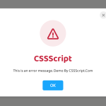 Create Custom Stylish Dialogs with SnapDialog JavaScript Library
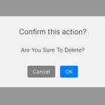 Easily Build Confirmation Popups with the confirmDialog.js Library
 Create Bootstrap 5 Modals Programmatically With JavaScript – bs_dialogs.js
 Moden Modal Window Using Dialog Element and CSS @starting-style
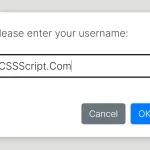 Async, Promise-based Alert/Confirm/Prompt Dialogs – Prompts.js
 Flexible Web-Based Window System Using Window Manager