


A stylish and animated modal window built with the <dialog> element, CSS @starting-style property, and a little bit of JavaScript.
Features:
- Native browser support through the
<dialog>element - Smooth fade-in and translation animations
- Responsive design with flexible styling options
Use Cases:
- Interactive Forms: Collect user input or feedback within a contained, non-intrusive dialog.
- Alerts and Notifications: Display information or warnings in a way that feels polished and modern.
- Lightbox Effects: Showcase media or additional content in a focused modal layout.
How to use it:
1. Add your content within the <dialog> tag:
<dialog id="myDialog"> ... Any Modal Content Here ... <button id="btn-dialog-close" class="btn-dialog-close">✕</button> </dialog>
2. Apply CSS animations and styling to the <dialog>. The CSS @starting-style property defines the initial state of the dialog, setting its opacity to 0 and translating it off-screen. When the dialog opens, the CSS transitions smoothly fade it in and translate it to its final position. The backdrop styling adds a blur effect and transitions its opacity.
dialog{
  opacity: 1;
  translate: 0;
  color: var(--clr-txt);
  border: 1px solid rgba(from var(--clr-primary) r g b /.25);
  background-color: var(--clr-bg);
  border-radius: 10px;
  max-width: 270px;
  padding: 1rem;
  text-wrap: balance;
  @starting-style {
    opacity: 0;
    translate: 0 100svh;
  }
  transition: opacity 500ms ease-in, translate 500ms cubic-bezier(0.28, -0.55, 0.27, 1.55);
}
dialog[open]::backdrop {
  background-color: rgba(from var(--clr-secondary) r g b / .5);
  backdrop-filter: blur(3px);
  opacity: 1;
  @starting-style {
    opacity: 0;
  }
  transition: opacity 1000ms ease-in; /* this doesn't appear to be working */
}
dialog .btn-dialog-close{
  position: absolute;
  top: 4px;
  right: 4px;
  border-radius: 50%;
  background-color: transparent;
  color: white;
  border: none;
  outline: none;
  cursor: pointer;
  transition: rotate 300ms, background-color 300ms ease-in-out;;

}
dialog .btn-dialog-close:focus-visible,
dialog .btn-dialog-close:hover{
  rotate: 90deg;
}
.btn-dialog-open{
  width: fit-content;
  margin-inline: auto;
  cursor: pointer;
  background-color: rgba(from var(--clr-secondary) r g b / .5);
  border: 1px solid var(--clr-secondary);
  border-radius: 5px;
  outline: none;
  padding: 1rem 2rem;
  font-size: 2rem;
  color: var(--clr-primary);
  transition: background-color 300ms ease-in-out;
}
.btn-dialog-open:focus-visible,
.btn-dialog-open:hover{
  background-color: var(--clr-secondary);
}
3. Create a button to trigger the modal:
<button id="btn-dialog-open" type="button" class="btn-dialog-open">Open Dialog</button>
4. Enable the modal’s open and close functionality using JavaScript:
const dialog = document.getElementById('myDialog');
document.getElementById('btn-dialog-open').addEventListener('click', () => dialog.showModal());
document.getElementById('btn-dialog-close').addEventListener('click', () => dialog.close());
See Also:
 WAI-ARIA Compliant Dialog Box In JavaScript – a11y-dialog
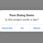 iOS Style Dialog Web Component – pure-dialog
 Modern Dialog Modals with Invoker Command API
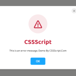 Create Custom Stylish Dialogs with SnapDialog JavaScript Library
 Easily Build Confirmation Popups with the confirmDialog.js Library
 Create Bootstrap 5 Modals Programmatically With JavaScript – bs_dialogs.js
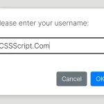 Async, Promise-based Alert/Confirm/Prompt Dialogs – Prompts.js
 Flexible Web-Based Window System Using Window Manager