


A pure JavaScript / CSS based responsive fullscreen page slider which enables the user to switch between page sections with a parallax scrolling effect.
How to use it:
Build the html structure for the page slider.
<div class="l">
  <div class="bg">
    <div class="c c1"></div>
    <div class="c c2"></div>
    <div class="c c3"></div>
    <div class="c c4"></div>
    <div class="c c5"></div>
  </div>
  <div class="fg">
    <div class="c">
      <h1>
        SAMPLE ONE<br />
        <small>THIS IS THE FIRST DESCRIPTION</small>
      </h1>
    </div>
    <div class="c">
      <h1>
        SAMPLE TWO<br />
        <small>THIS IS THE SECOND DESCRIPTION</small>
      </h1>
    </div>
    <div class="c">
      <h1>
        SAMPLE THREE<br />
        <small>THIS IS THE THIRD DESCRIPTION</small>
      </h1>
    </div>
    <div class="c">
      <h1>
        SAMPLE FOUR<br />
        <small>THIS IS THE FOURTH DESCRIPTION</small>
      </h1>
    </div>
    <div class="c">
      <h1>
        SAMPLE FIVE<br />
        <small>THIS IS THE FIVE DESCRIPTION</small>
      </h1>
    </div>
  </div>
</div>
Add a bottom pagination to the slider.
<div class="i">
  <a href="#" class="active"></a>
  <a href="#"></a>
  <a href="#"></a>
  <a href="#"></a>
  <a href="#"></a>
</div>
Make the slider fullscreen.
html,
body,
.l,
.bg,
.bg > .c,
.fg {
  width: 100%;
  height: 100%;
}
The primary CSS styles for the parallax, background and foreground layers.
/* LAYER */
.l {
  position: relative;
  overflow: hidden;
}
/* BACKGROUND */
.bg {
  position: absolute;
  top: 0;
  left: 0;
  transition: top 1s;
}
/* FOREGROUND */
.fg {
  position: absolute;
  top: 0;
  left: 0;
}
.fg > .c {
  width: 100%;
  height: 200%;
  position: relative;
}
.fg > .c > h1 {
  font-size: 56px;
  color: white;
  width: 100%;
  text-align: center;
  position: absolute;
  top: 50%;
  text-shadow: -2px 0 black, -2px 2px black, -2px -2px black, 0 2px black, 2px 0 black, 2px 2px black, 2px -2px black, 0 -2px black;
  transform: translateY(-50%);
}
.fg > .c > h1 > small {
  font-size: 32px;
  color: #cfcfcf;
}
Style the pagination dots.
.i {
  width: 100%;
  text-align: center;
  position: absolute;
  bottom: 10px;
  word-spacing: 10px;
}
.i > a {
  background: #888888;
  width: 20px;
  height: 20px;
  display: inline-block;
  border-radius: 50%;
}
.i > a.active {
  background: white;
}
Add background images to the slider.
.c1 {
  background: url("1.jpg") center center no-repeat;
}
.c2 {
  background: url("2.jpg") center center no-repeat;
}
.c3 {
  background: url("3.jpg") center center no-repeat;
}
.c4 {
  background: url("4.jpg") center center no-repeat;
}
.c5 {
  background: url("5.jpg") center center no-repeat;
}
The core JavaScript to enable the page slider.
var bg = document.querySelector(".bg");
var fg = document.querySelector(".fg");
var link = document.querySelectorAll(".i > a");
var selectLink = 0;
function leInitWrapper() {
  var bgHeight = window.innerHeight;
  var fgHeight = bgHeight * 2;

  if (window.innerWidth < 1024) {
    for (var i = 0; i < bg.children.length; i++) {
      bg.children[i].style.backgroundSize = "auto";
      fg.children[i].style.backgroundSize = "auto";
    }
  }
  else {
    for (var i = 0; i < bg.children.length; i++) {
      bg.children[i].style.backgroundSize = "100%";
      fg.children[i].style.backgroundSize = "100%";
    }
  }
  fg.style.top = "";
  fg.style.top = Math.floor(fgHeight / 4 * -1).toString() + "px";
  fg.style.transition = "top 1s";
  for (var i = 0; i < link.length; i++) {
    link[i].setAttribute("page-value", i.toString());
    link[i].addEventListener("click", function(evt) {
      evt.preventDefault();
      selectLink = parseInt(this.getAttribute("page-value"))
      bg.style.top = (selectLink * bgHeight * -1) + "px";
      fg.style.top = (((selectLink * fgHeight) + Math.floor(fgHeight / 4)) * -1) + "px";
      for (var j = 0; j < link.length; j++) {
        link[j].classList.remove("active");
      }
      this.classList.add("active");
    });
  }
}
leInitWrapper();
window.addEventListener("resize", function() {
  leInitWrapper();
});
See Also:
 TailwindCSS HTML Presentation Library – tw-slide
 Build Smooth One-Page Scrolling Websites With ScrollFlow.js
 Enhance One-Page Websites with JavaScript Fullpage Slider
 Fluid SVG Page Transitions with GSAP
 Mobile-friendly Fullpage Slider Library – Horizontally.js
 Responsive One Page Scroll JavaScript Plugin – fullpage-scroll.js
 Touch-enabled Slider & Scroller – JPage
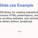 CSS Only Presentation Library – slide.css
Make this autoplay?