


tw-slide is a Tailwind-based presentation JS library that builds HTML slide decks with animated transitions, fragment reveals, and plugin-based navigation.
You write slides in standard HTML, style them with Tailwind utility classes, and keep direct control over layout, spacing, and color.
Features:
- Tailwind-first slide styling and layout control.
- Six deck transitions for slide movement.
- Eight fragment animations for staged reveals.
- Keyboard, touch, and swipe navigation.
- URL hash syncing for deep links.
- Progress bar, slide counter, and overview extensions.
- Dark mode support for presentation themes.
- Reduced-motion handling for users who prefer less animation.
- Print-friendly output for PDF export.
Keyboard shortcuts:
- Right Arrow, Down Arrow, Space, or N moves to the next step.
- Left Arrow, Up Arrow, or P moves to the previous step.
- Home jumps to the first slide.
- End jumps to the last slide.
- O or Esc toggles overview mode.
Use Cases:
- Startup pitch decks with brand styling from Tailwind.
- Conference talks with staged talking points on each slide.
- Internal product demos with direct links to key slides.
- Training decks that need browser printing and PDF handouts.
How to use it:
1. Install & download the package with NPM.
# NPM
$ npm install tw-slide
2. Import tw-slide and optional plugins into your project.
import TailSlide, {
  ProgressPlugin,
  SlideNumberPlugin,
  OverviewPlugin,
} from 'tw-slide';
import 'tw-slide/style.css';
3. Or directly load the tw-slide’s JavaScript & Stylesheet from a CDN.
<script src=”https://cdn.jsdelivr.net/npm/tw-slide/dist/tailslide.umd.js”></script>
<link rel=”stylesheet” href=”https://cdn.jsdelivr.net/npm/tw-slide/dist/tw-slide.css”>
4. Create the slide markup. Every presentation starts with a container element and individual slides. The ts-dark class enables dark mode styling.
<!-- Deck container -->
<div class="ts-deck ts-dark">
  <!-- Slide 1 -->
  <section class="ts-slide">
    <div class="ts-content flex min-h-screen flex-col justify-center text-center">
      <h1 class="text-6xl font-bold text-white">Q2 Product Review</h1>
      <p class="mt-4 text-xl text-slate-300">Roadmap, metrics, and release plans</p>
    </div>
  </section>
  <!-- Slide 2 with staged fragment reveals -->
  <section class="ts-slide" data-ts-transition="fade">
    <div class="ts-content max-w-4xl">
      <h2 class="mb-6 text-4xl font-semibold text-white">Release priorities</h2>
      <ul class="space-y-4 text-2xl text-slate-200">
        <li class="ts-fragment" data-ts-animation="fade-up">Launch the analytics workspace.</li>
        <li class="ts-fragment" data-ts-animation="grow">Ship the mobile editor update.</li>
        <li class="ts-fragment" data-ts-animation="highlight">Finish the accessibility pass.</li>
      </ul>
    </div>
  </section>
  <!-- Slide 3 -->
  <section class="ts-slide">
    <div class="ts-content grid gap-8 md:grid-cols-2">
      <div class="rounded-2xl bg-slate-800 p-8">
        <h3 class="text-3xl font-semibold text-white">North America</h3>
        <p class="mt-3 text-lg text-slate-300">Revenue up 18% from the last quarter.</p>
      </div>
      <div class="rounded-2xl bg-slate-800 p-8">
        <h3 class="text-3xl font-semibold text-white">Europe</h3>
        <p class="mt-3 text-lg text-slate-300">Customer growth reached 24%.</p>
      </div>
    </div>
  </section>
</div>
5. Initialize the deck and register plugins:
const deck = new TailSlide({
  el: '.ts-deck',
  transition: 'cube',
  transitionSpeed: 650,
  easing: 'ease-in-out',
  dark: true,
  hash: true,
  touch: true,
  startSlide: 0,
});
// Add the top progress bar
deck.use(new ProgressPlugin());
// Add the current slide / total slide counter
deck.use(new SlideNumberPlugin());
// Add the overview grid and click navigation
deck.use(new OverviewPlugin());
// Watch slide changes for analytics or speaker tooling
deck.on('slide:changed', ({ from, to }) => {
  console.log(`Slide changed from ${from} to ${to}`);
});
// CDN Usage
const deck = new TailSlide.TailSlide({
transition: 'slide',
dark: true,
clickToAdvance: true,
hash: true,
});
// Register built-in UI plugins
deck.use(new TailSlide.ProgressPlugin());
deck.use(new TailSlide.SlideNumberPlugin());6. Override transitions per slide and control fragment order:
<!-- This slide uses a custom transition -->
<section class="ts-slide" data-ts-transition="zoom">
  <div class="ts-content">
    <h2 class="text-4xl font-bold text-white">Milestones</h2>
    <!-- Fragments reveal in order -->
    <p class="ts-fragment text-slate-200" data-ts-index="0" data-ts-animation="fade-up">
      Closed beta starts on May 12.
    </p>
    <p class="ts-fragment text-slate-200" data-ts-index="1" data-ts-animation="fade-left">
      Public launch opens on June 3.
    </p>
    <p class="ts-fragment text-slate-200" data-ts-index="2" data-ts-animation="highlight">
      Support team shifts to launch coverage.
    </p>
  </div>
</section>
7. All configuration options:
el(string | HTMLElement): Sets the deck container selector or element reference.transition('none' | 'fade' | 'slide' | 'zoom' | 'flip' | 'cube'): Picks the slide transition style.transitionSpeed(number): Sets transition duration in milliseconds.easing(string): Sets the easing value for slide transitions.keyboard(boolean): Turns keyboard navigation on or off.hash(boolean): Syncs the current slide index to the URL hash.progress(boolean): Stores the progress UI flag in the internal config object. UseProgressPluginto render the bar.slideNumber(boolean): Stores the slide number UI flag in the internal config object. UseSlideNumberPluginto render the counter.touch(boolean): Turns touch and swipe navigation on or off.clickToAdvance(boolean): Moves to the next step when the deck container is clicked.autoSlide(number): Sets the auto-advance interval in milliseconds. Use0to disable it.loop(boolean): Restarts at the first slide after the last slide. The reverse path works from the first slide too.startSlide(number): Sets the initial slide index.dark(boolean): Adds the dark theme class to the deck container at startup.deckClass(string): Appends one or more custom class names to the deck container.
8. API methods.
// Move to the next fragment or slide
deck.next();
// Move to the previous fragment or slide
deck.prev();
// Jump to a specific slide index
deck.goTo(4);
// Read the current runtime state
const state = deck.getState();
// Read the merged config object
const config = deck.getConfig();
// Get the deck root element
const root = deck.getContainer();
// Get all slide elements
const slides = deck.getSlides();
// Get fragment elements from a specific slide index
const fragments = deck.getFragments(1);
// Register a plugin instance
deck.use(new OverviewPlugin());
// Open or close overview mode
deck.toggleOverview();
// Attach an event listener
const handleSlideChanged = ({ from, to }) => {
  console.log(`Moved from ${from} to ${to}`);
};
deck.on('slide:changed', handleSlideChanged);
// Remove an event listener
deck.off('slide:changed', handleSlideChanged);
// Remove listeners, plugins, and deck bindings
deck.destroy();
9. Events.
// Fires after the active slide changes
deck.on('slide:changed', ({ from, to }) => {
  console.log(`Slide changed from ${from} to ${to}`);
});
// Fires when a fragment becomes visible
deck.on('fragment:shown', ({ slide, fragment, element }) => {
  console.log(`Fragment ${fragment} is now visible on slide ${slide}`);
  console.log(element);
});
// Fires when a fragment is hidden
deck.on('fragment:hidden', ({ slide, fragment, element }) => {
  console.log(`Fragment ${fragment} is now hidden on slide ${slide}`);
  console.log(element);
});
// Fires when the deck instance finishes startup
deck.on('deck:ready', ({ totalSlides }) => {
  console.log(`Deck is ready with ${totalSlides} slides`);
});
// Fires during deck teardown
deck.on('deck:destroyed', () => {
  console.log('Deck cleanup finished');
});
// Fires when overview mode opens
deck.on('overview:open', () => {
  console.log('Overview mode opened');
});
// Fires when overview mode closes
deck.on('overview:close', () => {
  console.log('Overview mode closed');
});
Alternatives:
See Also:
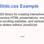 CSS Only Presentation Library – slide.css
 Horizontal & Vertical One Page Scroll Plugin In JavaScript – Wholepage Slider
 Minimal Page Slideshow Library – onePage.js
 Smooth Fullscreen Page Slideshow With Vanilla JavaScript – FullScroll
 Build Fullscreen Snap-Scroll Presentations with SnapRollJS
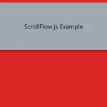 Build Smooth One-Page Scrolling Websites With ScrollFlow.js
 Enhance One-Page Websites with JavaScript Fullpage Slider
 Fluid SVG Page Transitions with GSAP