


A minimal, responsive, CSS only navigation drawer (sidebar menu) that slides out from the left side of the screen and covers part of your main content when you click the hamburger button.
How to use it:
1. Code the HTML for the navigation drawer.
<div class="menu-wrap">
  <input type="checkbox" class="toggler" />
  <div class="hamburger">
    <div></div>
  </div>
  <div class="menu">
    <div>
      <ul>
        <li><a href="#">Home</a></li>
        <li><a href="#">CSS</a></li>
        <li><a href="#">Script</a></li>
        <li><a href="#">Com</a></li>
      </ul>
    </div>
  </div>
</div>
2. Download the package and then insert the stylesheet menu.css in the document. That’s it.
<link rel="stylesheet" href="menu.css" />
3. Override the default styles of the navigation drawer.
.menu {
  position: fixed;
  top: 0;
  left: 0;
  background: rgb(77, 58, 58, 0.8);
  height: 100vh;
  width: 0;
  display: flex;
  align-items: center;
  justify-content: center;
  text-align: center;
  opacity: 0;
  transition: all var(--menu-speed) ease;
}
.menu > div {
  position: relative;
  top: 0;
  left: 0;
  height: 100%;
  width: 100%;
  flex: none;
  display: flex;
  align-items: center;
  justify-content: center;
  text-align: center;
  opacity: 0;
  transition: opacity 0.4s ease-in;
}
.menu ul {
  list-style: none;
}
.menu li {
  padding: 1rem 0;
}
.menu > div a {
  text-decoration: none;
  color: #fafafa;
  font-size: 1.5rem;
  opacity: 0;
  transition: opacity 1s ease-in;
}
.menu a:hover {
  color: rgb(230, 177, 177);
  transition: color 0.3s ease-in;
}
See Also:
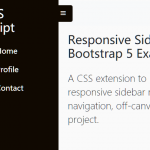 Responsive Sidebar Navigation For Bootstrap 5
 CSS Only Responsive Drawer Navigation – sz-navbar
 Easy Sliding Drawer In Vanilla JavaScript
 JavaScript Library For Creating App Style Side Menus – Snap.js
 Vanilla JS Offcanvas Side Menu – Mobile Swipe Menu
 Multi-Direction Offcanvas Drawers with Smooth Sliding Animations
 Create Mobile-First Side Menus with SlideReveal.js Library
 6 Modern Responsive Sidebar Navigation Components for TailwindCSS