


A CSS-only responsive navigation component that collapses the regular horizontal navbar into a hamburger toggle button on mobile.
Clicking/tapping the hamburger toggle button will toggle a side menu sliding from the right side of the webpage just like a drawer.
How to use it:
1. Load the core stylesheet sz-navbar.css in the document’s head section.
<link rel="stylesheet" href="css/sz-navbar.css" />
2. The required HTML structure for the responsive navbar.
<div class="sz-navbar">
  <div class="sz-navbar-inner sz-navbar-right">
    <div class="demo-navbar-logo"><span>CSSScript.Com</span></div>
    <input type="checkbox" id="sz-navbar-check">
    <label for="sz-navbar-check" class="sz-navbar-hamburger">☰</label>
    <div class="sz-navbar-items">
        <div class="sz-navbar-item"><span><a href="link1">Item 1</a></span></div>
        <div class="sz-navbar-item"><span><a href="link2">Item 2</a></span></div>
        <div class="sz-navbar-item"><span><a href="link3">Item 3</a></span></div>
        ... more links here ...
    </div>
  </div>
</div>
3. Override the default style of the responsive navbar.
.sz-navbar{
  height: 48px; /* overriding default 64px height */
}
.sz-navbar-inner{
  padding: 0 24px;
}
@media (max-width: 600px){
  .sz-navbar-items{
      width: 300px; /* limit width of mobile menu */
  }
}
See Also:
 Responsive Multi-level Dropdown Menu With JavaScript And CSS – ozmenu.js
 Responsive Collapsible Side & Tab Navigation In JavaScript/CSS
 Flexible Mobile Hamburger Navigation With 4 Styles – Kin Menu
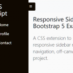 Responsive Sidebar Navigation For Bootstrap 5
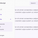 Responsive Multi-level Sidebar Menu With JavaScript/CSS
 Minimal Hamburger Overlay Navigation Drawer In CSS
 Easy Sliding Drawer In Vanilla JavaScript
 CSS Only Responsive Fixed Sidebar Navigation