


honey-toast is a JavaScript notification library that delivers modern, highly customizable toast notifications across any JavaScript framework without dependencies.
This notification system supports multiple themes, animations, positions, and customization options to present toast alerts easily in your next web application.
Features:
- Multiple notification types including success, error, warning, and info alerts
- Built-in dark, light, and system theme support
- Customizable notification positioning
- Animation options including slide, bounce, fade, and zoom effects
- Progress bar integration
- Custom button support
- Flexible container mounting
- Icon customization
- Offset control
How to use it:
1. Install the honey-toast package through your preferred package manager:
# Yarn
$ yarn add honey-toast
# NPM
$ npm install honey-toast
# PNPM
$ pnpm install honey-toast
2. Import honey-toast into your JavaScript files and include the CSS for styling:
import toast from 'honey-toast';
import 'honey-toast/dist/style.css';
<!-- OR -->
<link href="/dist/style.css" rel="stylesheet" />
<script src="/dist/toast.umd.min.js"></script>
3. Creating simple toast notifications is as easy as calling the toast function with a message. These examples demonstrate the basic notification types: notify, success, info, warn, and error. Each type has a default style associated with it.
toast.notify("Basic Toast")
toast.success("Success Toast")
toast.info("Info Toast")
toast.warn("Warning Toast")
toast.error("Error Toast")
4. You can further customize the appearance and behavior of your toast notifications by passing options:
- position:
string- Description: Position of the toast on the screen:
top-left,top-right,top-center,bottom-left,bottom-right,center - Default Value:
top-right
- Description: Position of the toast on the screen:
- animation:
string- Description: Animation that will be applied once the Toast appears and disappears:
slide,bounce,fade,zoom - Default Value:
slide
- Description: Animation that will be applied once the Toast appears and disappears:
- type:
string- Description: Type of the Toast:
default,success,info,warning,error - Default Value:
default
- Description: Type of the Toast:
- design:
string- Description: Design of the Toast:
minimal,standard,colorful,gradient - Default Value:
minimal
- Description: Design of the Toast:
- theme:
string- Description: Color mode of the Toast:
light,dark,system - Default Value:
light
- Description: Color mode of the Toast:
- duration:
number- Description: Duration in milliseconds for which the toast is visible
- Default Value:
3000
- autoClose:
boolean- Description: If the Toast should close automatically once Duration is elapsed
- Default Value:
true
- hasProgressBar:
boolean- Description: If the Toast should have a progressbar
- Default Value:
false
- progress:
number- Description: If the Progress Bar is visible then it will be used as starting position of the progress. Value must be between 0 to 100
- Default Value:
0
- isCloseable:
boolean- Description: If the Toast should have the close icon
- Default Value:
true
- container:
HTMLElement- Description: Container where the all Toasts will be mounted
- Default Value:
document.body
- classNames:
string[]- Description: A list of classes which will be added on the Toast
- Default Value:
[]
- hasIcon:
boolean- Description: If the Toast should have Icon visible
- Default Value:
true
- icon:
{url: string, classes: string[], size: "small" or "medium" or "large"}- Description: Size of the Icon of the Toast
- Default Value:
small
- offset:
{x: number, y: number}- Description: Gap from the nearest edges or the Container. x and y values are treated as px
- Default Value:
{x:30, y:30}
- onShow:
() => void- Description: Will be called once the Toast is appeared in the screen after finishing Animation
- Default Value: N/A (No default value, it’s a function)
- onClose:
() => void- Description: Will be called once the Toast is removed from the DOM
- Default Value: N/A (No default value, it’s a function)
const notification = toast.notify({
  title: 'Toast Title',
  message: 'Toast Message',
  // custom buttons
  buttons: [
    {
      iconUrl: '/path/to/close.svg',
      label: 'Cancel',
      classes: [],
      onClick: () => {
        console.log('Canceling...');
      },
    },
    {
      iconUrl: '/path/to/confirm.svg',
      classes: [],
      label: 'Confirm',
      onClick: () => {
        console.log('Confirming...');
      },
    },
  ]
  },{
  // options here
  isCloseable: true,
  autoClose: true,
  type: "default",
  design: "minimal",
  position: "top-right",
  hasIcon: true,
  hasProgressBar: false,
  progress: 0,
  classNames: [],
  theme: "light",
  animation: "slide",
  icon: {
    url: void 0,
    size: "small",
    classes: []
  },
  offset: {
    x: 30,
    y: 30
  },
  duration: 3000,
  onShow: () => void,
  onClose: () => void
});
5. API methods.
// Modify an existing toast's content and options dynamically.
notification.update(content: ToastContent, options?: ToastOptions);
// Manually close a specific toast.
notification.close();
// Close all currently active toast notifications.
toast.closeAll();
// Access the container element where the toast is mounted.
notification.mountedIn;
// Get the DOM node of the toast element.
notification.element;
// Retrieve the options applied to the toast.
notification.options;
See Also:
 Framework-Agnostic Toast Notifications with TypeScript – NotifyX
 Advanced Toast/Tooltip/Popover/Confirm/Modal Notification Library – toast-anchor
 Developer-Friendly Toast Alerts in JavaScript – Toast-JS
 Modern Toast Popup JavaScript Library – EggyJS
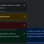 Advanced Alert Notification System For Bootstrap 5 – AvalynxAlert.js
 SVG Gooey Toast Notification Library – Physics Toast
 Modern JavaScript Toast Notification & Modal Popup Library – JSPT
 Lightweight Toast & Growl Notifications Inspired by macOS – Toastify