


toastedjs is a responsive, interactive, touch-enabled toast notification library for both desktop and mobile.
Main features:
- Inspired by Material Design.
- Supports Material Icons.
- Touch device supported based on hammer.js.
- Smooth animations based on anime.js.
- 6 positions: ‘top-right’, ‘top-center’, ‘top-left’, ‘bottom-right’, ‘bottom-center’, ‘bottom-left’.
- Custom actions in the toast messages.
- 5 built-in themes: alive, material, bootstrap, colombo, venice, and bulma.
- 4 notification types: ‘default’, ‘success’, ‘info’, ‘error’.
Basic usage:
Install, import & include the toastedjs in your project.
# NPM
$ npm install toastedjs --save
// ES 6
import Toasted from 'toastedjs'
import 'toastedjs/dist/toastedjs.min.css'
<!-- Browser -->
<link href="dist/toasted.min.css" rel="stylesheet">
<script src="dist/toasted.js"></script>
Create a new Toasted object.
const toasted = new Toasted()
Show a default toast notification on the page.
toasted.show('A simple toast message')Add an icon to the toast notification.
<link href="https://fonts.googleapis.com/icon?family=Material+Icons" rel="stylesheet">
const toasted = new Toasted({
      icon : 'check'
})
If you want to append the icon to the end of the toast message.
const toasted = new Toasted({
      icon : {
        name : 'check',
        color : '#fafafa',
        after : true
      }
})
Add a custom action to the toast message.
const toasted = new Toasted({
      action : {
        text : 'Action',
        href : '#',
        icon : 'check',
        class : 'custom-class'
        onClick : (e, toasted) => {
          toasted.delete()
        }
      }
})
More configuration options with default values.
const toasted = new Toasted({
      // toast position
      // 'top-right', 'top-center', 'top-left', 'bottom-right', 'bottom-center', 'bottom-left'
      position: "top-right",
      // toast duration
      duration: null,
      // check if the fullWidth is enabled
      fullWidth: false,
      // check if the toast needs to be fitted in the screen (no margin gap between screen)
      fitToScreen: null,
      // class name to be added on the toast
      className: null,
      // class name to be added on the toast container
      containerClass: null,
      // normal type will allow the basic color
      // 'success', 'info', 'error'
      type: "default",
      // normal type will allow the basic color
      // alive, material, bootstrap, colombo, venice, and bulma
      theme: "material",
      // normal type will allow the basic color
      color:  null,
      // get icon color
      iconColor: null,
      // complete call back of the toast
      onComplete: null,
})
API methods.
// shows the toast message
toasted.show(message, options)
// shows a success toast message
toasted.success(message, options)
// shows an error toast message
toasted.error(message, options)
// shows an info toast message
toasted.info(message, options)
// clears the toast message
toasted.clear()
// Registers your own toast
toasted.register(name, message[string,function(payload)], options)
// Creates a new group of toasts
toasted.group(options)
See Also:
 Framework-Agnostic Toast Notifications with TypeScript – NotifyX
 Advanced Toast/Tooltip/Popover/Confirm/Modal Notification Library – toast-anchor
 Developer-Friendly Toast Alerts in JavaScript – Toast-JS
 Modern Toast Popup JavaScript Library – EggyJS
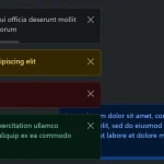 Advanced Alert Notification System For Bootstrap 5 – AvalynxAlert.js
 SVG Gooey Toast Notification Library – Physics Toast
 Modern JavaScript Toast Notification & Modal Popup Library – JSPT
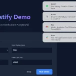 Lightweight Toast & Growl Notifications Inspired by macOS – Toastify