


ButterPop.js is a lightweight toast notification library to display customizable, interactive messages within your web applications.
It handles everything from simple success messages to complex multi-action dialogs without requiring jQuery, React, or any external frameworks.
For interfaces that need confirmation dialogs and alerts alongside toast messages, compare this JavaScript toast, alert, and confirmation library.
Features:
- 40+ Built-in Theming: From ‘glassmorphism’ to ‘cyberpunk’ to ‘terminal’, there’s a lot to choose from. You can also create custom themes.
- Highly Customizable: Beyond themes, you control position, duration, icons, and more.
- Responsive: Toasts look good across devices.
- Flexible Positioning: 7 different screen positions for your notifications.
- Progress Indicators: Optional progress bars show the remaining time for a toast.
- Pause on Hover: Timers intelligently pause when a user hovers over a notification – a nice UX touch.
- Interactive Elements: Supports action buttons within toasts, with custom callbacks.
- Queue Management: Handles multiple notifications gracefully.
- Accessibility: Includes ARIA attributes and keyboard navigation support.
- Duplicate Prevention: An option to stop the same notification from appearing multiple times.
- ES Module Support: Ready for modern JavaScript workflows.
How to use it:
1. Download and import the ButterPop’s JavaScript & CSS files into your project.
<link rel="stylesheet" href="path/to/butterpop.css">
<script src="path/to/butterpop.js"></script>
// For ES modules:
<script type="module">
  import ButterPop from './path/to/butterpop.esm.min.js';
</script>
2. Display basic toast notifications:
ButterPop.success('Success Message');
ButterPop.error('Error Message');
ButterPop.warning('Warning Message');
ButterPop.info('Info Message');
3. Create custom toast notification using the show method:
ButterPop.show({
  // options here
});
4. All possible options:
message(String): The text content for the notification.type(String): Sets the notification category (success,error,warning,info), influencing default styling and icon.position(String): Screen location for the toast (top-left,top-right,top-center,bottom-left,bottom-right,bottom-center,center).duration(Number): Time in milliseconds before the toast auto-dismisses;0makes it persistent.theme(String): Name of the pre-built or custom theme to apply.progress(Boolean): Iftrue, shows a progress bar indicating remaining duration.progressColor(String): Custom CSS color for the progress bar.closable(Boolean): Iftrue, displays a close button on the toast.closeOnClick(Boolean): Iftrue, the toast dismisses when clicked anywhere on its body.pauseOnHover(Boolean): Iftrue, the dismiss timer pauses when the mouse hovers over the toast.preventDuplicates(Boolean): Iftrue, prevents showing a new toast if an identical one (same message) is already visible.onClick(Function): Callback function executed when the toast body is clicked.onClose(Function): Callback function executed when the toast is closed (either by timer, button, or programmatically).actions(Array): Defines interactive buttons within the toast. Each object in the array needstextandcallback.className(String): Additional CSS class(es) to apply to the toast element for custom styling.icon(String/HTML/Boolean): Custom icon content (emoji, SVG string, HTML like<i>tag) orfalseto disable the icon.trueshows default.maxVisible(Number): (Global option viaButterPop.configure()) Maximum number of toasts to display simultaneously.
ButterPop.show({
  message: 'Your Message Here',
  position: 'top-right',
  duration: 5000,  // milliseconds
  closable: true,
  pauseOnHover: true,
  pauseOnFocusLoss: true,
  progress: false,
  theme: 'default',
  maxVisible: 5,
  preventDuplicates: false,
  escapeHtml: true,
  rtl: false,
  closeOnClick: false,
  showClass: 'butterpop-enter',
  hideClass: 'butterpop-exit',
  autoInject: true,
  animation: {
    type: 'slide',  // 'slide', 'fade', 'bounce'
    duration: 300   // milliseconds
  },
  accessibility: {
    role: 'alert',
    ariaLive: 'polite',
    ariaRelevant: 'additions text',
    closeAriaLabel: 'Close notification'
  }
});
5. Themes:
Okay, here’s the list of ButterPop.js themes with their concise descriptions:
default: Clean, simple style with colored borders.minimal: Subtle, minimalist style with thin borders.dark: Dark background, light text; good for light-themed sites.light: Light background, dark text; good for dark-themed sites.glassmorphism: Modern frosted glass effect with transparency.neon: Glowing borders with colorful text shadows.material: Google Material Design inspired; shadows and transitions.gradient: Smooth color gradients based on notification type.rounded: Pill-shaped toasts with fully rounded corners.neumorphism: Soft UI/Neumorphic design; adaptive light/dark mode.retro: Vintage computer/pixel art inspired style.cyberpunk: Futuristic neon style; scan lines and glowing effects.pastel: Soft, gentle colors; smooth corners, subtle shadows.terminal: Command-line inspired; monospace font, console aesthetics.elegant: Sophisticated typography; subtle bottom borders, serif fonts.bubble: Speech bubble style; triangular tail, rounded corners.forest: Nature-inspired dark green; leaf pattern texture.futuristic: High-tech UI; gradients, accents, modern typography.comic: Fun cartoon-style; speech bubbles, bold outlines.luxury: Premium dark theme; gold accents, subtle gradients.neon-brutalism: Bold, skewed design; bright contrasting colors, thick outlines.monochrome: Minimalist black and white; geometric accents.candy: Sweet, colorful design; dotted patterns, soft gradients.aqua: Water-inspired; ocean gradients, wave effects.nordic: Clean Scandinavian design; minimal colors, crisp aesthetics.blueprint: Technical drawing style; grid backgrounds, structured layout.paper: Paper texture; folded corner effect, subtle patterns.origami: Paper-fold inspired; sharp angles, geometric patterns.sunset: Warm gradient colors (like a sunset); soft light effects.holographic: Iridescent metallic effect; rainbow highlights, reflections.chalk: Chalkboard texture; handwritten style text, rustic appeal.aurora: Northern lights inspired; flowing gradients, soft glows.corporate: Professional business-like; clean lines, subtle accents.zen: Minimalist, calm design; subtle gradient accents, balanced aesthetics.frost: Translucent frosted glass; subtle shadows, light reflections.velvet: Rich, luxurious dark theme; elegant typography, gradient accents.quantum: Futuristic sci-fi inspired; animated gradients, tech aesthetics.neon-glow: Vibrant glowing text; colorful shadows, pulsing effects.watercolor: Soft, artistic style; gradient backgrounds, subtle texture.vintage: Retro-inspired; aged paper texture, classic typography.pixel: 8-bit style; pixelated aesthetics, game-inspired colors.handwritten: Casual note-like; handwritten font, paper texture.
6. More API methods.
// Removes a specific toast by its ID
ButterPop.remove(id)
// Clears all currently visible toasts
ButterPop.clearAll()
// Sets global default options for all subsequent toasts
ButterPop.configure(options)
Changelog:
v1.0.4 (05/26/2025)
- bugfixes
- The onClose callback now works as documented! It is called whenever a toast is removed (by timeout, close button, or programmatically) in both butterpop.js and butterpop.esm.js.
See Also:
 Material Design Toast & Snackbar Library with Action Buttons – MiniSnackbar
 Developer-Friendly Toast Alerts in JavaScript – Toast-JS
 Sonner-Style Stacked Toast Notifications in JavaScript – Toastry
 Framework-Agnostic Toast Notifications with TypeScript – NotifyX
 Advanced Toast/Tooltip/Popover/Confirm/Modal Notification Library – toast-anchor
 Modern Toast Popup JavaScript Library – EggyJS
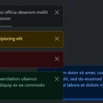 Advanced Alert Notification System For Bootstrap 5 – AvalynxAlert.js
 SVG Gooey Toast Notification Library – Physics Toast