


ZephyrToast is a lightweight JavaScript notification library that creates elegant customizable toast notifications inspired by Bootstrap 5 styling.
It delivers a clean solution for displaying transient messages to users without the bloat of larger UI frameworks.
Features:
- Multiple notification types: Success, Info, Warning, Error, Zen, Void
- Six different positioning options: Top-right, Top-left, Bottom-right, Bottom-left, Top-center, Bottom-center
- Customizable animation effects and notification icons
- Progress bar with adjustable duration
How to use it:
1. Download and add the ‘zephyr-toast.js’ script to your webpage.
<script src="zephyr-toast.js"></script>
2. Create a new ‘ZephyrToast’ instance:
const toast = new ZephyrToast();
3. Call the appropriate method based on the notification type:
// success
toast.success("Success Toast");
// error
toast.error("Error Toast");
// warning
Toast.warning("Warning Toast");
// info
toast.info("Info Toast");
// zen toast (light)
toast.zen("Zen Toast");
// void toast (dark)
toast.void("Void Toast");
4. Customize options with an object parameter:
position: String. Determines where the toast appears: ‘top-right’, ‘top-left’, ‘bottom-right’, ‘bottom-left’, ‘top-center’, ‘bottom-center’duration: Number. How long the toast is displayed (in milliseconds).title: String. An optional title for the toast.showClose: Boolean. Whether to display a close button.showProgress: Boolean. Whether to display a progress bar.newestOnTop: Boolean. If true, new toasts appear above older ones.animation: Object containinginandoutproperties, allowing different entrance/exit animation. Available animations include:fadeIn,slideInLeft,slideInRight,slideInDown,slideInUp,bounceIn,zoomIn,fadeOut,slideOutLeft,slideOutRight,slideOutDown,slideOutUp,bounceOut,zoomOut.icon: Object. Allows adding an image, SVG, or FontAwesome class icon.isIcon: Boolean. If set to true, it will prevent the use of custom URLs or image sources.enableIcon: Boolean. Toggle toast icons on or off.pauseOnHover: Boolean. Pauses the auto-dismiss feature when the toast is hovered over.allowHtml: Boolean. Supports rendering HTML content within the toast message.onClose: function. Callback which fires after toast dissapears.onClick: function. Callback which fires after toast is clicked.
toast.success("Operation completed successfully!",{
  position: "top-right",
  duration: 3000,
  title: "Success",
  showClose: true,
  showProgress: true,
  newestOnTop: true,
  animation: {
    in: "fadeIn",
    out: "fadeOut",
  },
  icon: {
    url: "icon.png",
    width: "24px",
    height: "24px",
  },
  enableIcon: true,
  isIcon: false,
  pauseOnHover: false,
  allowHtml: false,
  onClose: () => console.log("Toast closed"),
  onClick: () => console.log("Toast clicked"),
});
5. fully customize toast appearance via a theme object:
toast.success("Operation completed successfully!", {
  theme: {
    bgColor: "#fff0f6",
    textColor: "#d63384",
    borderColor: "#f5c2e7",
    progressTrackColor: "#00000026",
    progressBarColor: "#00000013"
  }
});
6. Implementation tips.
- Set appropriate duration values based on message importance and length.
- If you’re displaying numerous notifications in quick succession, consider increasing the
durationvalue to prevent overlapping. - Use the
newestOnTopoption strategically depending on your application’s context.
Changelog:
v1.5.0 (04/17/2025)
- Added pauseOnHover (default: true): Pauses the auto-dismiss feature when the toast is hovered over, allowing users to read the toast message before it disappears.
- Added allowHtml (default: false): Supports rendering HTML content within the toast message. This allows for rich formatting and dynamic content.
v1.4.0 (04/14/2025)
- New Feature: enableIcon Option
- You can now fully customize toast appearance via a theme object
v1.3.0 (04/13/2025)
- Added two new toast types: Zen (Light) and Void (Dark)
- Renamed CSS class zephyr_animate__animated to zephyr-animate (removed double underscores and replaced with a single hyphen). This change will not break functionality if new CSS and JS files are replaced.
v1.2.0 (04/04/2025)
- Support for Any Icon Library
- New isIcon Option
- Bugfixes
See Also:
 Framework-Agnostic Toast Notifications with TypeScript – NotifyX
 Advanced Toast/Tooltip/Popover/Confirm/Modal Notification Library – toast-anchor
 Developer-Friendly Toast Alerts in JavaScript – Toast-JS
 Modern Toast Popup JavaScript Library – EggyJS
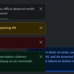 Advanced Alert Notification System For Bootstrap 5 – AvalynxAlert.js
 SVG Gooey Toast Notification Library – Physics Toast
 Modern JavaScript Toast Notification & Modal Popup Library – JSPT
 Lightweight Toast & Growl Notifications Inspired by macOS – Toastify