


The NoticeKit JavaScript library provides 6 types of loading spinners and 5 types of toast notifications for modern web development.
How to use it:
1. To use this library, include the following files on the web page.
<link rel="stylesheet" href="./dist/notice.min.css" />
<script src="./dist/notice.min.js"></script>
2. Or import the NoticeKit as an ES module.
# NPM
$ npm i @ouduidui/notice
import Notice from "@ouduidui/notice";
import "@ouduidui/notice/style.css";
3. Create a new instance of the NoticeKit.
const instance = new Notice();
4. Show a loading spinner on the screen. Possible spinner types:
- ‘line’ (default)
- ‘dots’
- ‘dots_zoom’
- ‘cube_flip’
- ‘dots_spin’
- ‘cube_zoom’
// show the loading spinner
instance.showLoading({
  type: 'line'
});
// hide the loading spinner
instance.hideLoading()
5. Available options to customize the loading spinners.
instance.showLoading({
  // color of the loading spinner
  color: '#ffffff',
  // background color of the background overlay
  backgroundColor: 'rgba(0,0,0,.6)',
  // shows loading text
  title: 'Loading...',
  // font size of the loading text
  fontSize: 16,
});
6. Show a toast-like notification popup on the screen. Possible toast types:
- ‘default’ (default)
- ‘success’
- ‘error’
- ‘info’
- ‘warning’
instance.showToast({
  text: 'Toast Message Here'
  type: 'default'
});
7. Determine whether to auto dismiss the toast notification after 4 seconds. Default: true.
instance.showToast({
  autoClose: true
});
8. Determine whether to show a close button inside the toast notification. Default: false.
instance.showToast({
  showClose: false
});
Changelog:
v1.1.3 (07/24/2021)
- Update
See Also:
 Framework-Agnostic Toast Notifications with TypeScript – NotifyX
 Mathematical SVG Loading Animations in CSS & JS – Math Curve Loaders
 Advanced Toast/Tooltip/Popover/Confirm/Modal Notification Library – toast-anchor
 Developer-Friendly Toast Alerts in JavaScript – Toast-JS
 Modern Toast Popup JavaScript Library – EggyJS
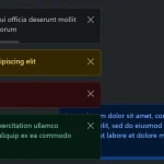 Advanced Alert Notification System For Bootstrap 5 – AvalynxAlert.js
 SVG Gooey Toast Notification Library – Physics Toast
 Modern JavaScript Toast Notification & Modal Popup Library – JSPT