


A tiny, easy-to-use, mobile-friendly modal popup library written in JavaScript and CSS/CSS3.
Features:
- Smooth animations based on CSS3 transitions and transforms.
- Blurs the main content when the modal popup is activated.
- Pretty nice clean design.
- Automatically turns the modal into a fullscreen swipeable popup on the mobile device.
How to use it:
1. Import the Easy Popup’s JavaScript and CSS files.
<link rel="stylesheet" href="dist/easy-popup.min.css">
<script src="dist/easy-popup.min.js"></script>
2. Add your modal content to a DIV container, assign a unique ID to it using the data-easy-popup attribute, and define the title in the data-easy-popup-title attribute.
<div data-easy-popup="example" data-easy-popup-title="My Modal Popup">
  Modal Content Here
</div>
3. Toggle the modal popup with an anchor link.
<a href="#example">
  Launch Modal Popup
</a>
4. Or via the open() method.
EasyPopup.get('example').open();5. Create & toggle the modal popup programmatically.
<div class="example-2">
  Modal Content
</div>
<a class="trigger">
  Launch Modal Popup
</a>
EasyPopup.init('.example-2', {
  id: 'example-2',
  title: 'Modal Popup 2',
  triggerSelector: '.trigger',
});
6. Customize the close button.
EasyPopup.init('.example-2', {
  id: 'example-2',
  title: 'Modal Popup 2',
  triggerSelector: '.trigger',
  closeButtonHTML: `<span>Close</span>`
});
7. Add an extra CSS class to the modal popup.
EasyPopup.init('.example-2', {
  id: 'example-2',
  title: 'Modal Popup 2',
  triggerSelector: '.trigger',
  outerClass: 'custom-class',
});
8. Determine whether to enable mobile layout on small screens. Default: true.
EasyPopup.init('.example-2', {
  id: 'example-2',
  title: 'Modal Popup 2',
  triggerSelector: '.trigger',
  hasMobileLayout: false,
});
9. Set the theme of the popup.
EasyPopup.init('.example-2', {
  id: 'example-2',
  title: 'Modal Popup 2',
  triggerSelector: '.trigger',
  theme: 'default', // or right-side
});
10. Determine whether to allow the user to close the popup by pressing the ESC key. Default: true.
EasyPopup.init('.example-2', {
  id: 'example-2',
  title: 'Modal Popup 2',
  triggerSelector: '.trigger',
  keyboard: false,
});
11. Auto show the popup on page load or after x seconds.
EasyPopup.init('.example-2', {
  id: 'example-2',
  title: 'Modal Popup 2',
  triggerSelector: '.trigger',
  autoShow: true, // or 5000, 3000, 1000, etc.
});
12. Config cookies.
EasyPopup.init('.example-2', {
  id: 'example-2',
  title: 'Modal Popup 2',
  triggerSelector: '.trigger',
  autoShow: true, // or 5000, 3000, 1000, etc.
});
13. You can also pass options via HTML data attributes as follows:
<div data-easy-popup="demo"
     data-easy-popup-mobile="true"
     data-easy-popup-title="Popup title"
     data-easy-popup-theme="right-side"
     data-easy-popup-click-outside-to-close="false">
    <p>Your content.</p>
</div>
14. Event handlers.
EasyPopup.init('.example-2', {
  id: 'example-2',
  title: 'Modal Popup 2',
  triggerSelector: '.trigger',
  onOpen: data => {},
  onClose: data => {},
});
15. API methods.
const myPopup = EasyPopup.get('example');
myPopup.open();
myPopup.close();
myPopup.toggle();
Changelog:
v1.3.0 (05/20/2025)
- feat(layout): add theme left side
- New theme: Corner layout
- feat(_index.js) add field named version in EasyPopup
v1.2.0 (10/20/2024)
- fix(outerClass): trim string to avoid adding empty class
- Remove layout shift on popup open
v1.1.0 (10/07/2024)
- hasMobileLayout: showing 2 close buttons on desktop
v1.0.1 (07/01/2024)
- Add aria-label to close popup button
- Extra classes in option outerClass
- Merge staging
v1.0.0 (10/17/2023)
- Small fixes for the close button position on the mobile layout.
- Fix retrieving the wrong popup ID when init.
- Shorten some CSS classes and deprecate title and closeButtonHTML
v0.2.1 (09/07/2023)
- improve get options
v0.2.0 (08/03/2023)
- Add events manager
- Add config file
v0.1.1 (07/28/2023)
- fix(cookie): not create new Cookie object if no cookie option found
v0.1.0 (06/29/2023)
- Set cookie with PiaJs
v0.0.9 (05/08/2023)
- Add aria-label for the close popup button to enhance accessibility.
v0.0.8 (01/13/2023)
- getOptions > refactor code for reuse through multiple ESLibs
v0.0.7 (12/29/2022)
- Add CSS variables
- Skip double init
- Add autoShow
v0.0.6 (12/27/2022)
- Init by data attribute with JSON Format
v0.0.5 (08/31/2022)
- add option keyboard for easy popup
v0.0.4 (08/30/2022)
- add theme right side
See Also:
 Accessible Dropdown Menu Component In Vanilla JavaScript – a11y-dropdown-component
 Animate Elements On Scroll – AOS
 Clip Elements On Scroll – scrollToClip
 Generate Random User Agents With Rotation.js
 Add Custom Spotlight Effects to Mouse Movements – gradient-cursor
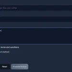 Modern Web Styling Without Class Declarations – Classless.css
 Standalone ES6 JavaScript Tooltip Library – Tipfy.js
 SVG Based QR Code Generator – QRcode.js