


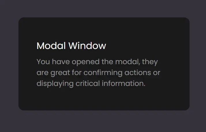
A collection of 3 modern animated modal window templates that can be used to display custom content or prompts to your users. Written in HTML, JavaScript, and CSS/CSS3.
Modal 1:
<button onclick="toggleModal()" type="button">Open Modal</button>
<div class="modal-background" onclick="toggleModal()"></div>
<div class="modal">
  <h2>Modal Window</h2>
  <p>Modal Content
  </p>
</div>
.modal-background {
  position: fixed;
  top: 0;
  left: 0;
  width: 100%;
  height: 100%;
  display: grid;
  place-items: center;
  opacity: 0;
  visibility: hidden;
  transform: scale(1, 1);
  background: rgba(0, 0, 0, 0.5);
  transition: 0.5s;
}
body.open .modal-background {
  visibility: visible;
  opacity: 1;
  animation: background-in 1s both;
}
@keyframes modal-in {
  0%,
  50% {
    width: 118px;
    border-radius: 50%;
  }
  55%,
  100% {
    right: 50%;
  }
  60% {
    width: 300px;
    border-radius: 12px;
  }
  75% {
    translate: 50% -50%;
  }
}
.modal {
  transition: 0.5s;
}
.modal {
  position: fixed;
  top: 50%;
  right: -300px;
  translate: 50% -50%;
  background: #1d2025;
  color: #f9f9f9;
  padding: 48px 40px;
  width: 300px;
  height: 118px;
  border-radius: 12px;
}
@keyframes modal-content-in {
  0%,
  75% {
    opacity: 0;
  }
  85%,
  100% {
    opacity: 1;
  }
}
body.open .modal-content {
  animation: modal-content-in 1s both;
}
body.open > .page-content {
  scale: 0.75;
}
body.open .modal {
  animation: modal-in 1s both;
}
const toggleModal = () => {
const bodyClassList = document.body.classList;
if (bodyClassList.contains("open")) {
bodyClassList.remove("open");
bodyClassList.add("closed");
} else {
bodyClassList.remove("closed");
bodyClassList.add("open");
}
};Modal 2:
<button onclick="toggleModal()" type="button">Open Modal</button>
<div class="background" onclick="toggleModal()"></div>
<div class="modal">
  <h2>Modal Window</h2>
  <p>Modal Content
  </p>
</div>
.background {
  position: fixed;
  top: 0;
  left: 0;
  width: 100%;
  height: 100%;
  display: grid;
  place-items: center;
  opacity: 0;
  visibility: hidden;
  background: rgba(0, 0, 0, 0.5);
}
body.open .background {
  visibility: visible;
  opacity: 1;
}
@keyframes modal-in {
  0% {
    translate: -50% 10%;
    scale: 0.5;
  }
  100% {
    opacity: 1;
    scale: 1;
    visibility: visible;
  }
}
.modal,
.background {
  transition: 0.5s;
}
.modal {
  position: fixed;
  top: 50%;
  left: 50%;
  background: #1a1a1a;
  color: #f9f9f9;
  padding: 48px 40px;
  width: 300px;
  border-radius: 12px;
  translate: -50% -50%;
  scale: 1;
  opacity: 0;
  visibility: hidden;
}
body.open > .page-content {
  scale: 0.75;
}
body.open .modal {
  opacity: 1;
  visibility: visible;
  animation: modal-in 0.5s;
}
const toggleModal = () => document.body.classList.toggle("open");Modal 3:
<button onclick="toggleModal()" type="button">Open Modal</button>
<div class="background" onclick="toggleModal()"></div>
<div class="modal">
  <h2>Modal Window</h2>
  <p>Modal Content
  </p>
</div>
.background {
  position: fixed;
  top: 0;
  left: 0;
  width: 100%;
  height: 100%;
  display: grid;
  place-items: center;
  opacity: 0;
  visibility: hidden;
  background: rgba(0, 0, 0, 0.5);
}
body.open .background {
  visibility: visible;
  opacity: 1;
}
.background {
  position: fixed;
  top: 0;
  left: 0;
  width: 100%;
  height: 100%;
  display: grid;
  place-items: center;
  opacity: 0;
  visibility: hidden;
  background: rgba(0, 0, 0, 0.5);
}
body.open .background {
  visibility: visible;
  opacity: 1;
}
@keyframes modal-in {
  0%,
  50% {
    width: 118px;
    border-radius: 50%;
  }
  55%,
  100% {
    right: 50%;
  }
  60% {
    width: 300px;
    border-radius: 12px;
  }
  75% {
    translate: 50% -50%;
  }
}
.modal,
.background {
  transition: 0.5s;
}
.modal {
  position: fixed;
  top: 50%;
  right: -300px;
  translate: 50% -50%;
  background: #1d2025;
  color: #f9f9f9;
  padding: 48px 40px;
  width: 300px;
  height: 118px;
  border-radius: 12px;
}
@keyframes modal-content-in {
  0%,
  75% {
    opacity: 0;
  }
  85%,
  100% {
    opacity: 1;
  }
}
body.open .modal-content {
  animation: modal-content-in 1s both;
}
body.open > .page-content {
  scale: 0.75;
}
body.open .modal {
  animation: modal-in 1s both;
}
const toggleModal = () => document.body.classList.toggle("open");
See Also:
 Create Smooth Toggle Button Animations with View Transition API
 Rotate & Transform SVG Elements With One Finger – rotodrag-js
 Fancy Three-dots Loading Spinners With Pure CSS – Three Dots
 Smooth Inline Editing JavaScript Library – Malle
 Convert Images to Pixel Art with JS Dithering & Custom Palettes – Image-to-Pixel
 Interactive Horizontal/Vertical Image Comparison Slider – Pixelcompare
 Versatile Slider & Carousel JavaScript Library – Swiffy Slider
 Easy Parallax Scrolling Effect In Vanilla JavaScript – parallax-vanilla