


A CSS library to generate an animated, highly customizable skeleton preview of your web content using a single DIV. Can be used as an interactive loading indicator when your content is being loaded into the document.
Supports commonly used UI components such as lists, cards, images, charts, paragraphs, and much more.
How to use it:
1. Install and import the css-skeletons.css.
# NPM
$ npm i css-skeletons --save
import 'css-skeletons'
2. Or directly import the compiled stylesheet in the document.
<link rel="stylesheet" href="css/css-skeletons.css" />
3. Create a skeleton preview of paragraphs.
<div class="skeleton skeleton-line"
  style="
    --lines: 3;
    --c-bg: #faecf6;
    --bg: #eeb6e0;
    --shine: #f5c3da;
  "
></div>
4. Create a skeleton preview of block content.
<div class="skeleton skeleton-rect"
  style="
    --rect-h: 150px;
    --lines: 3;
  "
></div>
5. Create a skeleton preview of user profiles.
<div class="skeleton skeleton-circle-multi-line"
  style="
    --c-s: 80px;
    --c-pos: top;
    --lines: 4;
  "
></div>
6. Create a skeleton preview of bar & line charts.
<div class="skeleton skeleton-chart-columns"
  style="
    --cols: 10;
    --col-w: 30px;
    --col-gap: 20px;
  "
></div>
<div class="skeleton skeleton-chart-line"
style="
--c-w: 400px;
--chart-h: 150px;
--chart-btm: 60px;
"
></div>7. Create a skeleton preview of cards.
<div class="skeleton skeleton-card-1"
  style="
    --c-w: 500px;
    --card-h: 120px;
  "
></div>
8. Create a skeleton preview of lists.
<div class="skeleton skeleton-list"
  style="
    --lines: 5;
    --c-w: 400px;
  "
></div>
9. Create a skeleton preview of videos.
<div class="skeleton skeleton-youtube"></div>
10. Create a skeleton preview of images.
<div class="skeleton skeleton-image"
  style="
    --i-w: 300px;
    --c-bg: #f8f7fc;
  "
></div>
11. All possible CSS variables and helpers.
- –c-w: Container width. Default: 300px
- –c-p: Container padding. Default: 10px
- –c-bg: Background color. Default: transparent
- –bg: Background color of shapes. Default: #e2e1eb
- –shine: Shine color. Default: rgba(255,255,255, 0.2)
- –t: Animation duration. Default: 2s
- –lines: Number of lines. Default: 1
- –l-h: Line height. Default: 20px
- –l-gap: Gap betweenlines. 10px
- –g-gap: Gap betweengroups. Default: 15px
- –c-s: Circle size. Default: 40px
- –c-pos: Circle position: top, bottom, center or percent value
- –rect-h: Rectangle height. Default: 80px
- –chart-h: Chart height. Default: 200px
- –chart-btm: Bottom height. Default: 40px
- –cols: Number of columns. Default: 5 (Max 10)
- –col-w: Column width. Default: 25px
- –col-gap: Gap between columns. Default:25px
- –card-h: Card height. Default:150px
- –f-l-w: First line width. Default: 90%
- –f-l-h: First line height. Default: 25px
- –s-l-w: Second line width. Default: 70%
- –s-l-h: Second line height. Default:20px
- –s-l-m-t: Second line margin-top. Default: 15px
- –f-l-c: First line color. Default: #e2e1eb
- –s-l-c: Second line color. Default:#e2e1eb
- –bullet-ratio: Bullet size depending on –l-h.
- –i-w: Width and height of .skeleton-image. Default: 250px
- .adapt-to-circle: Adpat to circile in ‘.skeleton-circle-multi-line’
- .no-animate : Disable animation.
Changelog:
v1.0.7 (07/19/2021)
- bugfix
See Also:
 Auto-Generated Skeleton Loader Web Component for Any Framework – phantom-ui
 Convert HTML Elements to Skeleton Loaders with SkeletonJS
 Highly Customizable Skeleton Loader In Pure CSS – Skeleton Mammoth
 Facebook Inspired Skeleton Loader In Pure CSS – Placeholder Loading
 Animated Skeleton Loading Screens In Pure CSS
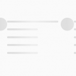 Animated Skeleton Loader In Pure JavaScript
 Material Design 3 Expressive Loading Indicator to React/Vue/Svelte/Vanilla JS
 Math Curve Loaders: Mathematical SVG Loading Animations in CSS & JS