


loading-Bar is a JavaScript library for creating highly customizable progress bars to visualizing loading status by filling SVG shapes.
How to use it:
1. Load the loading-Bar’s JavaScript and Stylesheet in the document.
<link rel="stylesheet" href="loading-bar.css" />
<script src="loading-bar.js"></script>
2. Create a basic SVG ‘Line’ progress bar.
// 60%
<div class="ldBar" data-value="60"></div>
3. Or render a progress bar in a given container using JavaScript.
var myBar = new ldBar("#myContainer");
// or
var myBar = document.getElementById('myContainer').ldBar;
5. Display a label inside the progress bar.
<div class="ldBar label-center" data-value="60"></div>
4. Apply custom styles to the progress bar.
.ldBar path.mainline {
  /* your own styles here */
}
.ldBar path.baseline {
  /* your own styles here */
}
.ldBar-label {
  /* your own styles here */
}
5. Built-in presets:
- line
- fan
- circle
- bubble
- rainbow
- energy
- stripe
- text
<div class="ldBar label-center" data-value="50" data-preset="fan">
</div>
6. All possible data attributes to config the progress bar.
- data-type: Progress type. stroke or fill
- data-fill-dir: Growth direction of fill type progress bar. ttb – top to bottom, btt – bottom to top, ltr – left to right, or rtl – right to left
- data-stroke-dir: Growth direction of stroke type progress bar. normal or reverse
- data-img: Custom SVG image
- data-path: SVG Path command
- data-fill: Fill color, pattern or image when using a fill type progress bar with custom data-path. could be image, generated patterns or colors.
- data-fill-background: Fill color of the background shape in fill type progress bar.
- data-fill-background-extrude: Size of the background shape in fill type progress bar.
- data-stroke: Stroke color or pattern.
- data-stroke-width: Stroke width of the progress bar.
- data-stroke-trail: Trail color.
- data-stroke-trail-width: Trail width.
- data-pattern-size: Specify pattern size; e.g., 100
- data-img-size: Specify image size; e.g., 200,100
- data-min: Minimal value
- data-max: Maximal value
- data-precision: Control how values are rounded. e.g., “0.01” rounds values to second decimal place.
- data-duration: Bar animation duration.
- data-transition-in: Animate the bar for entering transition, when value is set by data-value.
7. Or pass the options to the ldBar function.
var myBar = new ldBar(".myContainer", {
    "type": 'stroke',
    "img": '',
    "path": 'M10 10L90 10M90 8M90 12',
    "fill-dir": 'btt',
    "fill": '#25b',
    "fill-background": '#ddd',
    "fill-background-extrude": 3,
    "pattern-size": null,
    "stroke-dir": 'normal',
    "stroke": '#25b',
    "stroke-width": '3',
    "stroke-trail": '#ddd',
    "stroke-trail-width": 0.5,
    "duration": 1,
    "easing": 'linear',
    "value": 0,
    "img-size": null,
    "bbox": null,
    "set-dim": true,
    "aspect-ratio": "xMidYMid",
    "transition-in": false,
    "min": 0,
    "max": 100,
    "precision": 0,
    "padding": undefined
});
8. Update the progress bar with or without animation.
myBar.set(
  60, // 60%
  false // disable animation
);
See Also:
 Pure CSS Progress Bar Library with Custom Themes – progress-bar.css
 Modern TypeScript Progress Bar Library – BProgress
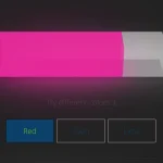 3D Liquid Progress Bar in Pure CSS/CSS3
 Easy Scroll Position Tracking – ScrollProgress.js
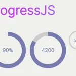 Visualize Progress Data With Animated, Circular Progress Bars – ProgressJS
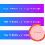 Radial Progress Indicator For Click-and-hold Actions – HoldCircleJS
 Simple Scroll Progress Indicator For Long Pages – PageBar.js
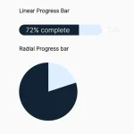 Generate Linear & Radial Progressbars Using CSS – Progress.css