


Orbit Menu is a lightweight JavaScript library that transforms HTML elements into interactive radial menus.
When you click its trigger, Orbit Menu pops out menu items in a circle around it. Click the trigger again, or click anywhere outside the menu, and the menu items will dismiss smoothly.
This is helpful for UIs where screen space is at a premium or when you want a more dynamic way to present options than a standard dropdown.
Use Cases
- Mobile App Navigation: Create floating action buttons that expand into contextual menu options without blocking screen content
- Dashboard Controls: Implement radial toolbars around key interface elements for quick access to related functions
- Gaming Interfaces: Build circular ability wheels or context menus that feel natural for touch and mouse interactions
- Creative Applications: Design artist tools with brush options, color pickers, or filter controls arranged in circular patterns
How to use it:
1. Import Orbit Menu’s JavaScript and CSS into your document.
<!-- Browser -->
<link rel="stylesheet" href="/src/orbit-menu.css">
<script src="/dist/orbit-menu.umd.js"></script>
<!-- ES Module -->
<script type="module">
import OrbitMenu from './dist/orbit-menu.esm.js';
</script>
2. Initialize the Orbit Menu.
OrbitMenu.attachOrbitMenus();
OrbitMenu.addOrbitActions('orbit-menu-1', {
  // any actions here
});
3. Create your menu using <span> elements (or other inline-block elements). The first <span> acts as the trigger, subsequent <span>s are the menu items.
<span id="orbit-menu-example" class="orbit-menu">
  <span>Menu</span>
  <span><a href="#">1</a></span>
  <span><a href="#">2</a></span>
  <span><a href="#">3</a></span>
  ... more items here ...
</span>
4. The library provides minimal CSS. You’ll want to style the trigger and items to match your design. The items get a .show class when visible.
.orbit-menu {
  border-radius: 50%;
  background: #222;
  color: #fff;
  width: 50px;
  height: 50px;
  display: flex;
  justify-content: center;
  align-items: center;
  cursor: pointer;
}
.orbit-menu > :nth-child(n+2).show {
  border-radius: 50%;
  padding: 20px;
  background: #222;
  color: #fff;
  width: 30px;
  height: 30px;
  display: flex;
  justify-content: center;
  align-items: center;
}
5. Config your menu with the following HTML data attributes:
Menu-level data attributes:
data-sector: Total angle span in degrees (default: 360)data-rx-offset: Horizontal spacing from center in pixels (default: 50)data-ry-offset: Vertical spacing from center in pixels (default: 50)data-angle-offset: Starting angle for first item in degrees (default: 0)data-close: Close menu after any item click (default: true)
Item-level data attributes:
data-action: Callback function name defined inaddOrbitActionsdata-close: Override menu-level close behavior for specific items
FAQs
Q: How can I style individual menu items differently?
A: Each menu item is a <span> (or whatever element you used). You can target them with CSS using nth-child selectors on the parent .orbit-menu container (e.g., .orbit-menu > span:nth-child(2) for the first item, .orbit-menu > span:nth-child(3) for the second, etc., since nth-child(1) is the trigger). Alternatively, add custom classes or data-* attributes to your item <span>s and style based on those.
Q: Can I use icons or images instead of text in the menu items?
A: Yes. Just place an <img> tag, an icon font (like Font Awesome <i> tags), or an SVG inside the item <span>. For example: <span data-action="edit"><i class="fas fa-pencil-alt"></i></span>. You’ll need to adjust your CSS for sizing and alignment.
Q: What if my trigger button isn’t perfectly circular? How does that affect item placement?
A: The library calculates rx and ry (the radii of the orbit path) based on (trigger.width / 2) + rxOffset and (trigger.height / 2) + ryOffset. So, item positions are relative to the center of the trigger’s bounding box. If your trigger is, say, a rectangle, the items will still orbit its geometric center. You can use different data-rx-off-set and data-ry-off-set values to create an elliptical orbit that might better suit a non-circular trigger.
Q: How does the menu behave if there are too many items to fit comfortably?
A: The items will be distributed along the data-sector angle. If you have many items in a small sector or with small offsets, they will likely overlap. There’s no built-in collision detection or automatic layout adjustment beyond the defined parameters. You’d need to manage the number of items or adjust data-sector, data-rx-off-set, and data-ry-off-set to ensure a good visual layout.
See Also:
 Pure CSS Radial Menu with Native Select Element
 Build Modern Accessible Circular Menus with Pure CSS – Radial Menu
 Beautiful Radial Popup Menu With JavaScript And CSS
 Versatile Radial Menu In Pure CSS – radialMenu.css
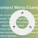 Touch-enabled Radial Context Menu In Pure JavaScript – radialMenu
 Multi-level Radial Tree Menu In Pure CSS
 Corner Radial Menu In JavaScript/CSS/SVG
 Radial Toggle Menu With JavaScript And CSS3