


A pure CSS circular navigation component that converts a native HTML <select> element into a fully styled radial menu.
It positions clickable items in a ring around a central toggle button, animates their entry with smooth CSS transitions, and adapts to light and dark color schemes through native CSS color functions.
Features:
- The native
<select>element manages open/close state natively. appearance: base-selectstyling.- Automatic radial positioning.
@starting-styleentry animations.- Staggered animation support.
- CSS custom variables.
- Automatic light/dark mode.
- SVG icon support.
- Graceful fallback.
How to Use It:
1. Create the HTML Structure. The component is a native <select> element. The first <option> acts as the center toggle/close icon. Every subsequent <option> becomes a radial menu item. Each item holds an inline SVG and a <span> label.
<select>
  <!-- The <button> renders the currently selected option's icon -->
  <button>
    <selectedcontent></selectedcontent>
  </button>
  <!-- First option: stays at center as the menu/close toggle -->
  <option>
    <svg xmlns="http://www.w3.org/2000/svg" viewBox="0 0 24 24">
      <g fill="none" stroke="currentColor" stroke-width="2"
         stroke-linecap="round" stroke-linejoin="round">
        <path d="M4 6l16 0" />
        <path d="M4 12l16 0" />
        <path d="M4 18l16 0" />
      </g>
    </svg>
    <span>Menu</span>
  </option>
  <!-- Radial item: Home -->
  <option>
    <svg xmlns="http://www.w3.org/2000/svg" viewBox="0 0 24 24" fill="currentColor">
      <path stroke="none" d="M0 0h24v24H0z" fill="none"/>
      <path d="M12.707 2.293l9 9c.63 .63 .184 1.707 -.707 1.707h-1v6a3 3 0 0 1
               -3 3h-1v-7a3 3 0 0 0 -2.824 -2.995l-.176 -.005h-2a3 3 0 0 0 -3
               3v7h-1a3 3 0 0 1 -3 -3v-6h-1c-.89 0 -1.337 -1.077 -.707
               -1.707l9 -9a1 1 0 0 1 1.414 0m.293 11.707a1 1 0 0 1 1 1v7h-4v-7a1
               1 0 0 1 .883 -.993l.117 -.007z"/>
    </svg>
    <span>Home</span>
  </option>
  <!-- Radial item: Messages -->
  <option>
    <svg xmlns="http://www.w3.org/2000/svg" viewBox="0 0 24 24" fill="currentColor">
      <path stroke="none" d="M0 0h24v24H0z" fill="none"/>
      <path d="M18 3a4 4 0 0 1 4 4v8a4 4 0 0 1 -4 4h-4.724l-4.762 2.857a1 1 0 0
               1 -1.508 -.743l-.006 -.114v-2h-1a4 4 0 0 1 -3.995 -3.8l-.005
               -.2v-8a4 4 0 0 1 4 -4zm-4 9h-6a1 1 0 0 0 0 2h6a1 1 0 0 0 0
               -2m2 -4h-8a1 1 0 1 0 0 2h8a1 1 0 0 0 0 -2"/>
    </svg>
    <span>Messages</span>
  </option>
  <!-- Add more <option> items following the same pattern -->
  <!-- sibling-index() auto-recalculates the ring for each new item -->
</select>
2. Add the CSS to your webpage.
@layer demo;
/* ══════════════════════════════════════════════════════════
   DEMO LAYER — radial menu configuration and styles
   ══════════════════════════════════════════════════════════ */
@layer demo {
  :root {
    /* Allows CSS to animate to/from keyword sizes like 'auto' */
    interpolate-size: allow-keywords;
    /* Global animation speed — applies to all transitions */
    --transition-duration: 300ms;
    /* ── Toggle button ── */
    --select-width: 100px;
    --select-padding: .25rem .75rem;
    --select-text-color: light-dark(rgb(113 113 123), rgb(245 245 245));
    --select-bg-color: light-dark(rgb(245 245 245), dodgerblue);
    --select-bg-color-hover: light-dark(rgb(228 228 231), rgb(0 105 168));
    --select-border-color: 1px solid light-dark(rgb(212 212 216), rgb(0 105 168));
    /* ── Picker container (the floating options panel) ── */
    --option-list-size: calc(var(--select-width) * 4); /* total ring area diameter */
    --option-list-bg-color: light-dark(rgb(226 232 240), rgb(29 41 61));
    --option-list-border: 1px solid var(--clr-lines);
    --option-list-padding: 1rem;
    --option-list-radius: 10px;
    /* ── Individual option items ── */
    --option-size: var(--select-width);
    --option-padding: 2rem;
    --option-offset: calc(var(--select-width) * 1); /* ring radius: distance from center */
    --option-radius: 9in;                           /* 9in = full circle (pill trick) */
    --option-font-size: .8rem;
    --option-border: none;
    --option-border-color: var(--clr-lines);
    --option-bg-color: light-dark(rgb(202 213 226), rgb(69 85 108));
    --option-bg-color-hover: rgb(0 105 168);
    --option-bg-color-selected: deeppink;
    --option-text-color: light-dark(rgb(10 113 123), rgb(255 255 255));
    --option-text-color-hover: white;
    --option-text-color-selected: white;
    /* ── selectedcontent (icon displayed inside the button) ── */
    --selected-element-radius: var(--option-radius);
    --selected-element-padding: var(--option-padding);
    --selected-element-bg-color: var(--option-bg-color);
    --selected-element-text-color: var(--option-text-color);
    --selected-element-border-color: var(--option-border-color);
  }
  /* ── Fallback: standard dropdown for non-supporting browsers ── */
  select {
    width: var(--select-width);
    margin-inline: auto;
    background-color: var(--select-bg-color);
    color: var(--select-text-color);
    padding: var(--select-padding);
    border: var(--select-border-color);
    outline: 1px dashed transparent;
    transition: scale var(--transition-duration) ease-in-out;
    &:hover, &:focus, &:active { scale: 1.1; }
    &:focus-visible {
      outline: 1px dashed dodgerblue;
      outline-offset: 5px;
    }
    /* Hide SVGs and the first "menu" option in fallback mode */
    selectedcontent > svg, option > svg { display: none; }
    option:first-of-type { display: none; }
  }
  /* ══════════════════════════════════════════════════════════
     Radial styles — only applied in supporting browsers
     ══════════════════════════════════════════════════════════ */
  @supports (appearance: base-select) {
    /* Opt both the select and its picker into base-select rendering */
    select, ::picker(select) {
      appearance: base-select;
    }
    select {
      background-color: transparent;
      border: none;
      padding: 0;
      border-radius: 9in; /* circular button */
      /* Remove the default dropdown arrow */
      &::picker-icon { display: none; }
      /* ── Labels: hidden by default, revealed on hover ── */
      selectedcontent > span,
      option > span {
        display: block;
        position: absolute;
        bottom: 1em;
        left: 50%;
        translate: -50% 50%;
        transition: all var(--transition-duration) ease-in-out;
        opacity: 0;
      }
      /* ── SVG icons: shown in both button and options ── */
      selectedcontent > svg,
      option > svg {
        display: block;
        width: 100%;
        aspect-ratio: 1;
        transition:
          scale var(--transition-duration) ease-in-out,
          translate var(--transition-duration) ease-in-out;
      }
      /* ── Toggle button ── */
      button {
        width: var(--select-width);
        aspect-ratio: 1;
        selectedcontent {
          display: grid;
          place-content: center;
          padding: var(--selected-element-padding);
          border: 1px solid var(--selected-element-border-color);
          border-radius: var(--selected-element-radius);
          background-color: var(--selected-element-bg-color);
          color: var(--selected-element-text-color);
          transition:
            opacity var(--transition-duration) ease-in-out,
            scale var(--transition-duration) ease-in-out;
        }
      }
      /* Fade and shrink the button icon when the picker opens */
      &:open selectedcontent {
        opacity: 0;
        scale: .5;
      }
      /* ── Picker container ── */
      &::picker(select) {
        /* sibling-count() returns the total option count; subtract 1 for the menu item */
        --items: calc(sibling-count() - 1);
        pointer-events: none;
        position-area: span-all; /* anchor picker over the select element */
        width: var(--option-list-size);
        aspect-ratio: 1;
        border: none;
        background: transparent;
        opacity: 0;
        scale: 0;
        transition: all var(--transition-duration) allow-discrete;
        backdrop-filter: blur(2px);
      }
      /* Animate picker panel in when open */
      &:open::picker(select) {
        pointer-events: auto;
        opacity: 1;
        scale: 1;
        /* Entry state for the opening animation */
        @starting-style {
          opacity: 0;
          scale: .4;
        }
      }
      /* ── Option items ── */
      option {
        /* First option stays at center as the close toggle */
        &:first-of-type {
          display: block;
          scale: .5;
          transition: 0ms; /* instant — no animation for the center icon */
        }
        /* All other items are distributed around the ring */
        &:not(:first-of-type) {
          --i: calc(sibling-index());
          /* Divide 360° evenly across all non-menu items */
          --angle: calc(360deg / calc(var(--items) - 1) * var(--i));
          transform:
            rotate(var(--angle))           /* rotate to calculated position */
            translate(var(--option-offset)) /* push outward by ring radius */
            rotate(calc(var(--angle) * -1)); /* counter-rotate: keeps icon upright */
        }
        /* Common layout for all options */
        grid-area: 1/1;
        position: absolute;
        inset: 50%;
        translate: -50% -50%;
        cursor: pointer;
        width: var(--option-size);
        aspect-ratio: 1;
        padding: var(--option-padding);
        border-radius: var(--option-radius);
        border: 1px solid var(--option-border-color);
        color: var(--option-text-color);
        background-color: var(--option-bg-color);
        isolation: isolate;
        outline: 1px dashed transparent;
        /* Remove the native checkmark glyph */
        &::checkmark { display: none; }
        /* Highlight the currently selected item */
        &:checked {
          background: var(--option-bg-color-selected);
          color: var(--option-text-color-selected);
        }
        transition:
          color var(--transition-duration) ease-in-out,
          opacity var(--transition-duration) ease-in-out,
          outline var(--transition-duration) ease-in-out,
          /* stagger delay: each item waits (index - 1) × 200ms */
          scale var(--transition-duration) ease-in-out calc((var(--i) - 1) * 200ms),
          background-color var(--transition-duration) ease-in-out;
      }
      /* Hover / focus: reveal label, shift icon upward */
      option:hover,
      option:focus-visible {
        background-color: var(--option-bg-color-hover);
        color: var(--option-text-color-hover);
        span { opacity: 1; translate: -50% -2ex; }
        svg  { scale: .5; translate: 0 -2ex; }
        &:focus-visible {
          outline: 1px dashed dodgerblue;
          outline-offset: 5px;
        }
      }
    }
    /* ── Stagger animation — active when checkbox is checked ── */
    /* The :has() selector detects checkbox state; no JS needed */
    body:has(input#stagger-toggle:checked) select:open option {
      @starting-style {
        scale: 0;
      }
    }
  } /* end @supports */
} /* end @layer demo */
3. Customize the radial menu with the followng CSS variables:
--transition-duration(time): Global animation speed for all transitions. Default:300ms.--select-width(length): Diameter of the circular toggle button. This drives derived calculations for item size and ring geometry. Default:100px.--select-padding(length): Padding applied to the fallback<select>element only. Default:.25rem .75rem.--select-text-color(color): Text color of the fallback<select>. Default:light-dark(rgb(113 113 123), rgb(245 245 245)).--select-bg-color(color): Background color of the fallback<select>. Default:light-dark(rgb(245 245 245), dodgerblue).--select-bg-color-hover(color): Background of the fallback<select>on hover. Default:light-dark(rgb(228 228 231), rgb(0 105 168)).--select-border-color(border shorthand): Border of the fallback<select>. Default:1px solid light-dark(...).--option-list-size(length): Total diameter of the floating picker container. Default:calc(var(--select-width) * 4).--option-list-bg-color(color): Background color of the picker container. Default:light-dark(rgb(226 232 240), rgb(29 41 61)).--option-list-border(border shorthand): Border of the picker container. Default:1px solid var(--clr-lines).--option-list-padding(length): Padding inside the picker container. Default:1rem.--option-list-radius(length): Border radius of the picker container. Default:10px.--option-size(length): Width and height of each circular option button. Default:var(--select-width).--option-padding(length): Padding inside each option item. Default:2rem.--option-offset(length): Outward translation applied to each option. This is the ring radius. Default:calc(var(--select-width) * 1).--option-radius(length): Border radius of each option. Use9infor a full circle. Default:9in.--option-font-size(length): Font size of option labels. Default:.8rem.--option-border(border shorthand): Border style of option items. Default:none.--option-border-color(color): Border color of option items. Default:var(--clr-lines).--option-bg-color(color): Default background color of option items. Default:light-dark(rgb(202 213 226), rgb(69 85 108)).--option-bg-color-hover(color): Background of an option on hover. Default:rgb(0 105 168).--option-bg-color-selected(color): Background of the currently selected option. Default:deeppink.--option-text-color(color): Default text and icon color of option items. Default:light-dark(rgb(10 113 123), rgb(255 255 255)).--option-text-color-hover(color): Text color on hover. Default:white.--option-text-color-selected(color): Text color of the selected option. Default:white.--selected-element-radius(length): Border radius of the<selectedcontent>block inside the toggle button. Default:var(--option-radius).--selected-element-padding(length): Padding of the<selectedcontent>block. Default:var(--option-padding).--selected-element-bg-color(color): Background of the<selectedcontent>block. Default:var(--option-bg-color).--selected-element-text-color(color): Text color of the<selectedcontent>block. Default:var(--option-text-color).--selected-element-border-color(color): Border color of the<selectedcontent>block. Default:var(--option-border-color).
See Also:
 Beautiful Radial Popup Menu With JavaScript And CSS
 Radial Toggle Menu With JavaScript And CSS3
 Path-style Animated Radial Menu – BloomingMenu.js
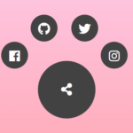 Radial Popup Menu In Pure CSS – Circle Menu
 Build Modern Accessible Circular Menus with Pure CSS – Radial Menu
 Interactive Radial Menus in JavaScript – Orbit Menu
 Expanding Spiral Menu With JavaScript And CSS3
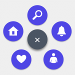 Rotating Circle Menu With JavaScript And CSS – Pentagon Menu