


This is a modern, customizable, space-saving radial (circular) navigation menu built using HTML & CSS. No JavaScript needed.
It transforms traditional hamburger menu interactions into elegant circular layouts that expand from a central toggle button.
Each menu item positions itself along a perfect circle using CSS transforms and custom properties.
Features
- Fully responsive design: Adapts to different screen sizes automatically
- Smooth animations: Uses CSS transitions for fluid opening and closing effects
- Accessibility focused: Includes proper ARIA labels and keyboard navigation support
- Customizable styling: CSS custom properties for easy theming and sizing
- Performance optimized: Uses transform3d for hardware acceleration
How to use it:
1. Add the HTML structure to your page. The radial menu uses a checkbox input to control the menu state without JavaScript:
input type="checkbox": This is the hidden state machine. Its:checkedstatus determines if the menu is open or closed.<label for="toggle">: This is the visible hamburger menu button that controls the checkbox.ul.menu-list: The container for the menu items.<li style="--i: 0">: Each menu item needs an inline custom property--ithat represents its index, starting from 0. This is critical for the CSS to position each item correctly around the circle.
<nav class="menu" aria-label="Main Menu">
  <input
    type="checkbox"
    id="toggle"
    name="cb"
    class="visually-hidden"
  />
  <label
    for="toggle"
    aria-controls="menu-list"
    aria-label="Open/Close Menu"
  >
    <span class="burger" aria-hidden="true">
      <span></span>
      <span></span>
      <span></span>
    </span>
  </label>
  <ul class="menu-list">
    <li style="--i: 0">
      <a href="#" aria-label="Home">
        <span class="icon">
          <img
            src="/path/to/icon.svg"
            alt=""
            aria-hidden="true"
          />
        </span>
      </a>
    </li>
    <li style="--i: 1">
      <a href="#" aria-label="Account">
        <span class="icon">
          <img
            src="/path/to/icon.svg"
            alt=""
            aria-hidden="true"
          />
        </span>
      </a>
    </li>
    <li style="--i: 2">
      <a href="#" aria-label="Like">
        <span class="icon">
          <img
            src="/path/to/icon.svg"
            alt=""
            aria-hidden="true"
          />
        </span>
      </a>
    </li>
    <li style="--i: 3">
      <a href="#" aria-label="Settings">
        <span class="icon">
          <img
            src="/path/to/icon.svg"
            alt=""
            aria-hidden="true"
          />
        </span>
      </a>
    </li>
    <li style="--i: 4">
      <a href="#" aria-label="Logout">
        <span class="icon">
          <img
            src="/path/to/icon.svg"
            alt=""
            aria-hidden="true"
          />
        </span>
      </a>
    </li>
  </ul>
</nav>
2. The main CSS styles for the radial menu. Here, you can quickly modify the menu’s appearance. For instance, if you need 7 menu items instead of 5, you just change --count: 5; to --count: 7; and add the corresponding <li> elements to your HTML. The CSS will handle the rest.
:root {
  --count: 5;
  --radius: 6rem;
  --toggle-size: 4rem;
  --item-size: 3.5rem;
  --gap: 0.4rem;
  --bg: #f4f5f7;
  --fg: #2c2f36;
  --muted: rgba(0, 0, 0, 0.05);
  --shadow: 0 6px 18px rgba(0, 0, 0, 0.05);
  --duration: 200ms;
  --offset: -0.25turn;
}
nav.menu {
  position: relative;
  width: max(var(--toggle-size), var(--radius) * 2 + var(--item-size));
  height: max(var(--toggle-size), var(--radius) * 2 + var(--item-size));
  display: grid;
  place-content: center;
}
nav label {
  width: var(--toggle-size);
  aspect-ratio: 1;
  display: grid;
  place-items: center;
  background-color: #fff;
  border-radius: 50%;
  box-shadow: var(--shadow);
  cursor: pointer;
  transition: all var(--duration) ease;
  position: relative;
  z-index: 2;
  user-select: none;
}
nav label:active {
  transform: scale(0.94);
}
.burger {
  width: 40%;
  display: flex;
  flex-direction: column;
  position: relative;
  gap: var(--gap);
}
.burger span {
  display: block;
  height: 3px;
  border-radius: 2px;
  background: black;
  transition: all var(--duration) ease;
}
ul.menu-list {
  list-style: none;
  position: absolute;
  inset: 0;
  display: grid;
  place-items: center;
  transform: rotate(-90deg);
  transition: all calc(var(--duration) * 1.5) ease;
}
ul.menu-list li {
  position: absolute;
  top: 50%;
  left: 50%;
  width: var(--item-size);
  height: var(--item-size);
  aspect-ratio: 1;
  transform: translate(-50%, -50%)
  rotate(calc((var(--i) * 1turn / var(--count)) + var(--offset))) translate(0)
  rotate(calc(-1 * var(--i) * 1turn / var(--count)));
  transform-origin: center center;
  opacity: 0;
  transition: inherit;
}
ul.menu-list a {
  display: grid;
  place-items: center;
  width: 100%;
  height: 100%;
  background-color: #fff;
  border-radius: 50%;
  box-shadow: var(--shadow);
  text-decoration: none;
  color: inherit;
  outline: none;
  will-change: transform;
  transition: transform var(--duration) ease;
}
ul.menu-list a::before {
  content: "";
  position: absolute;
  inset: -1px;
  padding: 10px;
  background: linear-gradient(
    to right bottom,
    var(--muted),
    transparent,
    var(--muted)
  );
  z-index: -1 !important;
  border-radius: 50%;
}
ul.menu-list a:focus-visible {
  box-shadow: 0 0 0 3px rgba(59, 130, 246, 0.35), var(--shadow);
}
ul.menu-list a:hover {
  transform: scale(1.1);
  filter: brightness(1.03);
}
span.icon {
  width: 100%;
  height: 100%;
  aspect-ratio: 1;
  display: grid;
  place-items: center;
}
span.icon img {
  width: 50%;
  height: 50%;
}
#toggle:checked ~ ul.menu-list li {
  transform: translate(-50%, -50%)
  rotate(calc((var(--i) * 1turn / var(--count)) + var(--offset))) translate(var(--radius))
  rotate(calc(-1 * var(--i) * 1turn / var(--count)));
  opacity: 1;
}
#toggle:checked ~ ul.menu-list {
  transform: rotate(0);
}
#toggle:checked ~ ul.menu-list a {
  transform: rotate(.25turn);
}
#toggle:checked + label .burger span:nth-child(1) {
  transform: translateY(calc(var(--gap) + 100%)) rotate(.125turn);
}
#toggle:checked + label .burger span:nth-child(2) {
  opacity: 0;
}
#toggle:checked + label .burger span:nth-child(3) {
  transform: translateY(calc(-1 * var(--gap) - 100%))  rotate(-.125turn);
}
.visually-hidden {
  position: absolute !important;
  width: 1px;
  height: 1px;
  padding: 0;
  margin: -1px;
  overflow: hidden;
  clip: rect(0 0 0 0);
  white-space: nowrap;
  border: 0;
}
/* Reduces motion for users who are sensitive to animation */
@media (prefers-reduced-motion: reduce) {
  ul.menu-list li,
  label .burger span {
      transition: none !important;
  }
}
3. Customize the radial menu.
- Adjusting the radius: Change
--radiusto increase or decrease the menu’s spread. Larger values create more dramatic animations but require more screen space. - Modifying item count: Update both
--countand the number of<li>elements. The CSS automatically recalculates positioning for any number of items. - Animation timing: Adjust
--durationfor faster or slower transitions. The menu list usescalc(var(--duration) * 1.5)for a slightly delayed effect that feels more natural. - Color theming: Customize
--bg,--fg,--muted, and--shadowvariables to match your brand colors.
FAQs:
Q: How do I handle more than 8-10 menu items?
A: While technically possible, more than eight items creates crowded layouts and usability issues. Consider grouping related items into sub-menus or using alternative navigation patterns for complex menu structures.
Q: Does this work on mobile devices?
A: Yes, the library includes touch-friendly sizing and responsive design patterns. The aspect-ratio property and flexible units ensure proper scaling across different screen sizes. Test thoroughly on your target devices as touch targets may need adjustment.
Q: Can I customize the opening animation direction?
A: Modify the --offset variable to change the starting position. The default -0.25turn starts items from the top. Use 0turn to start from the right, 0.25turn for bottom, or 0.5turn for left positioning.
Q: Can I position the menu in a corner of the screen, like a real FAB?
A: Absolutely. You can wrap the nav.menu element in a container and apply position: fixed or position: absolute to it. Then use properties like bottom: 2rem; and right: 2rem; to place it wherever you need it.
Related Resources:
See Also:
 Pure CSS Radial Menu with Native Select Element
 Interactive Radial Menus in JavaScript – Orbit Menu
 Beautiful Radial Popup Menu With JavaScript And CSS
 Versatile Radial Menu In Pure CSS – radialMenu.css
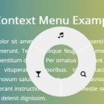 Touch-enabled Radial Context Menu In Pure JavaScript – radialMenu
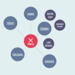 Multi-level Radial Tree Menu In Pure CSS
 Corner Radial Menu In JavaScript/CSS/SVG
 Radial Toggle Menu With JavaScript And CSS3