


A modern responsive sidebar panel (also called off-canvas side menu) with an animated hamburger toggle button. Written in plain JavaScript, CSS, and HTML.
How to use it:
1. Create the HTML for the sidebar navigation.
<aside id="sidebar">
  <div class="sidebar_content sidebar_head">
    <h1>Sidebar</h1>
  </div>
  <div class="sidebar_content sidebar_body">
    <nav class="side_navlinks">
      <ul>
        <li><a href="#">Home</a></li>
        <li><a href="#">About</a></li>
        <li><a href="#">Services</a></li>
        <li><a href="#">Portfolio</a></li>
        <li><a href="#">Contact</a></li>
      </ul>
  </nav>
  </div>
  <div class="sidebar_content sidebar_foot">
    <p>Sidebar Footer</p>
  </div>
</aside>
2. Create a sidebar toggler on the page.
<div class="sidebar_toggler">
  <span></span>
  <span></span>
  <span></span>
</div>
3. The necessary CSS styles for the sidebar navigation.
/*--====== Global Variables ======--*/
:root {
  --bg-color: #13131f;
  --bg-color-2: #161623;
  --text-color: #a9afc3;
}
/*--====== Sidebar ======--*/
#sidebar {
  position: fixed;
  top: 0;
  left: 0;
  z-index: 999;
  max-width: 300px;
  width: 80%;
  height: 100%;
  padding: 2rem;
  background-color: var(--bg-color-2);
  box-shadow: 0 10px 20px -4px #000;
  overflow-x: hidden;
  overflow-y: auto;
  pointer-events: none;
  opacity: 0;
  visibility: hidden;
  transform: translateX(-100%);
  transition: opacity 0.3s ease, visibility 0.2s ease, transform 0.3s ease;
}
/* when the sidebar has 'show' class */
#sidebar.show {
  pointer-events: all;
  opacity: 1;
  visibility: visible;
  transform: translateX(0);
}
.sidebar_content {
  padding: 2.8rem 0;
  pointer-events: none;
  /* so that the Sidebar does not get closed while clicking on sidebar_content */
}
.sidebar_content a {
  pointer-events: all;
  /* so that all the a inside sidebar_content are clickable */
}
.sidebar_body {
  border-top: 1px dashed var(--text-color);
  border-bottom: 1px dashed var(--text-color);
}
.side_navlinks ul {
  display: grid;
  gap: 2rem;
}
.side_navlinks li a {
  text-transform: uppercase;
  letter-spacing: 1px;
  opacity: 0.8;
}
.side_navlinks a:hover {
  opacity: 1;
}
4. Style the hamburger toggle button.
/*---- Sidebar-Toggler ----*/
.sidebar_toggler {
  position: fixed;
  top: 4vh;
  right: 3vw;
  width: 1.75rem;
  height: 1.3rem;
  display: flex;
  flex-direction: column;
  justify-content: space-between;
  cursor: pointer;
  overflow: hidden;
}
.sidebar_toggler span {
  background-color: #ddd;
  width: 100%;
  height: 2.4px;
  transition: all 0.3s ease;
  pointer-events: none;
  /* so that it doesn't overlap the sidebar_toggler */
}
/* if the sidebar has 'show' class then their adjacent-sibling (i.e., sidebar_toggler) will... */
#sidebar.show + .sidebar_toggler {
  justify-content: center;
}
#sidebar.show + .sidebar_toggler span {
  margin-top: -1.2px;
  margin-bottom: -1.2px;
}
#sidebar.show + .sidebar_toggler span:first-child {
  transform: rotate(45deg);
}
#sidebar.show + .sidebar_toggler span:nth-child(2) {
  opacity: 0;
  transform: translateX(-100%);
}
#sidebar.show + .sidebar_toggler span:last-child {
  transform: rotate(-45deg);
}
See Also:
 Simple Sidebar Hamburger Menu In CSS
 Create Mobile-First Side Menus with SlideReveal.js Library
 Off-canvas Accordion Menu With Bootstrap 5
 Beautiful Dashboard Sidebar Menu Template
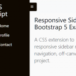 Responsive Sidebar Navigation For Bootstrap 5
 Responsive Multi-level Sidebar Menu With JavaScript/CSS
 Minimal Sliding Sidebar Nav In JavaScript
 Hamburger Sidebar Navigation In Pure CSS – Sidebar-Menu