


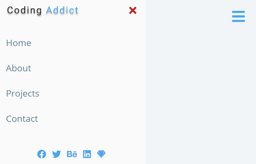
A responsive sliding sidebar navigation (a.k.a off-canvas menu) with a hamburger toggle button, written in plain JavaScript and CSS/CSS3.
How to use it:
1. Create the HTML for the sidebar navigation.
<aside class="sidebar">
  <div class="sidebar-header">
    <img src="logo.svg" class="logo" alt="">
    <button class="close-btn">
      Close Button
    </button>
  </div>
  <!-- links -->
  <ul class="links">
    <li>
      <a href="#">Home</a>
    </li>
    <li>
      <a href="#">About</a>
    </li>
    <li>
      <a href="#">Blog</a>
    </li>
    <li>
      <a href="#">Contact</a>
    </li>
  </ul>
  <!-- social media -->
  <ul class="social-icons">
    <li>
      <a href="https://www.twitter.com">
        Twitter
      </a>
    </li>
    <li>
      <a href="https://www.facebook.com">
        Facebook
      </a>
    </li>
    <li>
      <a href="https://www.pinterest.com">
        Pinterest
      </a>
    </li>
    <li>
      <a href="https://www.linkedin.com">
        LinkedIn
      </a>
    </li>
  </ul>
</aside>
2. Create a hamburger toggle button on the page.
<button class="sidebar-toggle">
  Any Hamburger Icon Here
</button>
3. The necessary CSS/CSS3 styles.
/* Hamburger Toggle Button */
.sidebar-toggle {
  position: fixed;
  top: 2rem;
  right: 3rem;
  font-size: 2rem;
  background: transparent;
  border-color: transparent;
  color: hsl(205, 78%, 60%);
  transition: all 0.3s linear;
  cursor: pointer;
}
.sidebar-toggle:hover {
  color: hsl(205, 90%, 76%);
}
/* Sidebar Nav */
.sidebar-header {
  display: flex;
  justify-content: space-between;
  align-items: center;
  padding: 1rem 1.5rem;
}
.close-btn {
  font-size: 1.75rem;
  background: transparent;
  border-color: transparent;
  color: hsl(205, 78%, 60%);
  transition: all 0.3s linear;
  cursor: pointer;
  color: hsl(360, 67%, 44%);
}
.close-btn:hover {
  color: hsl(360, 71%, 66%);
  transform: rotate(360deg);
}
.logo {
  justify-self: center;
  height: 40px;
}
.links a {
  display: block;
  font-size: 1.5rem;
  text-transform: capitalize;
  padding: 1rem 1.5rem;
  color: hsl(210, 22%, 49%);
  transition: all 0.3s linear;
}
.links a:hover {
  background: hsl(205, 86%, 81%);
  color: hsl(205, 78%, 60%);
  padding-left: 1.75rem;
}
.social-icons {
  justify-self: center;
  display: flex;
  padding-bottom: 2rem;
}
.social-icons a {
  font-size: 1.5rem;
  margin: 0 0.5rem;
  color: hsl(205, 78%, 60%);
  transition: all 0.3s linear;
}
.social-icons a:hover {
  color: hsl(205, 86%, 17%);
}
.sidebar {
  position: fixed;
  top: 0;
  left: 0;
  width: 100%;
  height: 100%;
  background: #fff;
  display: grid;
  grid-template-rows: auto 1fr auto;
  row-gap: 1rem;
  box-shadow: hsl(360, 67%, 44%);
  transition: all 0.3s linear;
  transform: translate(-100%);
}
.show-sidebar {
  transform: translate(0);
}
@media screen and (min-width: 676px) {
  .sidebar {
    width: 400px;
  }
}
4. Enable the hamburger button to toggle the sidebar nav.
const toggleBtn =document.querySelector('.sidebar-toggle');
const closeBtn =document.querySelector('.close-btn');
const sidebar =document.querySelector('.sidebar');
toggleBtn.addEventListener('click', function(){
  // using add and remove class
  /*
  if(sidebar.classList.contains('show-sidebar')){
      sidebar.classList.remove('show-sidebar');
  }else{
      sidebar.classList.add('.show-sidebar');
  }
  */
  //using toggle
  sidebar.classList.toggle('show-sidebar');
});
closeBtn.addEventListener('click', function(){
  sidebar.classList.remove('show-sidebar');
});
See Also:
 Create Mobile-First Side Menus with SlideReveal.js Library
 Simple Sidebar Hamburger Menu In CSS
 Responsive Sidebar Navigation With Hamburger Toggle Button
 Off-canvas Accordion Menu With Bootstrap 5
 Beautiful Dashboard Sidebar Menu Template
 Responsive Sidebar Navigation For Bootstrap 5
 Responsive Multi-level Sidebar Menu With JavaScript/CSS
 Hamburger Sidebar Navigation In Pure CSS – Sidebar-Menu