


An easy-to-use responsive video background web component that works perfectly on mobile and desktop.
The component automatically detects screen sizes and provides a background image fallback for smaller screens like mobile phones (OPTIONAL).
It also considers user preferences by detecting the prefers-reduced-motion media query and disabling video playback when necessary.
How to use it:
1. Import the responsive video background web component.
<script type="module" src="./responsive-video-background.js"></script>
2. Add the <responsive-video-background /> component to the page and specify the path to your video.
<responsive-video-background
  webm="1.webm"
  mp4="1.mp4"
  poster="poster.jpg"
>
  ... any content here ...
</responsive-video-background>
3. Add a responsive image fallback to the component.
<responsive-video-background
  webm="1.webm"
  mp4="1.mp4"
  poster="poster.jpg"
  fallback="1.jpg"
  srcset="1-small.jpg 420w, 1-medium.jpg 768w, 1-large.jpg 1024w, 1-original.jpg 1440w"
  sizes="calc(100vh - 2rem)"
  breakpoint="1024px"
>
  ... any content here ...
</responsive-video-background>
See Also:
 Animated ASCII Backgrounds for Web Apps – ASCIIGround.js
 Create A Background Particles System With JavaScript And Canvas – nodes.js
 Create a Single Gradient/Image Background across Multiple Elements – ShareShade
 Lazy Loading Video Backgrounds with IntersectionObserver
 Create Interactive Particle Backgrounds with Pure JavaScript – DotWave.js
 Interactive Star Field Background with JavaScript and Canvas
 Create Dynamic Abstract Web Backgrounds With color4bg.js
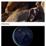 Lightweight Background Video Library – vidim